Multimedia Installation

2025

Designing for curiosity: making complex history accessible with interactive dual-display experiences

Project Snapshot

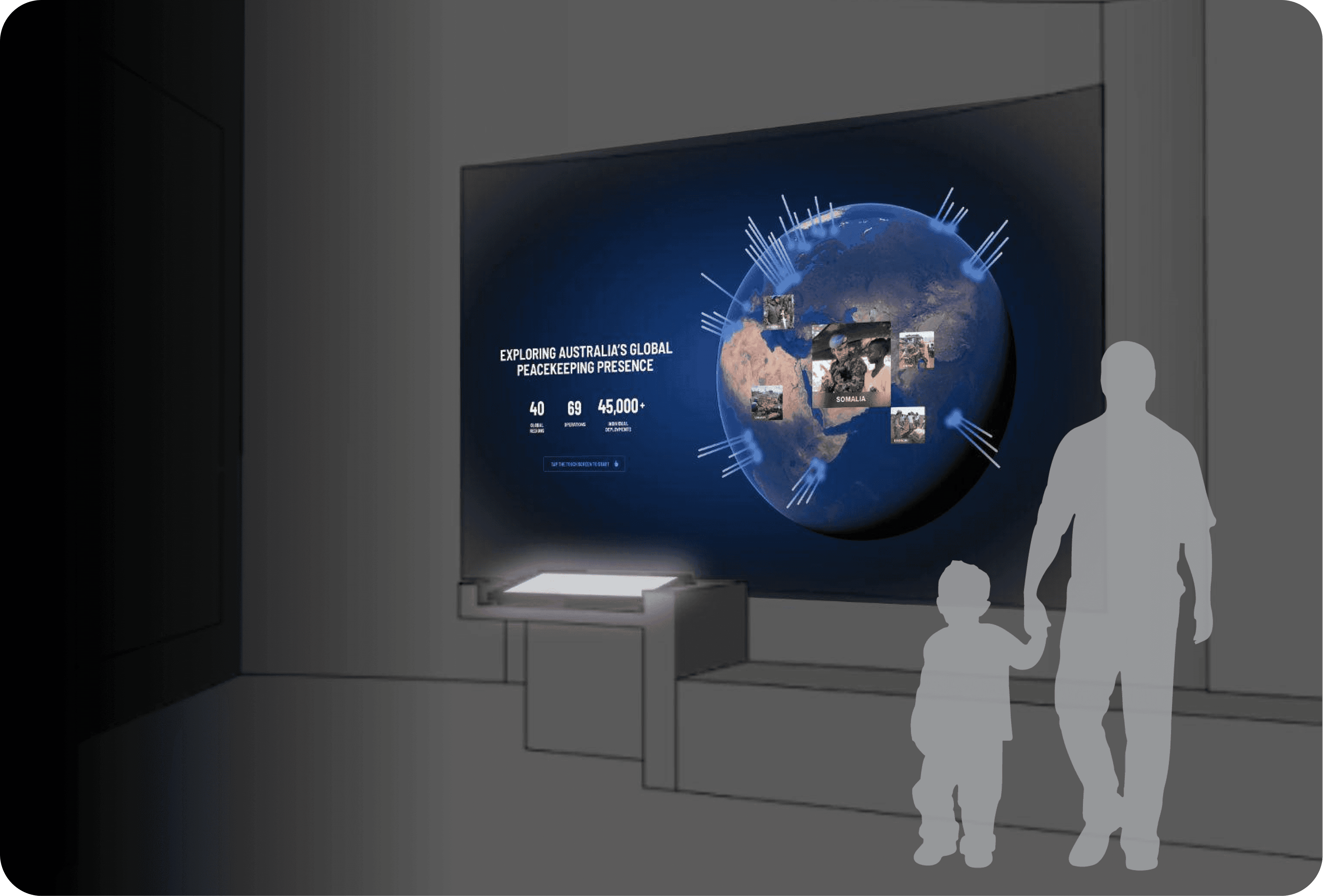
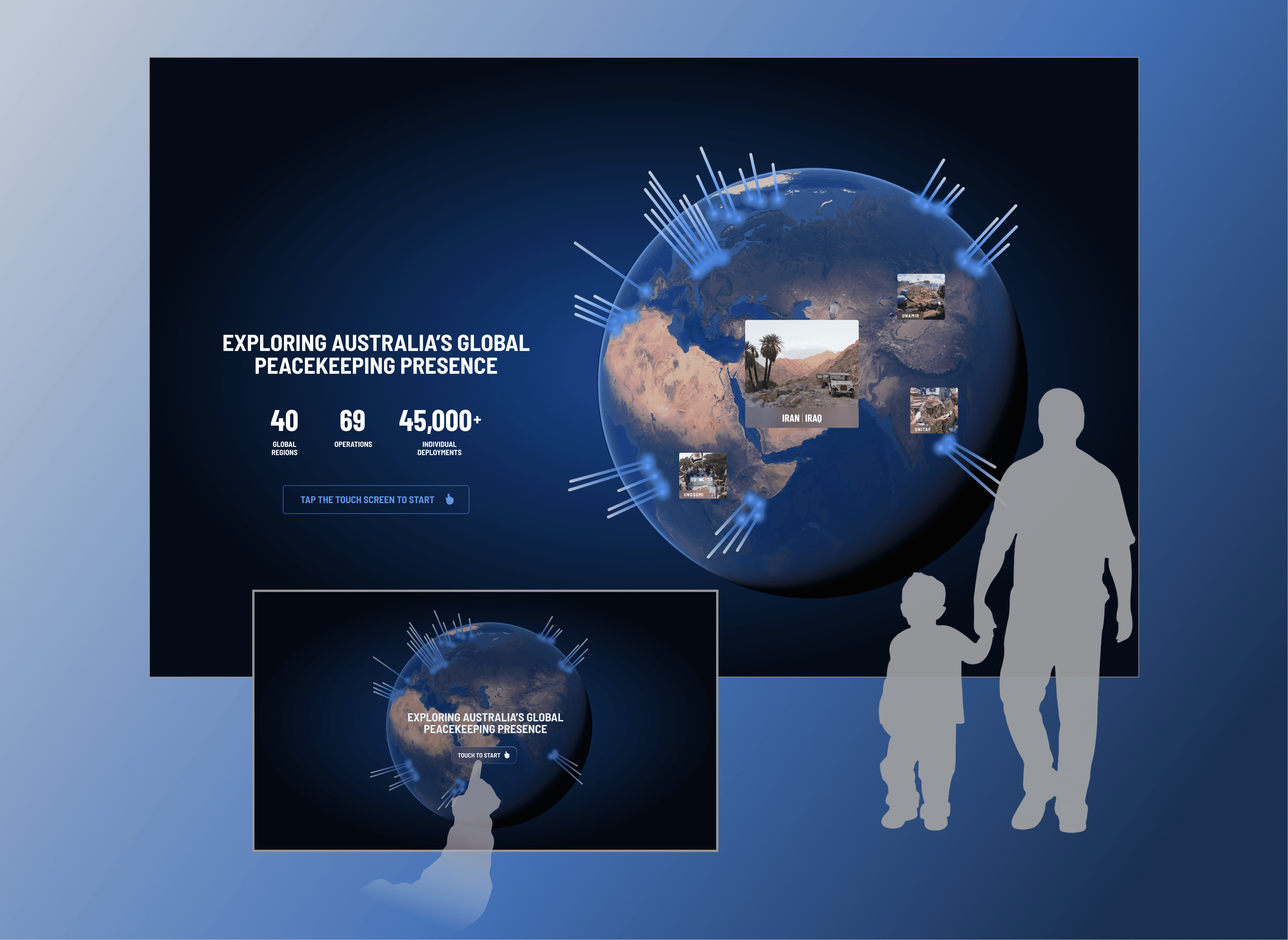
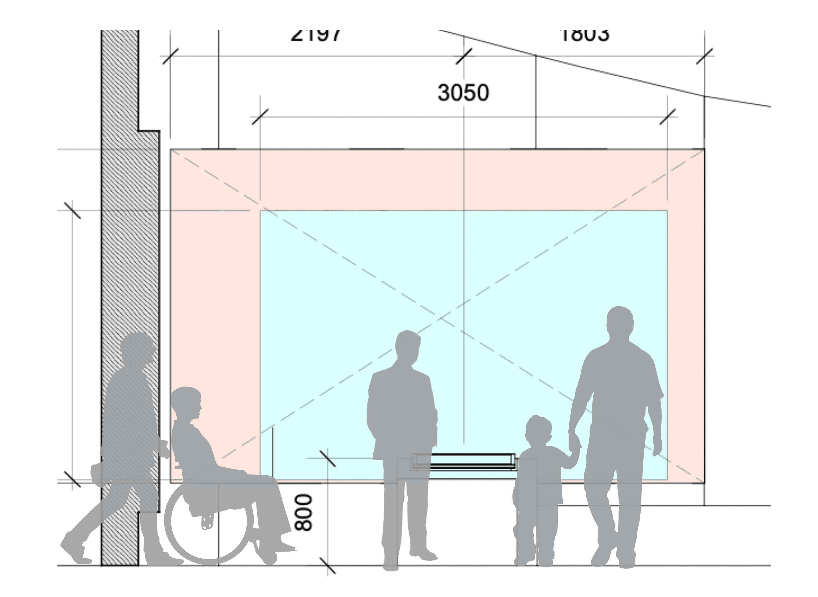
The Australian War Memorial tasked our agency, Grumpy Studios, with creating interactive experiences for their gallery redevelopment. I led the UX/UI design for the Peacekeeping Gallery's centrepiece—a multimedia installation pairing a 4m projection wall with a touchscreen to showcase 60 peacekeeping operations across the globe. The challenge was designing for simultaneous passive and active engagement, ensuring both casual gallery visitors and deeply curious audiences could grasp Australia's global peacekeeping legacy. This project required balancing visual spectacle with information clarity, accessibility standards with creative ambition.

Role

Senior UX/UI Designer

Team

Creative Director

Product Manager

Technology & Development

Impact

Dual-display design enabled simultaneous passive and active engagement.

WCAG-compliant interface served visitors of all abilities.

Progressive disclosure improved information retention without overwhelm.

Streamlined CMS handoff reduced development friction.

The challenge

Designing for glances and deep dives simultaneously

The AWM attracts diverse visitors—school groups, history enthusiasts, veterans, tourists—each seeking different levels of engagement. I reframed these visitor types into two design priorities:

Passive users

People walking past who glance at the projection and absorb key messages without touching anything.

Passive users

People walking past who glance at the projection and absorb key messages without touching anything.

Active users

Visitors who stop, interact with the touchscreen, and dive deep into specific operations.

Active users

Create a medically verified, LGBTQI+-specific resource library with clear categorisation and search functionality.

Active users

Create a medically verified, LGBTQI+-specific resource library with clear categorisation and search functionality.

The design challenge was ensuring both experiences felt valuable without duplicating content or causing confusion about how the two displays related to each other.

The opportunity

Create an interactive installation that makes Australia's global peacekeeping legacy both visually striking and educationally meaningful. By designing for simultaneous passive and active engagement, I could ensure every visitor—regardless of age, prior knowledge, or time spent—walked away understanding the breadth and diversity of Australian peacekeeping missions. This was a chance to prove that dual-display experiences can serve multiple audiences without compromising clarity or depth.

Design decision 01

Finding the right balance between two screens

When I joined the project, another designer had established a basic user flow. My role was to refine this and determine the relationship between the projection wall and touchscreen—a critical decision that would define the entire experience.

The risk

If the displays were identical, active users would find the touchscreen redundant. If they were too different, passive users would be confused about what they were seeing.

The risk

If the displays were identical, active users would find the touchscreen redundant. If they were too different, passive users would be confused about what they were seeing.

My approach

I designed key wireframes to validate that a projection with simplified content would complement the detailed touchscreen experience. This meant the wall would show bold visuals and top-level facts, while the touchscreen offered layered exploration for engaged visitors.

My approach

I designed key wireframes to validate that a projection with simplified content would complement the detailed touchscreen experience. This meant the wall would show bold visuals and top-level facts, while the touchscreen offered layered exploration for engaged visitors.

The outcome

Users could engage at their chosen depth—whether a 30-second glance or a 5-minute exploration—and still walk away understanding three core messages:

  • Australian peacekeeping is global in nature

  • Australians have served in diverse locations worldwide

  • Peacekeepers have performed a wide range of roles

Projection versus touchscreen

Design decision 02

Designing entry points that match user intent

Creating curiosity through motion

To draw visitors into the experience, I designed a dynamic attract screen where an idle-state globe slowly rotates, revealing location labels, glowing nodes, and imagery. This subtle animation signals interactivity from across the gallery and communicates scale without requiring any touch.

Ambient motion creates curiosity. Even small animations significantly influence participation rates by transforming a static display into something that feels alive and inviting.

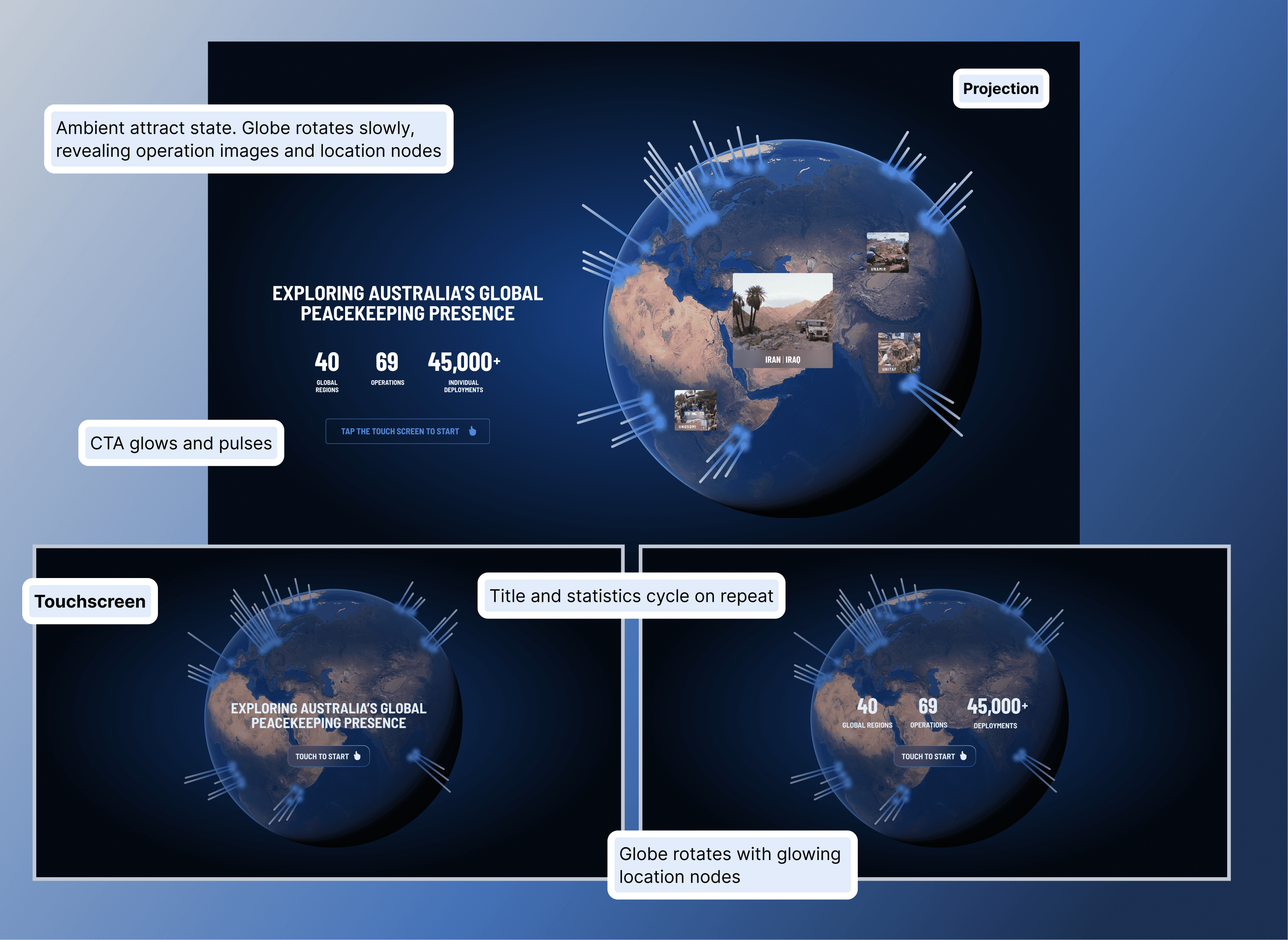
Two paths to discovery

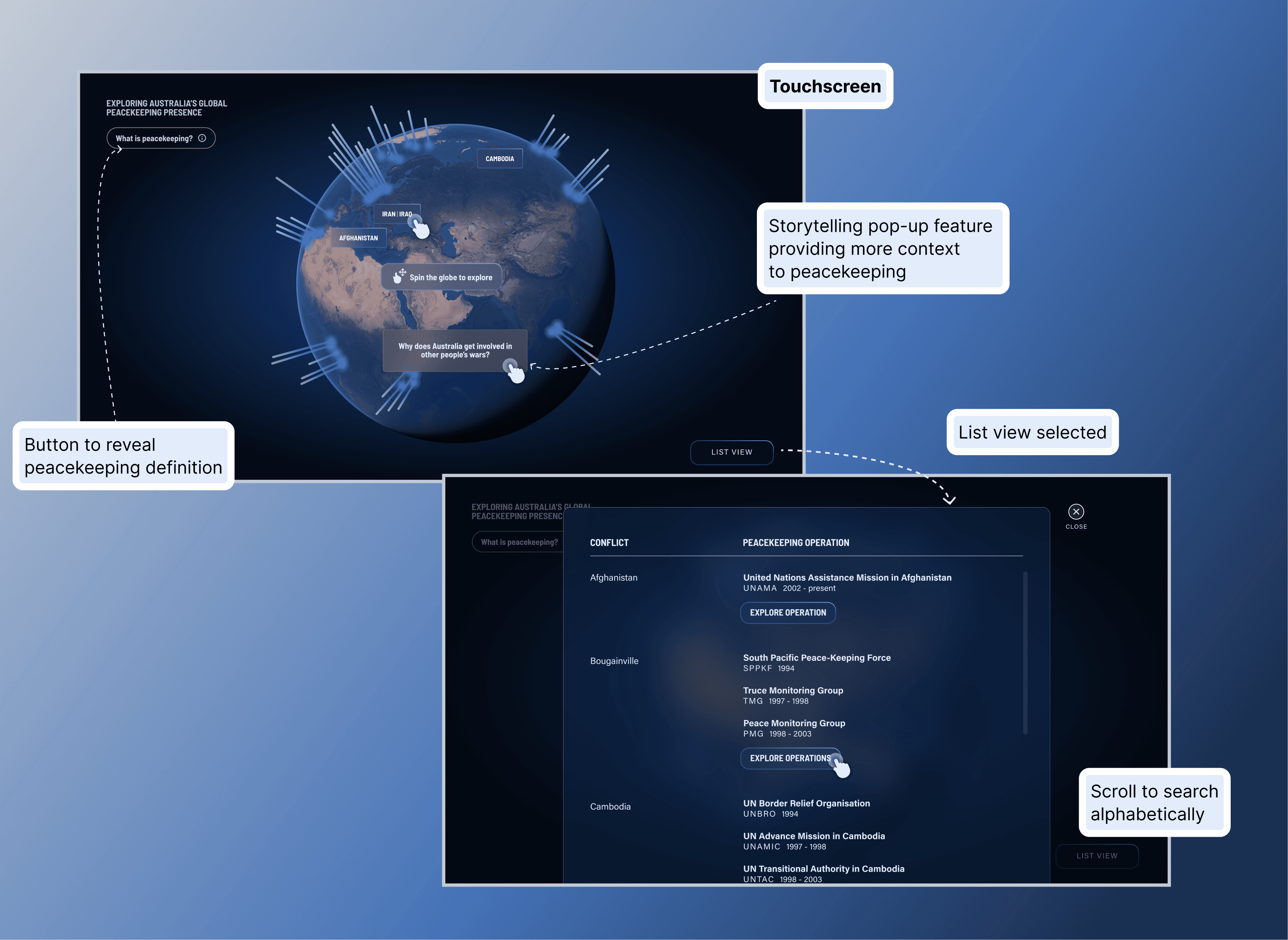
The home screen offers dual navigation—users can spin a 3D globe and tap location nodes, or switch to an alphabetised list view to scroll through conflict zones.

By providing multiple entry points, I lowered the barrier to engagement. Casual browsers could explore randomly by spinning the globe, while purposeful visitors with prior knowledge could navigate directly to specific operations. Flexibility in UX means designing for different curiosity styles.

Design decision 03

Progressive disclosure prevents information overload

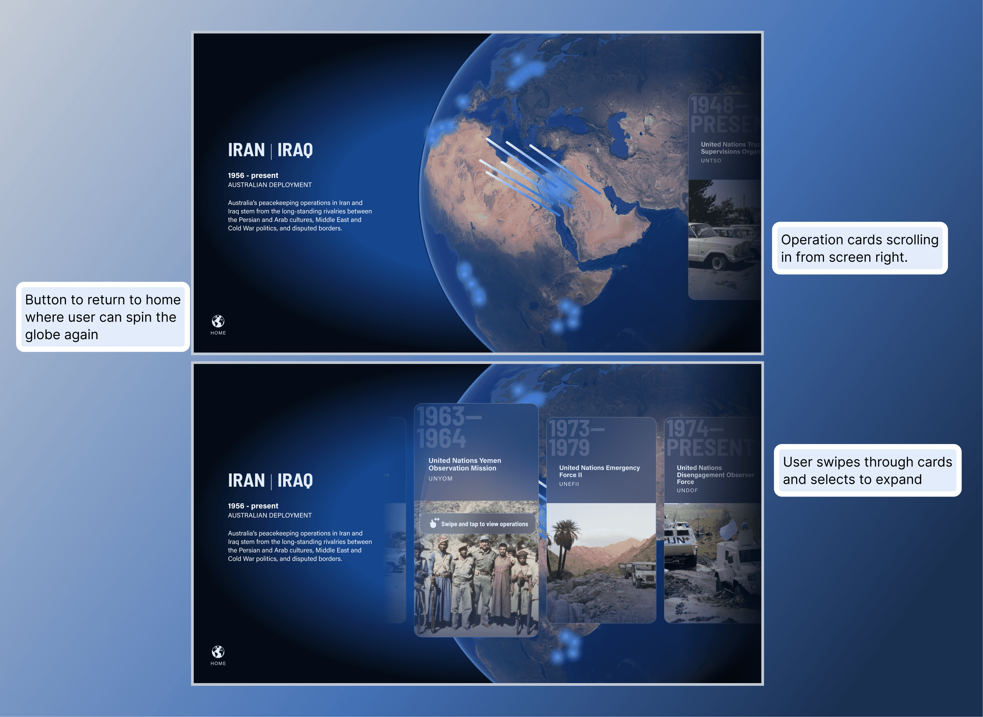
Zooming from global to regional

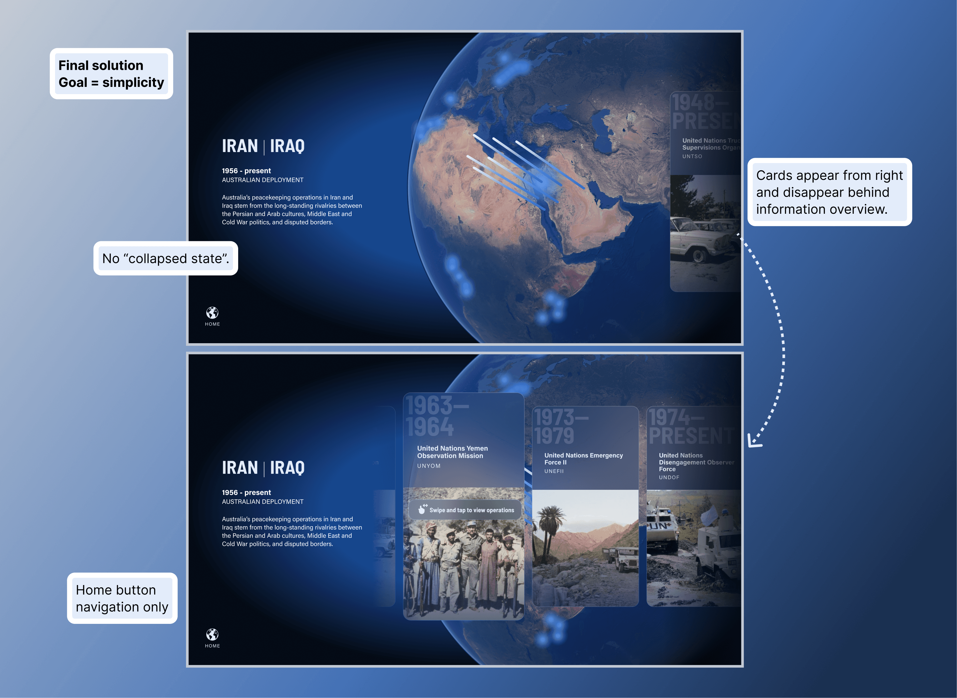
Selecting a location triggers an animated zoom on the projection, highlighting how many peacekeeping operations occurred in that region. The touchscreen mirrors this but adds contextual text and prompts users to reveal operation cards through horizontal scrolling.

This layer bridges the gap between global context and individual stories. Progressive disclosure sustains engagement by revealing information gradually—users aren't confronted with everything at once.

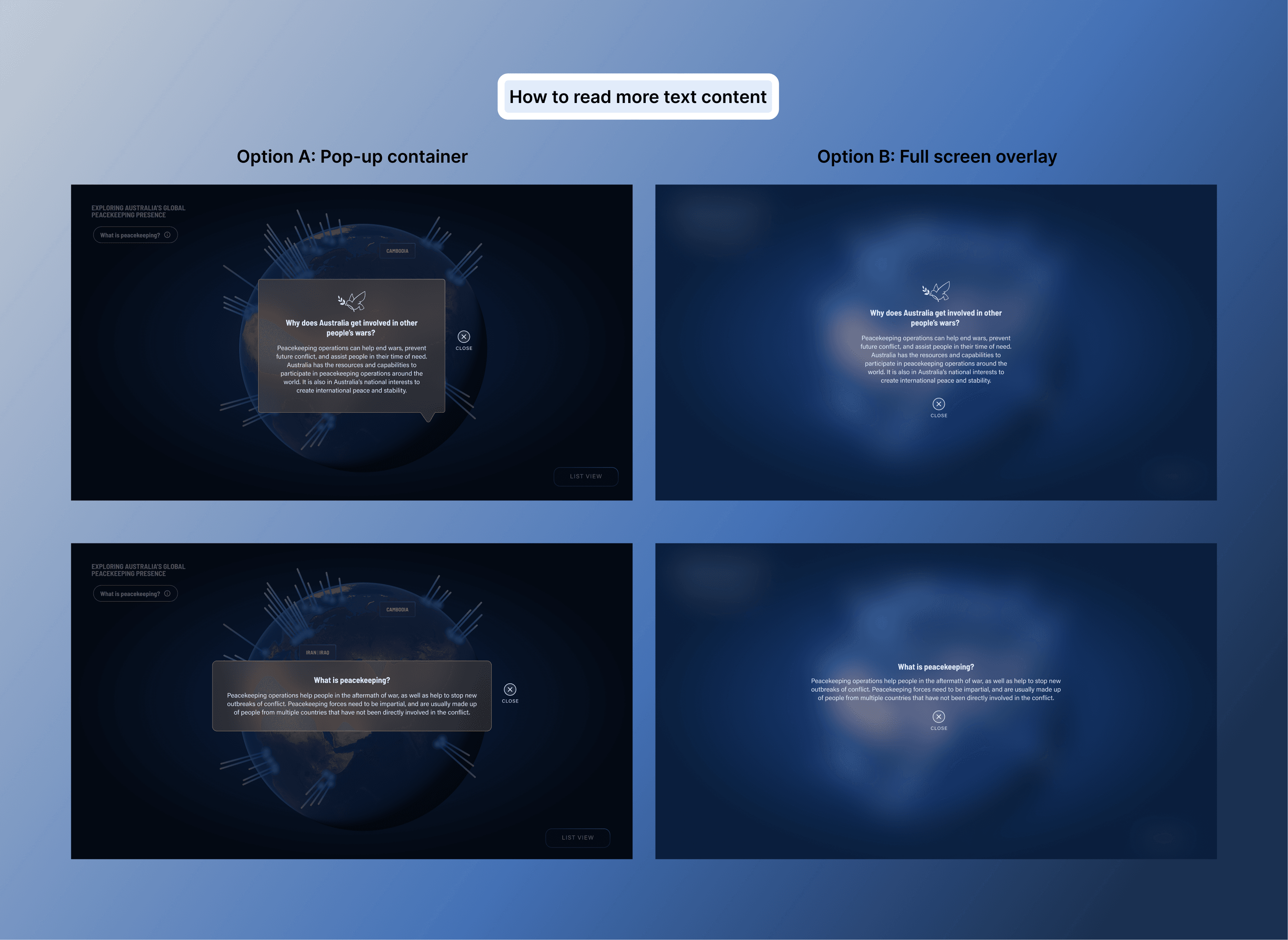
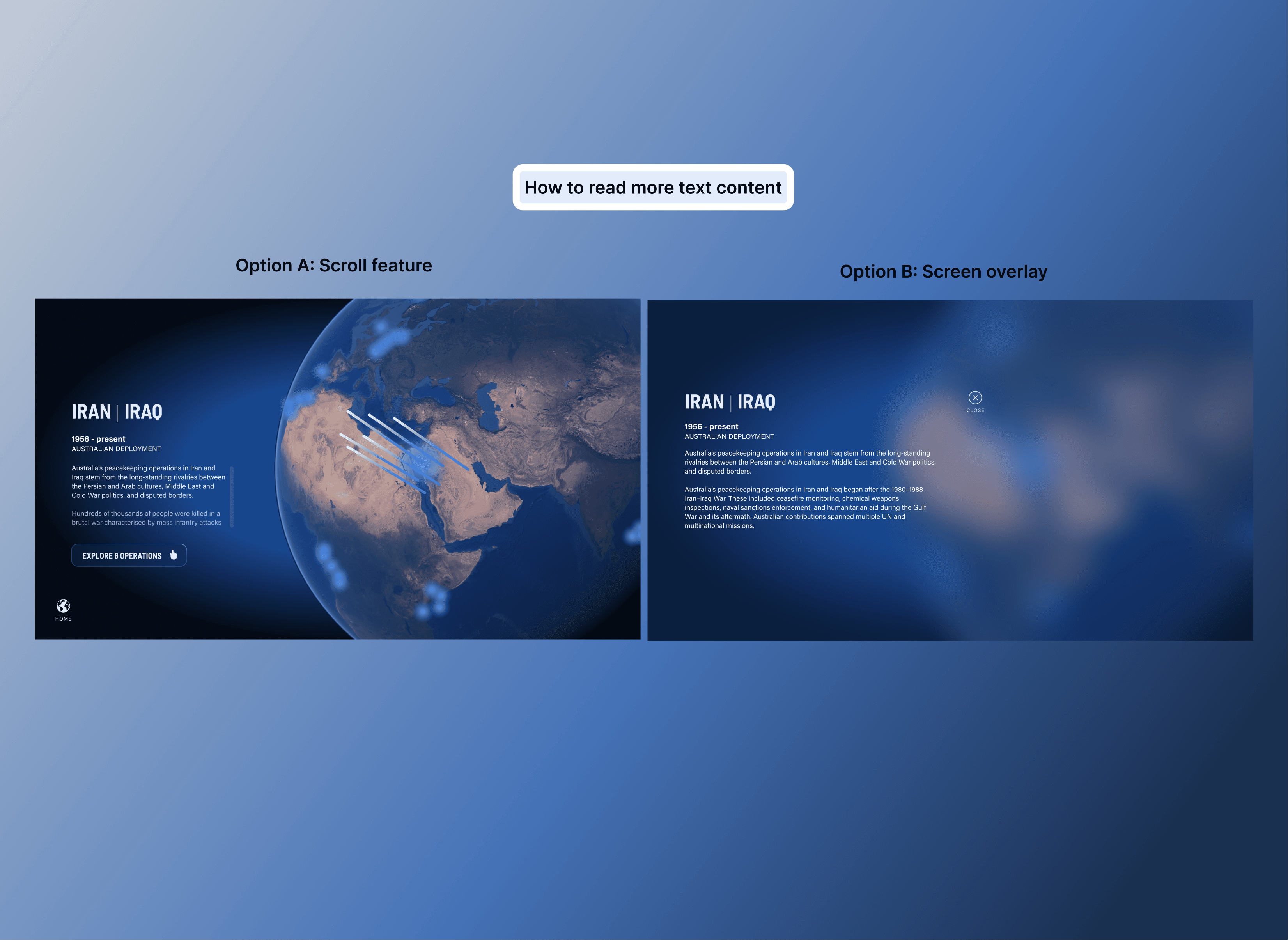
Saying less to communicate more

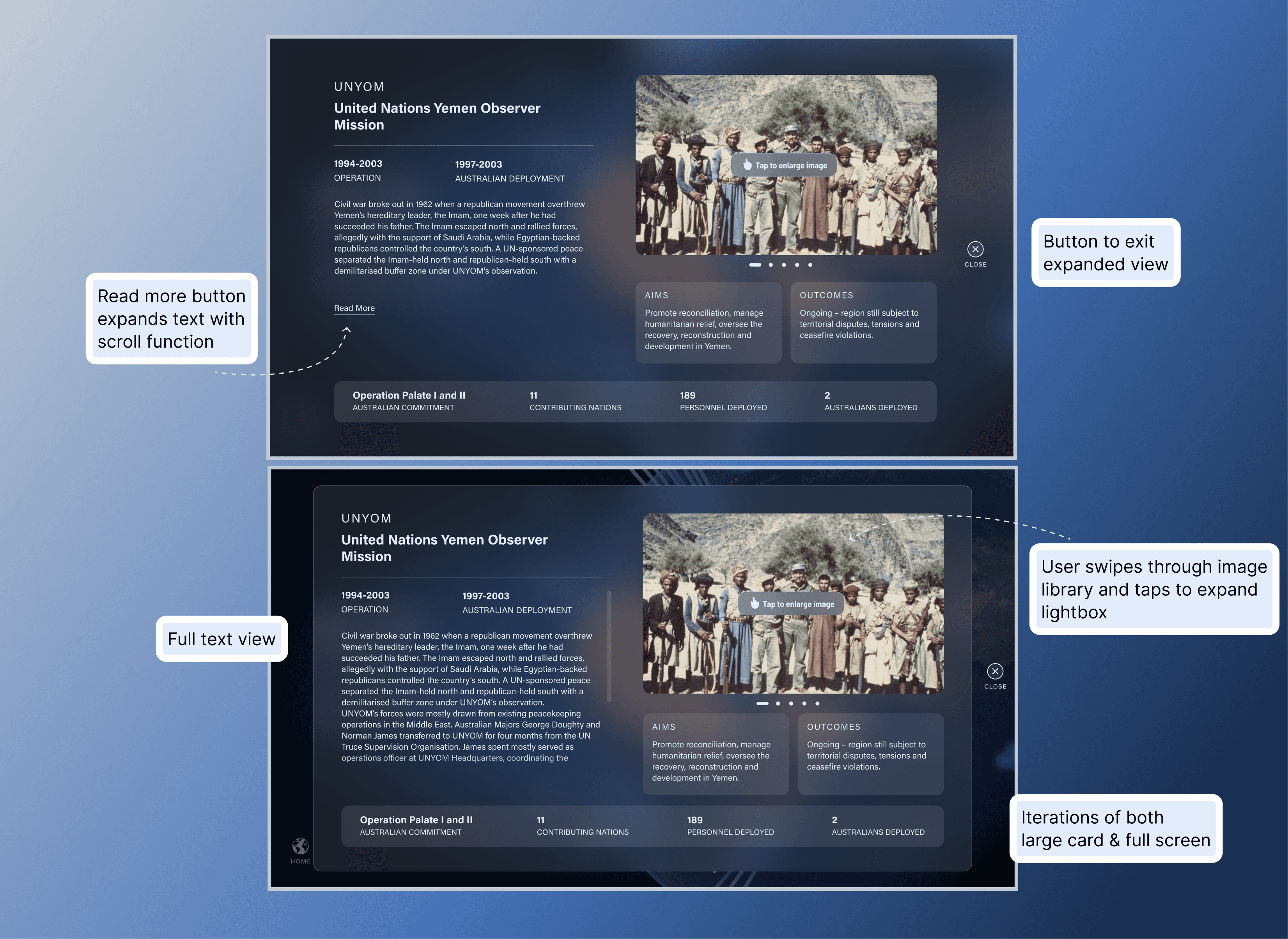
Tapping a card expands it into a detailed view with operation data, images, statistics, and contextual information. The challenge was presenting this volume of content without overwhelming users.

My solutions

  • "Read More" button for longer text to reduce initial cognitive load

  • Generous spacing between elements for visual breathing room

  • Image galleries kept small with lightbox enlargement option

  • Key statistics anchored at the bottom for easy scanning

  • Clear navigation (Close and Home buttons) for easy wayfinding

On the projection, I showed only top-level statistics and a hero image—simplifying content for passive viewers and preventing visual fatigue on a large screen.

Sometimes the most powerful choice is restraint. By saying less on the projection, I allowed visitors to absorb information at their own pace without feeling overwhelmed.

Design decision 04

Creative direction that supports storytelling

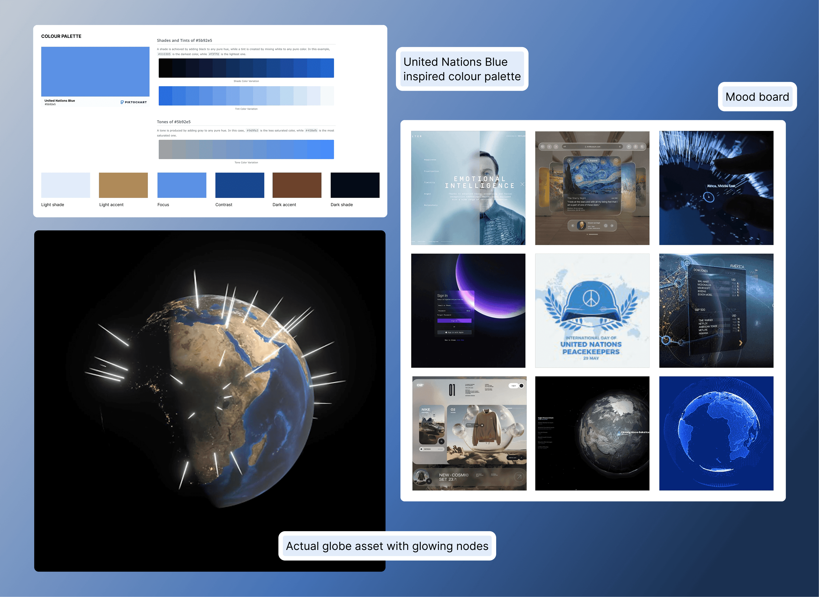
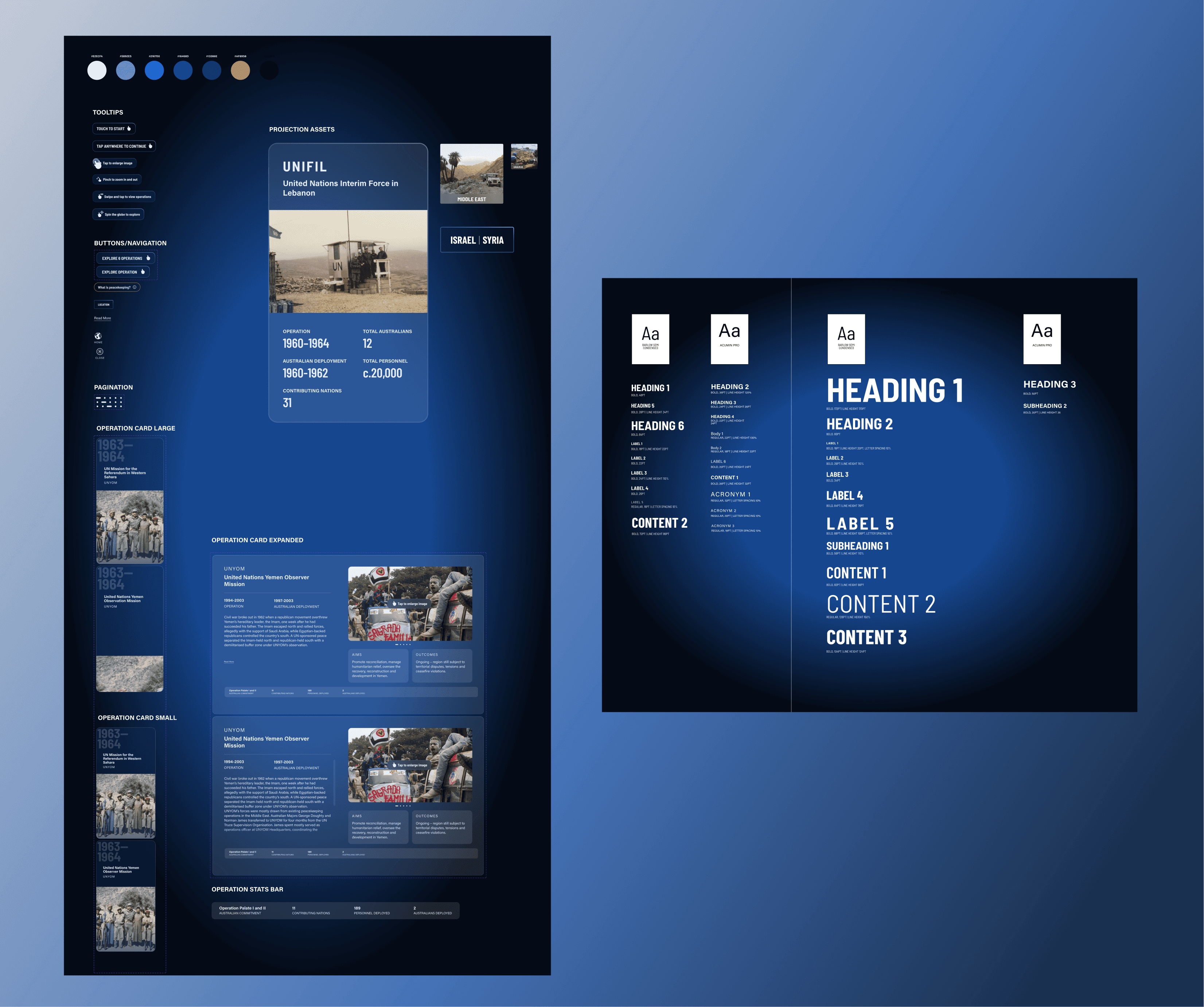
I believe conceptually grounded design resonates more deeply with audiences. Starting with UN blue—immediately peaceful, immediately recognisable—I adopted a glassmorphism visual style that mimics frosted glass. This allowed UI elements to sit over the NASA Visible Earth globe without obscuring its beauty, while adding depth and modernity.

Conceptual rationale

The glass-like aesthetic speaks to "intentional clarity" and shifting perspectives—from micro to macro, from the fog of war to the clarity of peace. It frames peacekeeping stories with transparency and purpose.

Conceptual rationale

The glass-like aesthetic speaks to "intentional clarity" and shifting perspectives—from micro to macro, from the fog of war to the clarity of peace. It frames peacekeeping stories with transparency and purpose.

Design decision 05

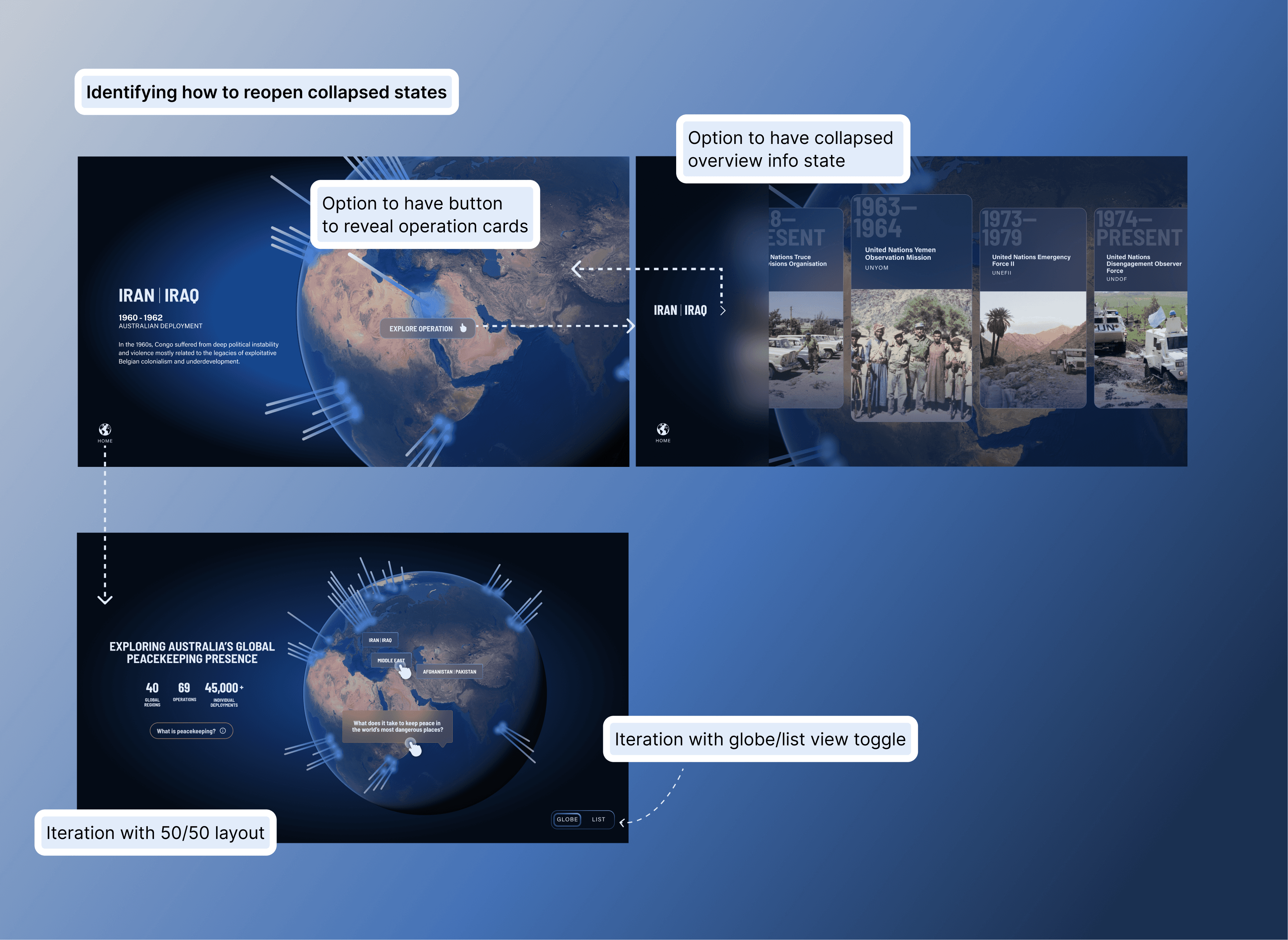
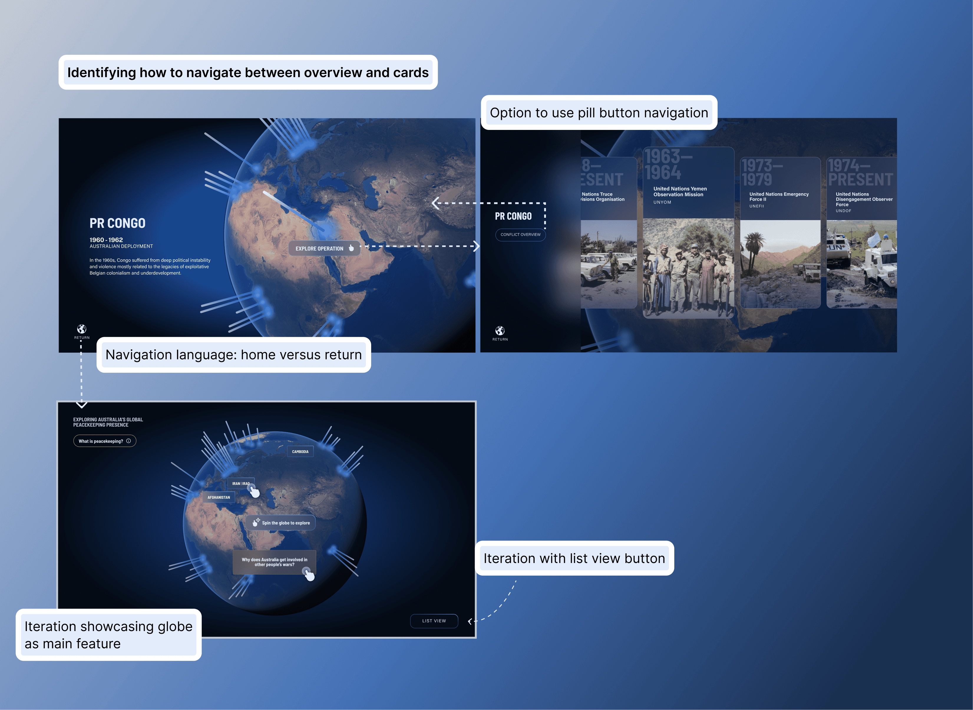
Iteration solved navigation confusion

Throughout the project, I encountered obstacles that required thoughtful iteration. One challenge was navigation confusion between the Location View and operation card scroll—users weren't sure how to move between layers.

My process

I explored multiple solutions, experimenting with button placement, button types, and collapsible shelves to hide/reveal content. I gathered usability feedback from team members, whose fresh perspectives revealed friction points I'd stopped noticing.

My process

I explored multiple solutions, experimenting with button placement, button types, and collapsible shelves to hide/reveal content. I gathered usability feedback from team members, whose fresh perspectives revealed friction points I'd stopped noticing.

The solution

A streamlined navigation pattern that prioritised simplicity over cleverness, making it obvious how to move forward and back through content.

The solution

A streamlined navigation pattern that prioritised simplicity over cleverness, making it obvious how to move forward and back through content.

Design decision 06

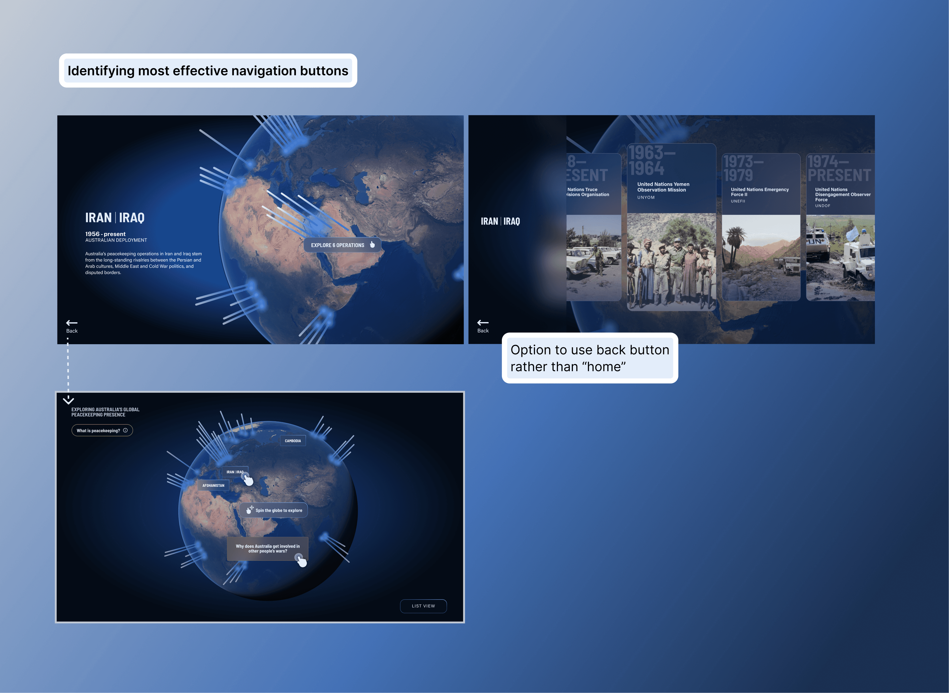
Final UI refinement through A/B testing

As I finalised detailed UI, I noticed my original touchscreen solution—using pop-up blocks for additional content—felt visually messy against the complex globe asset.

The test

I ran informal A/B testing with agency colleagues, comparing pop-ups with a full-screen takeover.

The test

I ran informal A/B testing with agency colleagues, comparing pop-ups with a full-screen takeover.

The result

The full-screen takeover was cleaner, improved readability, and allowed users to focus entirely on the story without visual competition from the globe.

The result

The full-screen takeover was cleaner, improved readability, and allowed users to focus entirely on the story without visual competition from the globe.

Small adjustments at final stages can significantly elevate clarity. This taught me to stay critical of my own work even in late stages and validate assumptions through testing.

Collaboration beyond design

I worked closely with production and technology teams on information architecture and content strategy, optimising designs for the CMS while adhering to AWM's multimedia style guide and accessibility standards. This often meant making trade-offs between creative freedom and technical feasibility—constraints that ultimately strengthened the final solution.

Impact

How I'd measure success in production

Since the installation launched in a physical gallery, traditional digital metrics don't apply. However, if I were measuring impact, I'd track dwell time at the installation, touchscreen interaction rates, operation card views per session, and qualitative visitor feedback to understand engagement depth.

What I validated through design

Dual-display system successfully served both passive and active users without content redundancy or confusion.

WCAG accessibility compliance across all interactive elements, ensuring inclusive access regardless of visitor ability.

CMS-optimised information architecture reduced development friction and enabled AWM to update content independently.

Complete UI kit and dev-ready files delivered for seamless handoff, ensuring design integrity and future maintainability.

Early AWM team feedback indicated strong stakeholder uptake and curiosity, with team members engaging meaningfully with the touchscreen

Retrospective

What this project taught me

Dual-display design requires intentional hierarchy. Every element must justify its presence on each screen—redundancy frustrates, but disconnection confuses.

Progressive disclosure builds engagement. Revealing information in layers keeps users curious without overwhelming them, especially in environments where attention is fragmented.

Constraints fuel better design. Accessibility standards, CMS limitations, and AWM's style guide forced me to refine solutions until they were robust, inclusive, and technically sound.

Collaboration improves outcomes. Usability feedback from teammates and A/B testing with colleagues revealed blind spots and validated decisions, reinforcing that design is a team sport.

Sarah Worrall

Copyright 2024 by Sarah Worrall

Sarah Worrall

Copyright 2024 by Sarah Worrall

Sarah Worrall

Copyright 2024 by Sarah Worrall