Ecommerce Website
2024
Building trust and identity for a musical instrument rental platform
Project Snapshot
Musicorp offers cost-effective instrument rentals for musicians of all levels, but their existing website lacked cohesive brand identity and intuitive user experience. Musicians couldn't efficiently search for gear, the interface felt forgettable, and the site didn't inspire the trust needed for users to commit to rentals. I redesigned the platform from the ground up—improving information architecture, creating a responsive design system, and developing a Bauhaus-inspired brand identity that balanced professionalism with accessibility. This project demonstrates how strategic visual design can transform a functional-but-forgettable product into something that inspires confidence and return visits.
The problem
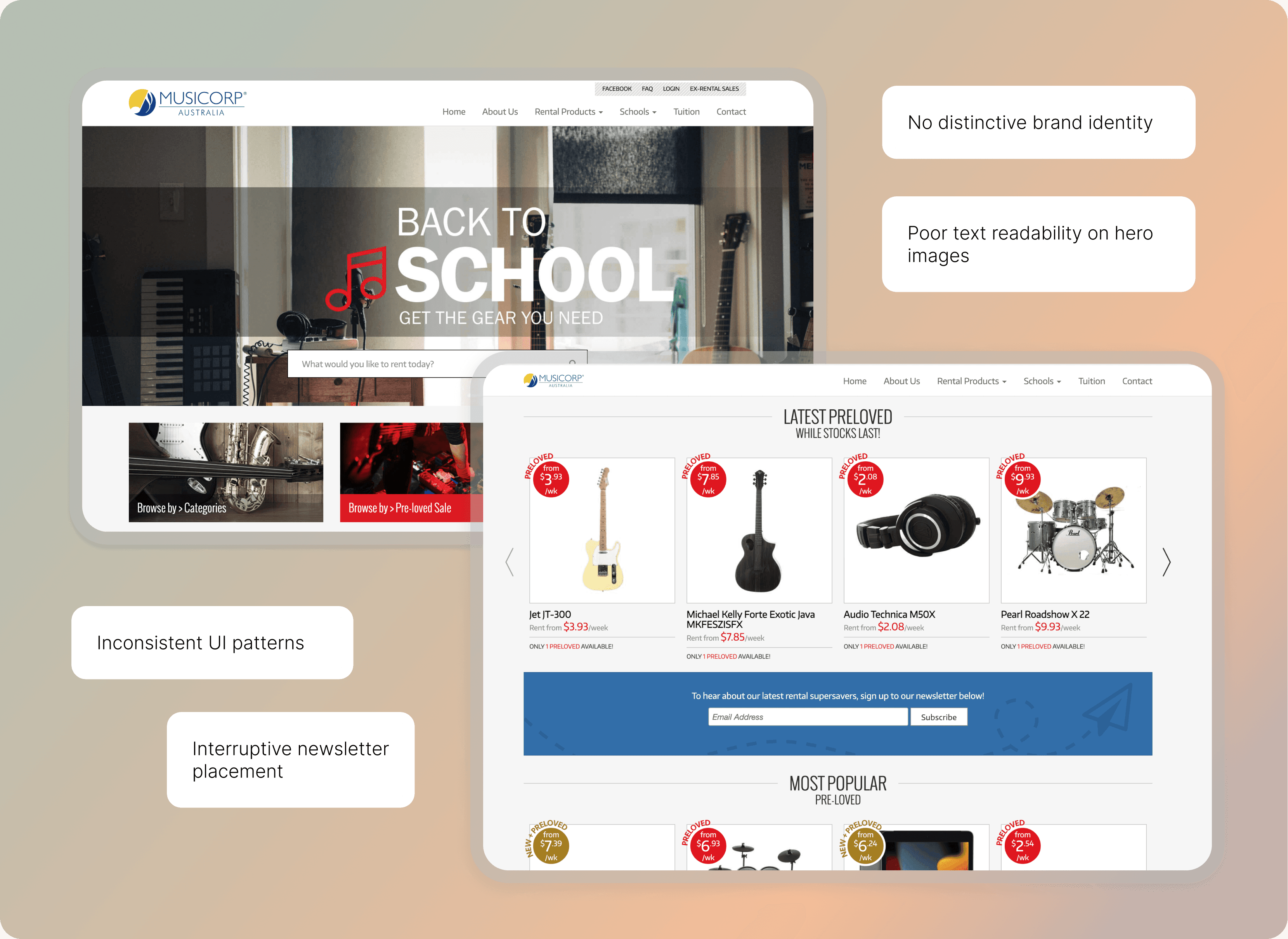
When function isn't enough: the memorability problem
Musicorp's existing site worked—users could search for instruments and submit rental applications—but the experience was unmemorable. The interface lacked personality, navigation was confusing, and the brand identity was nonexistent. For musicians making rental decisions that require trust (handing over payment details, relying on product quality), this created a significant barrier to conversion.
Understanding what musicians actually need
Rather than jumping straight to visual design, I started by auditing the existing site and developing user stories to understand core needs:
These stories revealed that Musicorp's main issues weren't about missing features—they were about how existing features were organised and presented.
Design decision 01
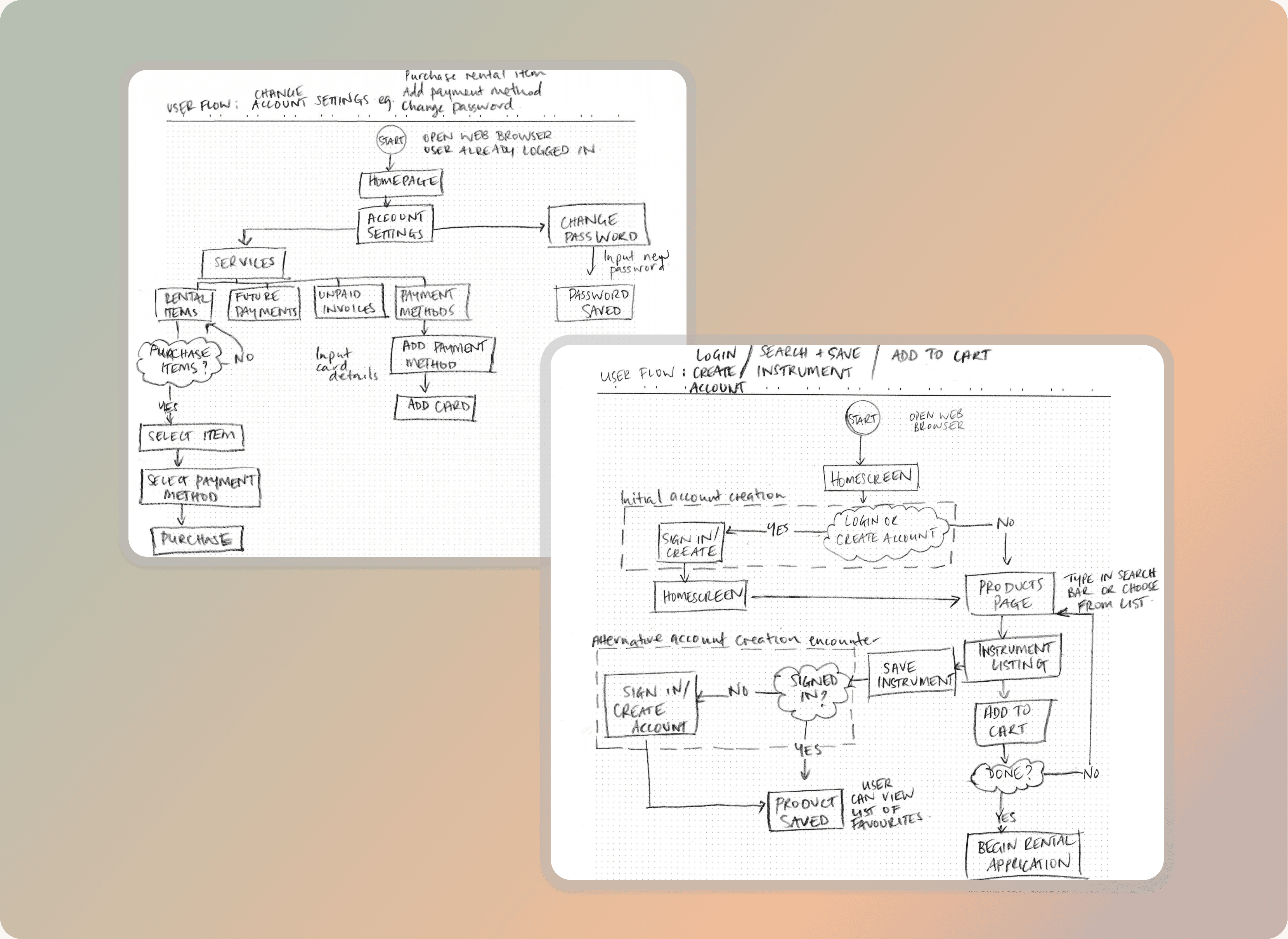
Streamlining through user flows
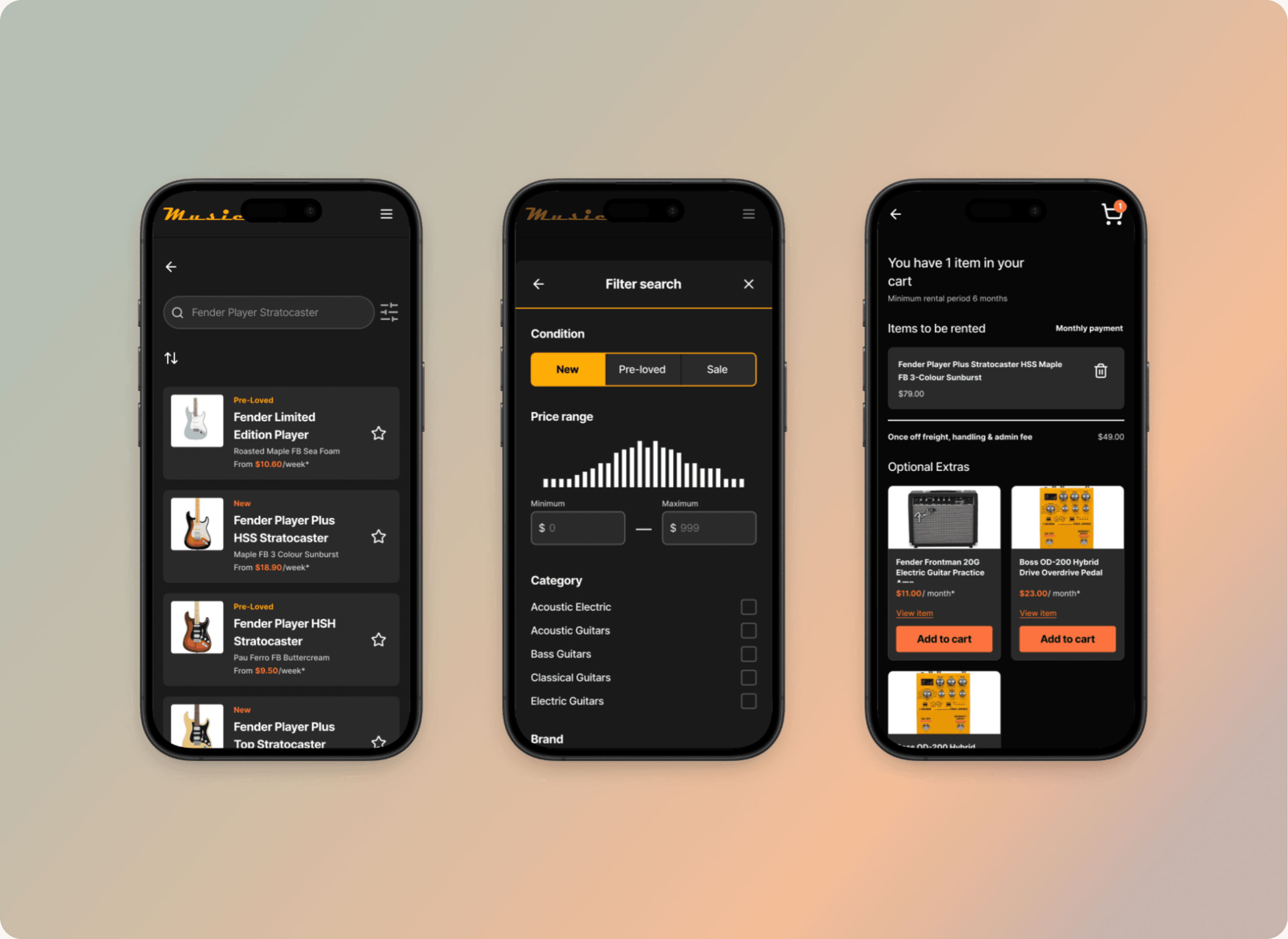
I mapped user flows to visualise how many steps it took to achieve core goals. This revealed opportunities to consolidate screens and reduce friction.
Key insights
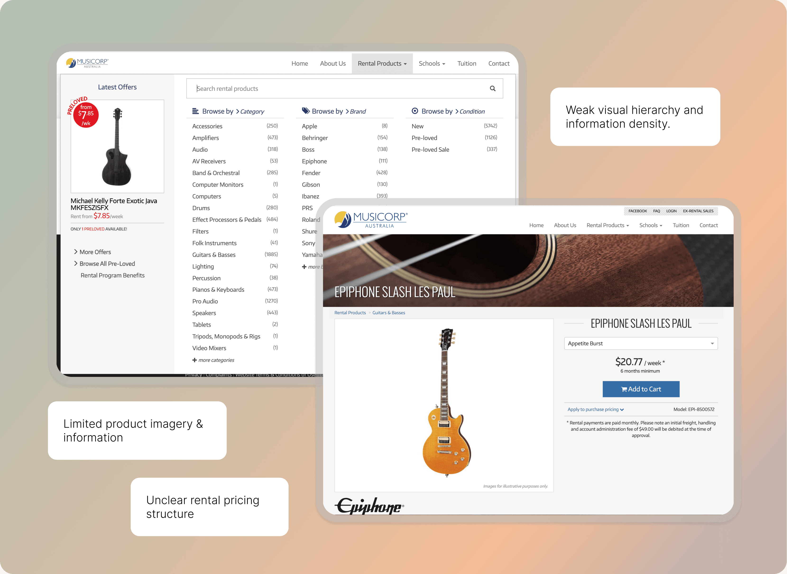
Search and filtering required too many clicks to refine results
Product pages buried important information below the fold
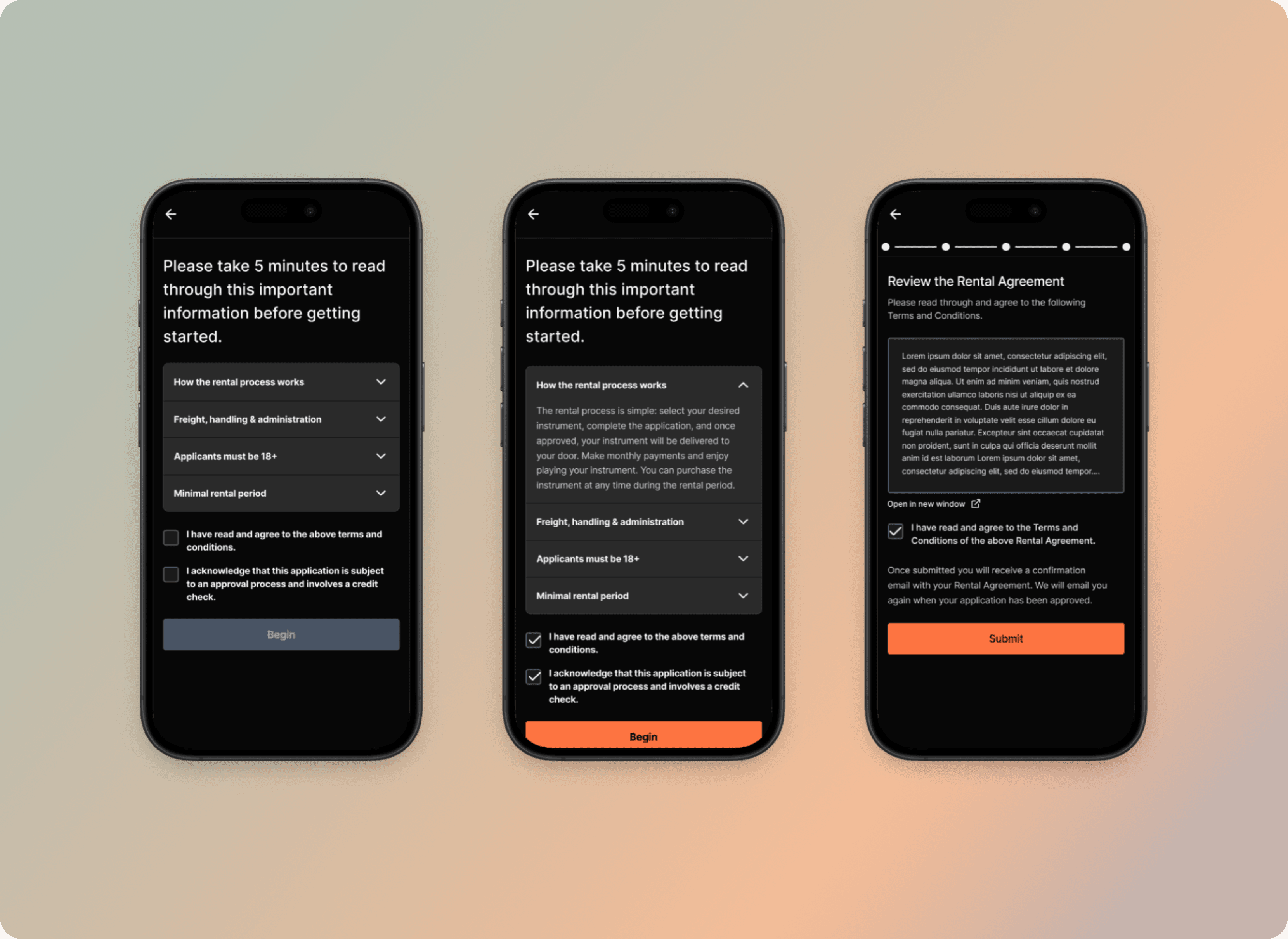
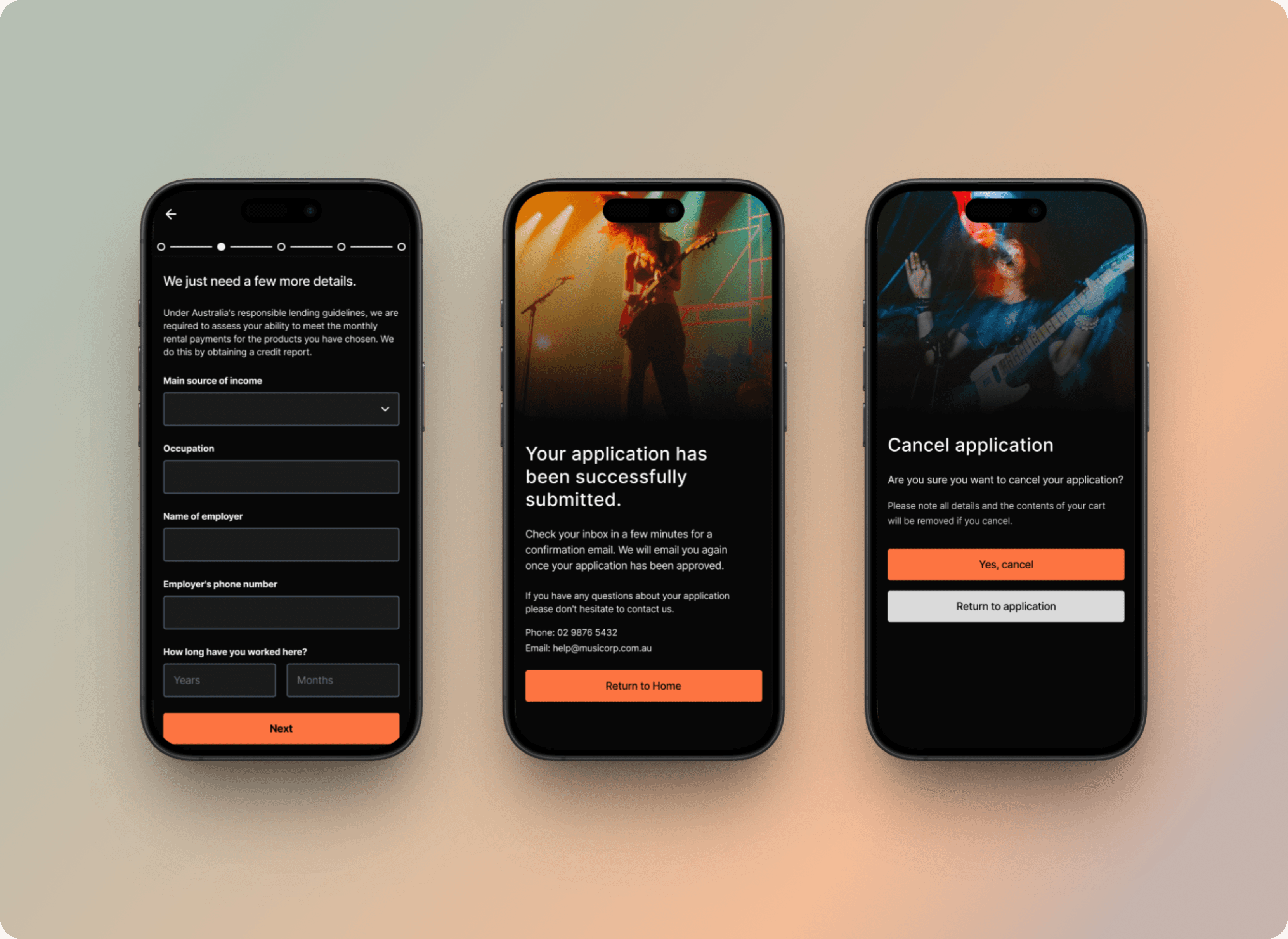
Rental application flow lacked progress indicators, making users uncertain about how many steps remained
Account management scattered related functions across multiple pages
Design decision
Prioritised consolidation over addition. Rather than adding new features, I focused on making existing functions faster and clearer by reducing navigation depth and grouping related actions.
Design decision 02
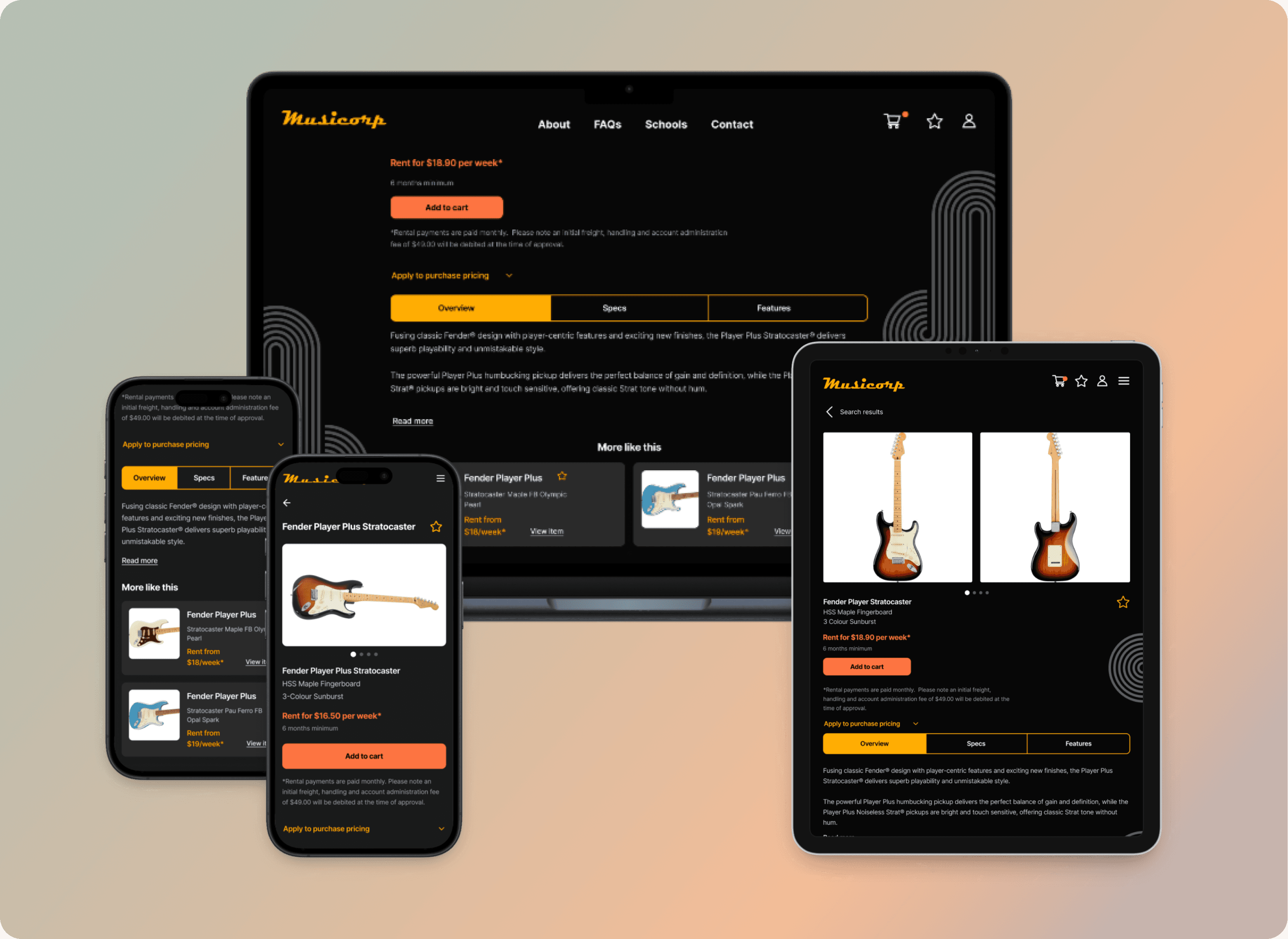
Mobile-first responsive design
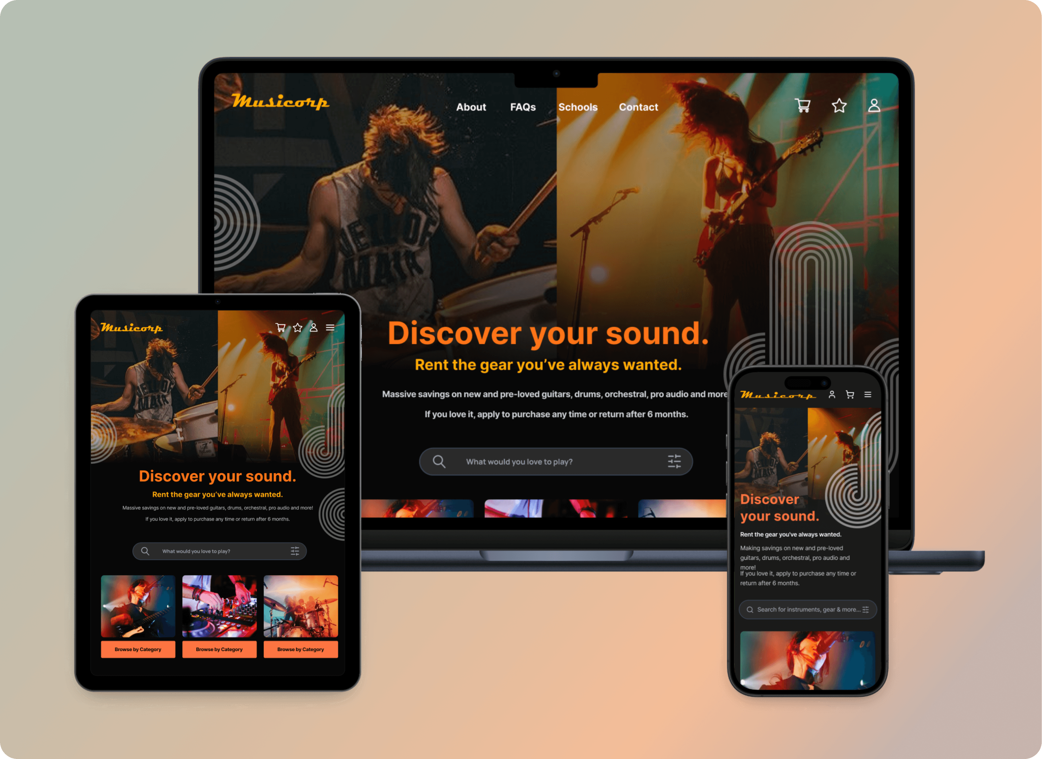
I took a mobile-first approach, designing for the smallest screens first before scaling up to tablet and desktop. This ensured that core functionality remained accessible regardless of device, whilst preventing the common trap of cramming desktop layouts onto mobile screens.
Design decisions
Established consistent grid systems and spacing rules that maintained hierarchy across breakpoints
Designed touch-friendly interactive elements (minimum 44x44px targets)
Prioritised progressive disclosure on mobile to prevent overwhelming small screens
Created flexible card-based layouts that reflow naturally across screen sizes
Why mobile-first matters for Musicorp
Musicians browse instruments everywhere—in studios, at home, on tour. A mobile-optimised experience isn't optional; it's essential for capturing users in the moment of inspiration.
Design decision 03
Creating an identity that both inspires and builds trust
The existing Musicorp site had no distinctive visual identity—it could have been selling any product. For a rental platform where users need to trust the company with payment details and rely on product quality, this was a missed opportunity.
I developed multiple mood boards exploring different directions before landing on a Bauhaus-inspired aesthetic that conveyed rhythm, movement, and professionalism.
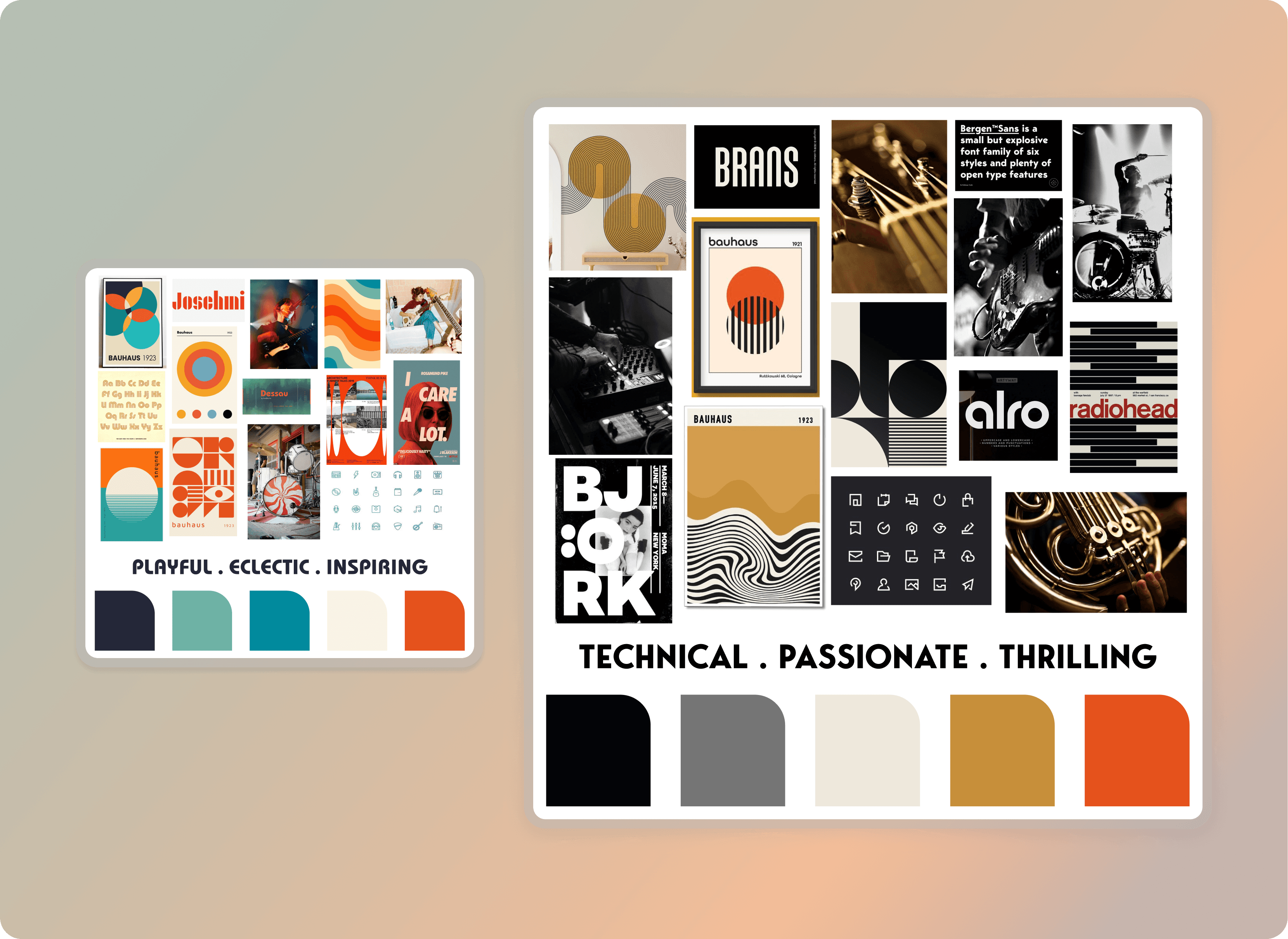
Strategic rationale for this direction
This identity elevated Musicorp from a forgettable utility into a brand that inspires confidence.
Design decision 06
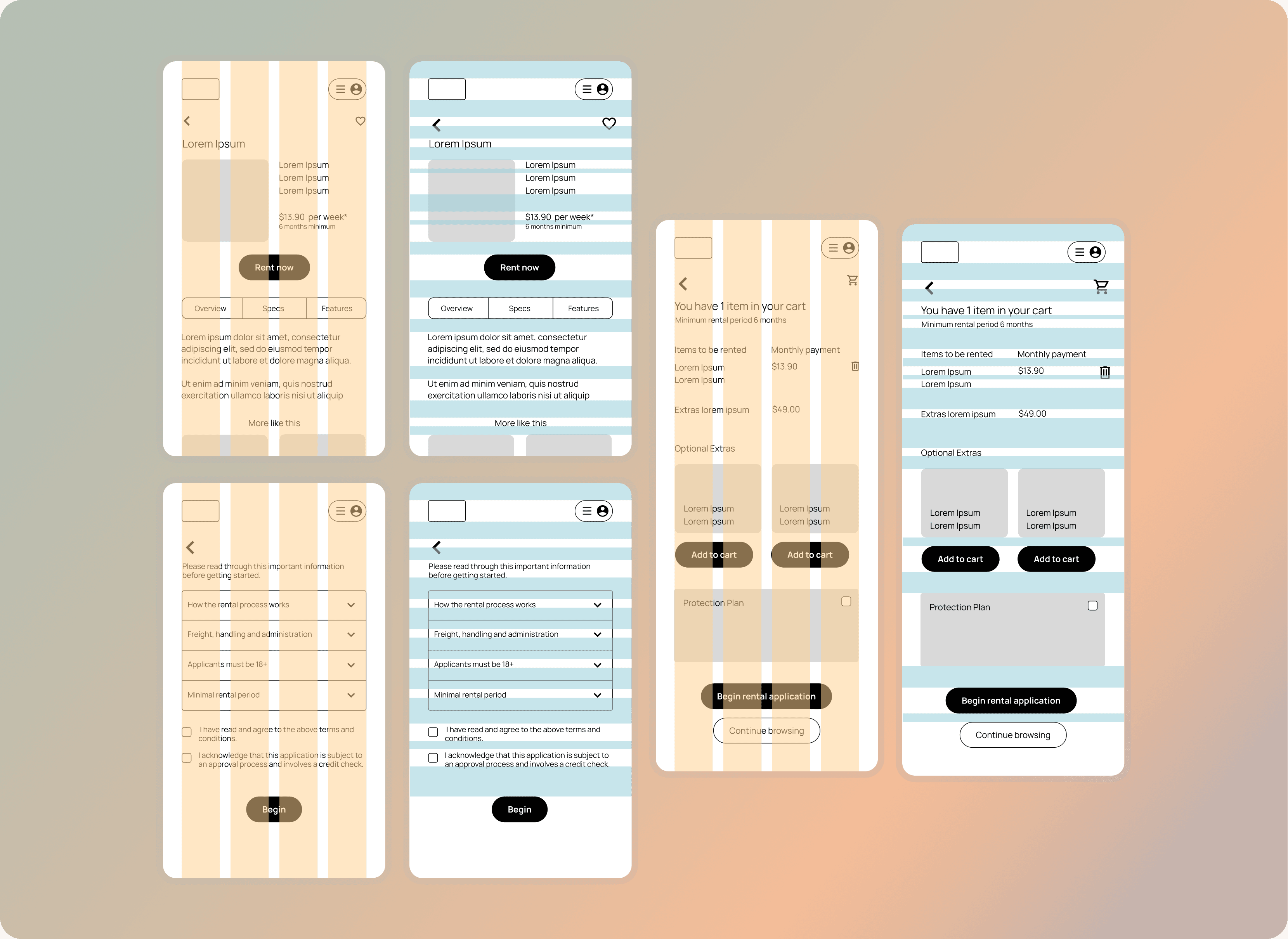
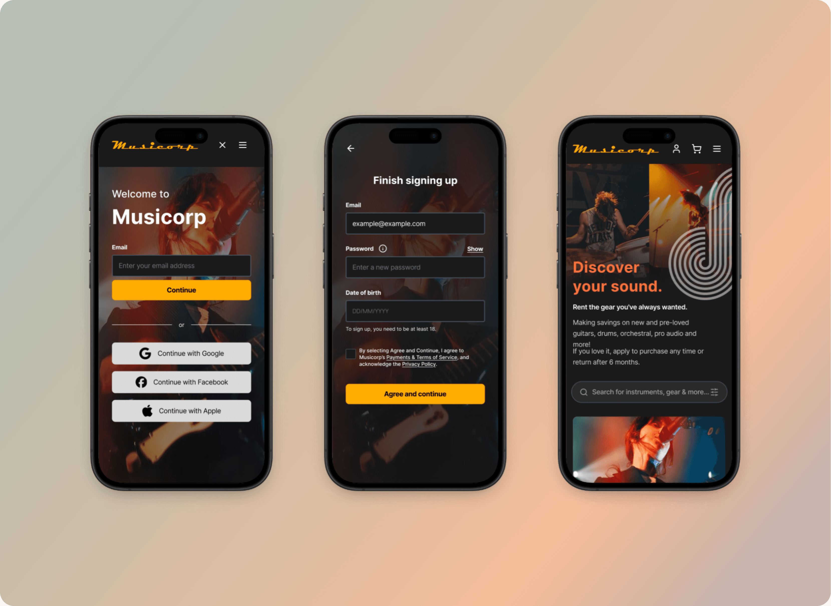
High fidelity designs with purpose
I translated wireframes into responsive, high-fidelity mockups with intentional design choices at every level:
Bold typography & colour palette created immediate brand recognition and improved visual hierarchy.
Custom iconography & UI components built a cohesive design system that could scale as the product grows.
Microinteractions and animations guided users through search, filtering, and checkout flows, reducing cognitive load and adding moments of delight.
Consistent UI patterns (cards, progress indicators, filters, text fields) followed universal conventions to minimise learning curve.
I built an interactive prototype to bring the redesigned experience to life, allowing stakeholders to explore flows firsthand.
Impact
How I'd measure success in production
Since this was a design concept rather than a live build, there are no production metrics to report. However, if Musicorp were live, I'd track search success rates, rental application completion rates, time spent on product pages, favourite/bookmark usage, and returning user rates to validate that the redesign improved both usability and trust.
What the design concept achieved:
Clearer information architecture reduced clicks to complete core tasks
Mobile-first responsive layouts ensured consistent experience across devices
Distinctive brand identity improved memorability and visual credibility
Streamlined rental application flow with progress indicators reduced user uncertainty
Design system documentation prepared for developer handoff and future scalability
Restrospective
What this project taught me
Brand identity isn't decoration—it's strategic. A cohesive visual identity transforms a functional product into something users trust and remember. For Musicorp, the Bauhaus-inspired direction elevated credibility without alienating beginner musicians.
Mobile-first prevents compromise. Designing for constraints first ensures core functionality works everywhere, rather than forcing desktop patterns onto smaller screens.
User stories reveal priorities. Mapping needs before jumping to solutions helped me focus on consolidation and clarity rather than adding unnecessary features.
Design without testing has limits. This project's biggest constraint was the lack of user research and usability testing. In a real-world scenario, I'd validate assumptions early and iterate based on feedback—something I'd prioritise in future work.