Health & Wellness App
2023
Simplifying complex fertility journeys with evidence-based, gender-inclusive design.
Project Snapshot
The LGBTQI+ community faces systemic barriers in fertility care—from discrimination and fragmented information to isolation and inadequate mental health support. I designed Kin, a mobile app concept that consolidates medically verified resources, tracks complex treatment journeys, and connects users with inclusive specialists and community support. Through research-driven design and iterative testing, I created a solution that addresses real pain points for an underserved community. This project demonstrates how thoughtful UX can turn systemic healthcare gaps into opportunities for meaningful impact.
Problem Area
When healthcare fails queer families
LGBTQI+ people navigating fertility care face systemic barriers that heteronormative healthcare doesn't address. Prospective parents encounter discrimination, struggle to find inclusive specialists, receive fragmented medical information across multiple providers, and have limited mental health support tailored to their experiences—particularly for trans and gender-diverse individuals.
Research Findings
Listening first: three pain points that shaped every decision
Rather than designing to assumptions, I conducted competitive analysis and three in-depth user interviews to understand real pain points. While existing fertility apps offered strong tracking features, none centred LGBTQI+ experiences.

Strategic Product Decisions
What to build and why
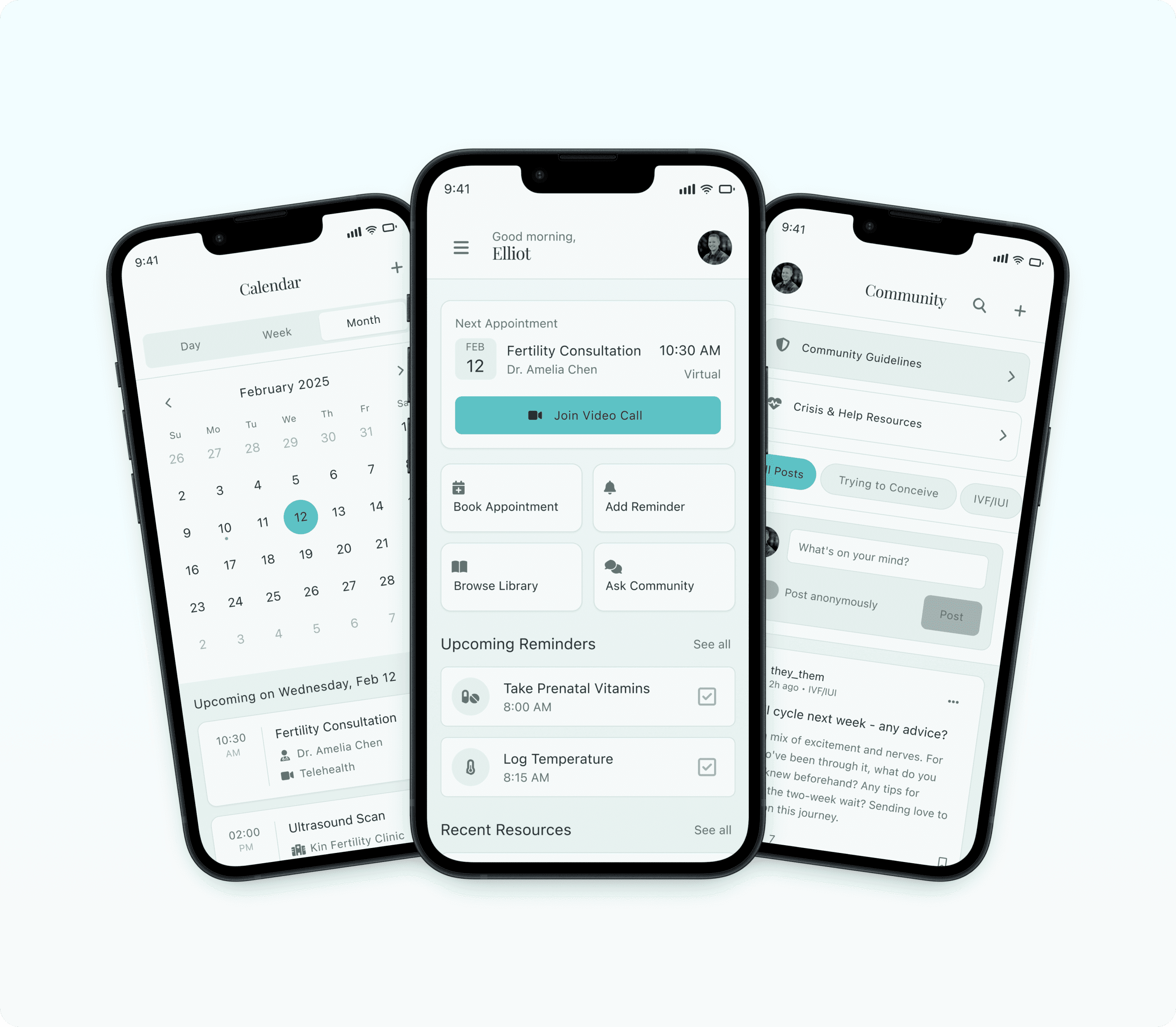
Prioritising the Dashboard as command centre
Rather than burying key actions in navigation, I designed the dashboard to surface the most critical information and actions immediately upon app open.
Design rationale
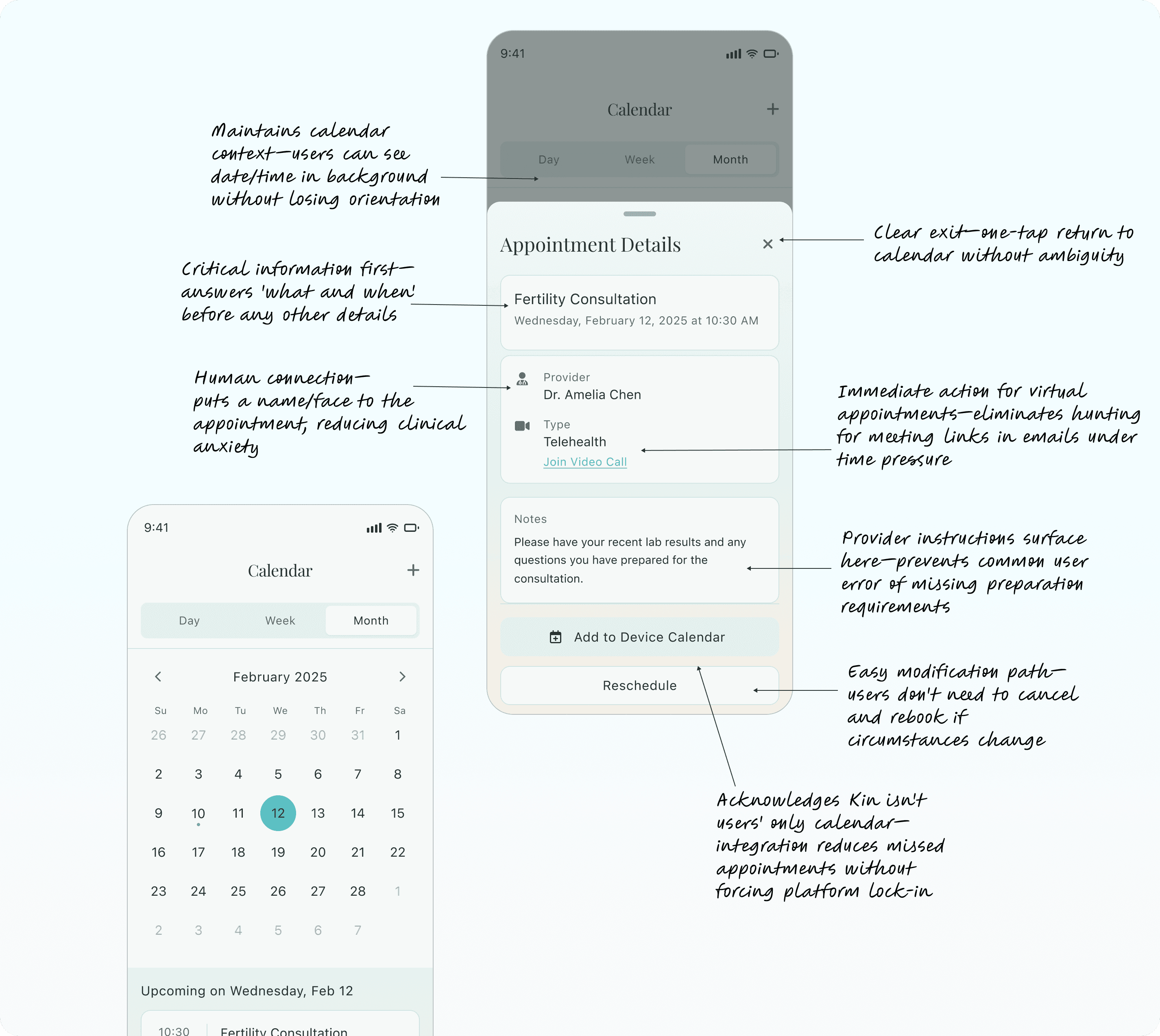
Next appointment front and centre
Users managing complex fertility treatments often have multiple specialists and tight timeframes. Surfacing the next appointment with a direct "Join Video Call" CTA reduces anxiety and missed appointments.
Quick action shortcuts
Four primary actions (Book Appointment, Add Reminder, Browse Library, Ask Community) allow users to complete core tasks in 2 taps rather than navigating through menus.
Contextual reminders
Daily tasks (medications, temperature logging) appear on the dashboard so users don't need to remember to check a separate section.
Community highlights
Surfacing recent community discussions reduces isolation by showing active peer support without requiring users to seek it out.
This approach reduces cognitive load for users managing medical information, appointments, and emotional stress simultaneously.

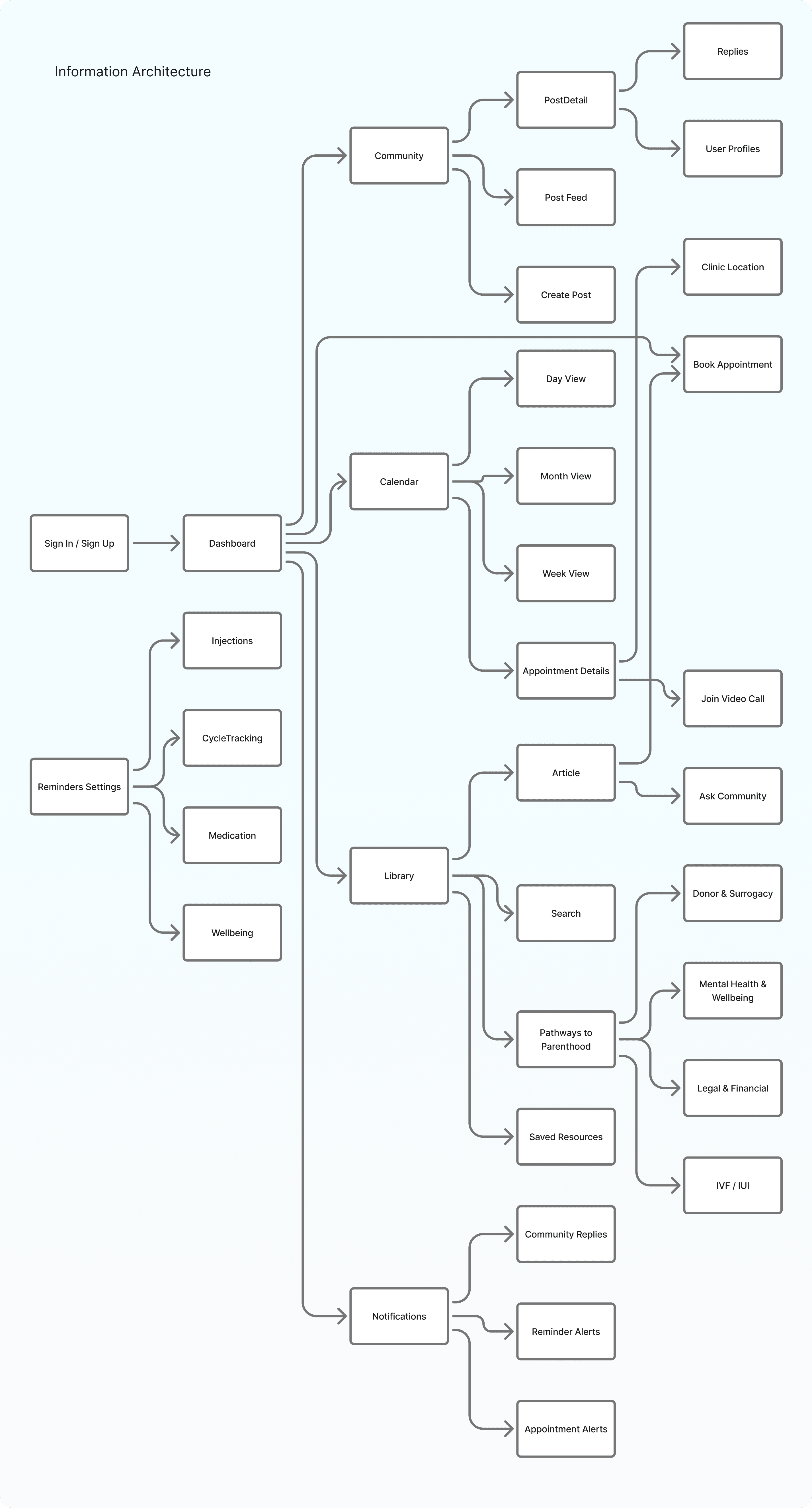
Information Architecture
Consolidation over feature creep
Through card sorting with OptimalSort, I validated that users mentally separated "tracking tools" from "educational resources" from "community support." This insight shaped the core navigation structure.
Design decisions
Five-tab bottom navigation
Dashboard, Notifications, Calendar, Library, Community—each representing a distinct mental model and use case.
Calendar as central tracking hub
Rather than scattering tracking across multiple features, the calendar consolidates appointments, symptoms, medications, and treatment cycles in one place. Users can view by day/week/month and drill into appointment details without losing context.
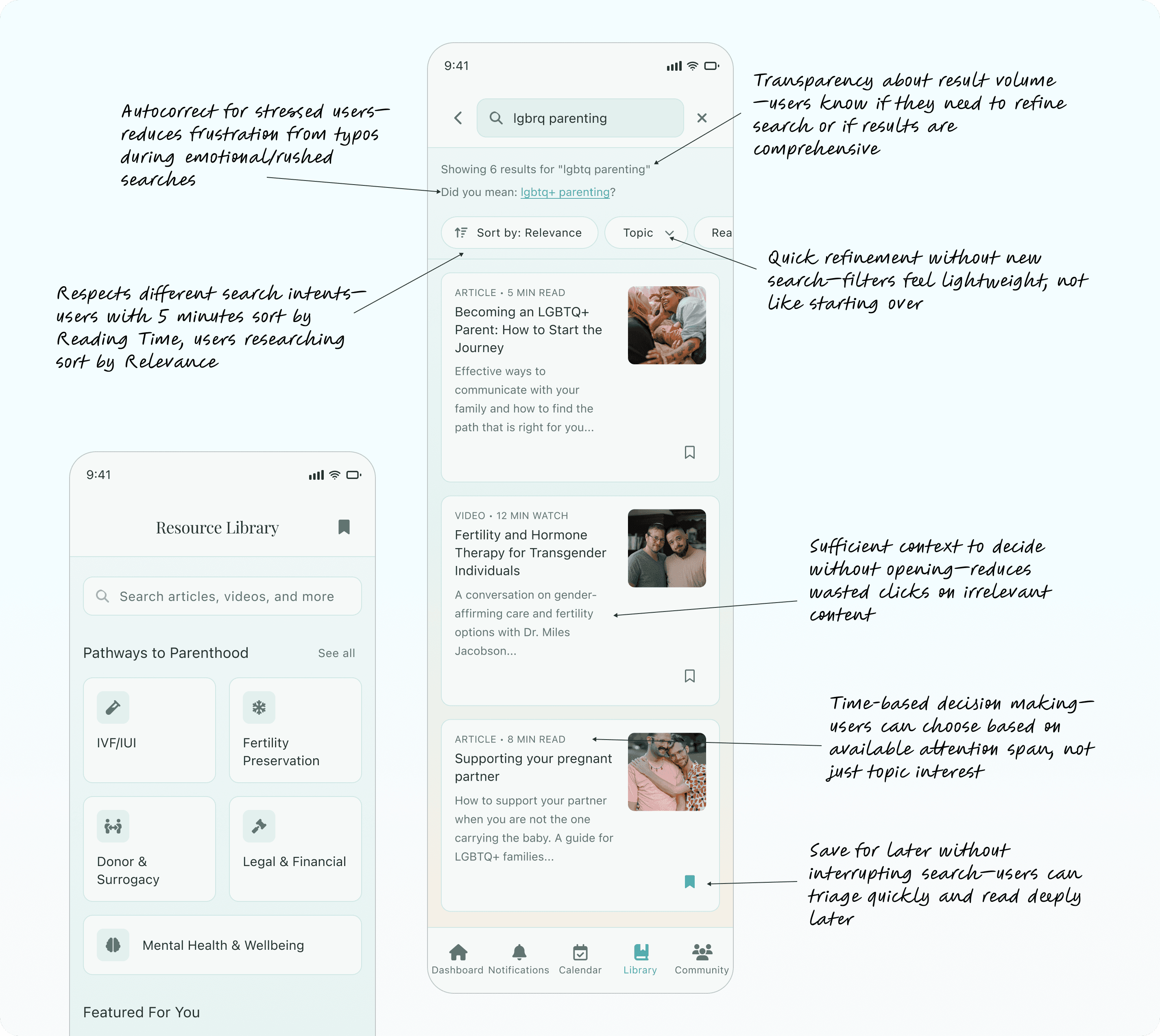
Library organised by pathways, not categories
Instead of generic categories like "Articles" or "Videos," I organised content by fertility pathways (IVF/IUI, Fertility Preservation, Donor & Surrogacy, Legal & Financial, Mental Health). This matches how users think about their journey—by the path they're on, not by content type.
Community with built-in safety
Anonymous posting option reduces fear of judgment whilst topic filters (Trying to Conceive, IVF/IUI, Mental Health) help users find relevant discussions quickly.
This structure ensures users can complete any core task in 3 taps or fewer whilst maintaining clear mental models for where information lives.
Designing For Trust
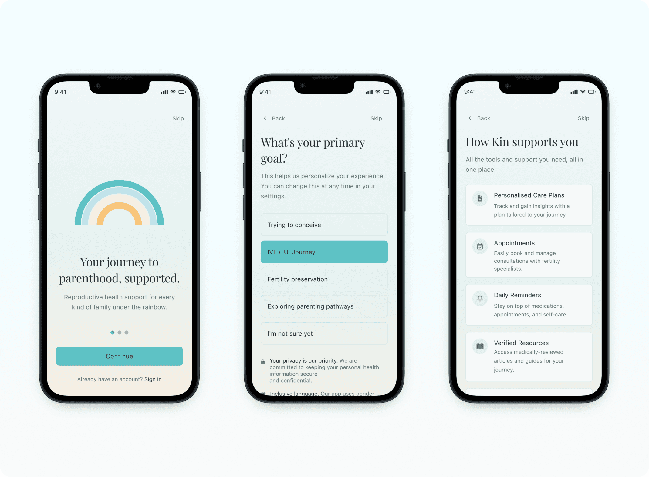
Onboarding sets expectations early
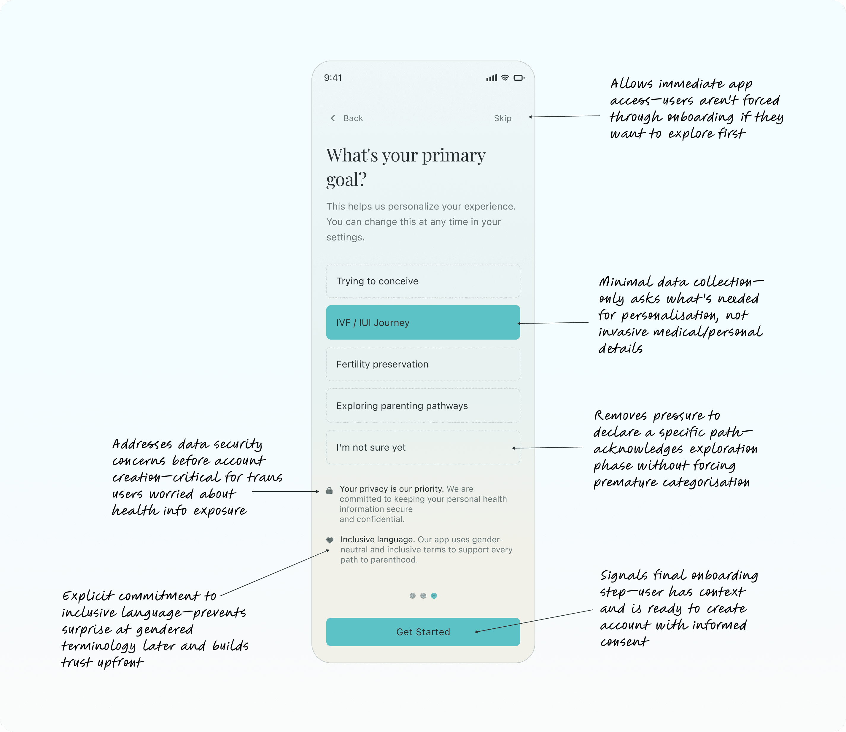
LGBTQI+ users approach healthcare apps with warranted caution—they've experienced discrimination, data breaches, and platforms that don't understand their needs. Onboarding needed to build trust immediately.
Design decisions
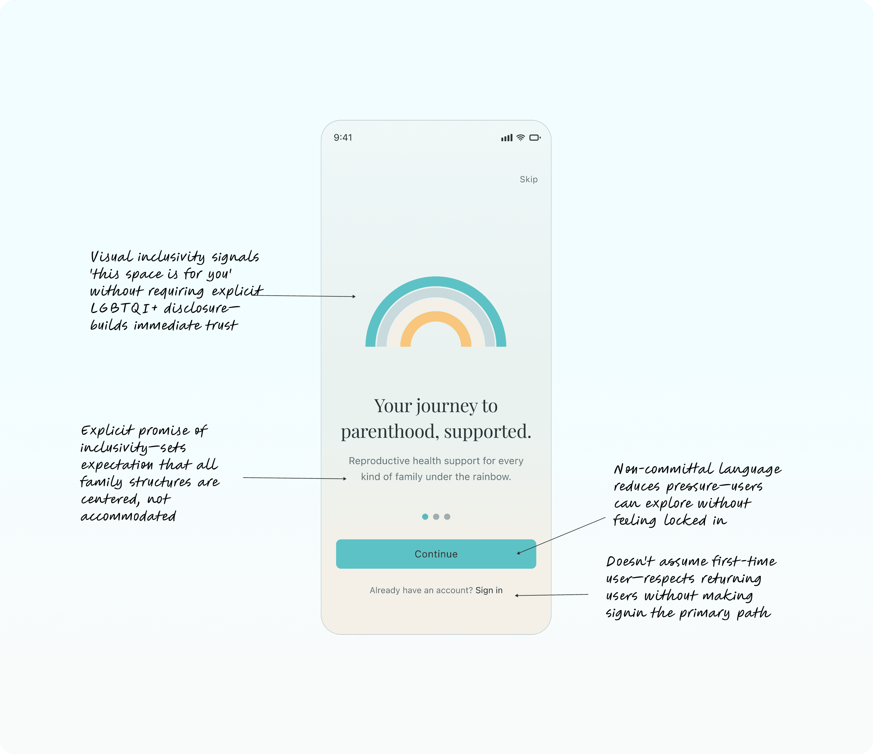
Visual inclusivity from frame one
Rainbow imagery in onboarding signals "this space is for you" without requiring explicit statement. Inclusive language callout ("Our app uses gender-neutral and inclusive terms") reinforces safety.
Privacy messaging upfront
"Your privacy is our priority" appears before any data collection, addressing fears about health information exposure—especially critical for trans users whose fertility journey may not align with their gender presentation.
Goal-based personalisation
Rather than asking invasive questions, onboarding collects one piece of information—primary goal (Trying to Conceive, IVF/IUI Journey, Fertility Preservation, Exploring Parenting Pathways)—which personalises the dashboard and library recommendations without requiring detailed disclosure.
Feature explanation, not feature overwhelm
Onboarding shows what the app does (Personalised Care Plans, Appointments, Daily Reminders, Verified Resources, Community Support) rather than requiring setup. Users can explore features at their own pace after onboarding.
This approach respects that trust is earned, not assumed. Every screen reinforces safety, privacy, and relevance to LGBTQI+ experiences.

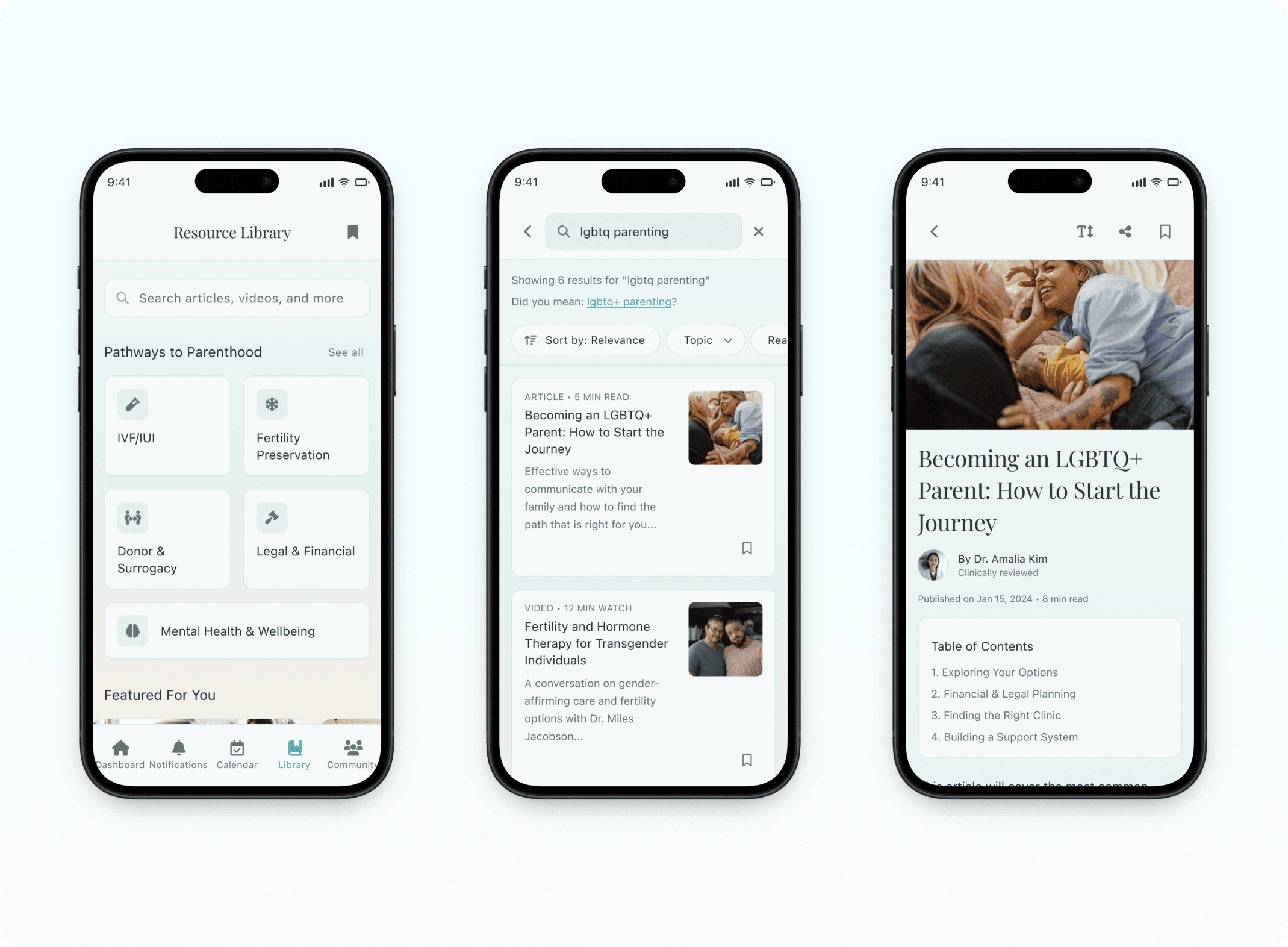
Resource Library Search
Design rationale
Search includes autocorrect ("Did you mean: lgbtq+ parenting?") because users are often searching under stress or whilst multitasking. Sort by Relevance/Topic/Reading Time and filter chips allow quick refinement without overwhelming the interface.
Results show content type (Article, Video), reading time, and visual preview—helping users make quick decisions about what to engage with based on time and energy available.
These micro-interactions compound into an experience that feels supportive rather than demanding.
Safety Measures
Designing for privacy and safety in community spaces
Community features in healthcare apps walk a fine line—connection is essential, but oversharing or harassment can cause harm. I designed with proactive safety measures.
Design decisions
Community Guidelines and Crisis Resources at the top
Before users can post, they see quick access to guidelines and help resources—setting expectations and providing safety nets.
Topic-based filtering rather than user profiles
Users browse by topic (All Posts, Trying to Conceive, IVF/IUI) not by following individuals. This reduces the risk of targeted harassment whilst maintaining topical relevance.
Moderated rather than open commenting
Posts show like and comment counts, but the emphasis is on peer support rather than viral engagement. No share function prevents sensitive discussions from being screenshot and shared outside the app.
Anonymous option with visual confirmation
The green "Anonymous" label provides immediate confirmation that identity is protected—reducing post-abandonment from users worried about accidental disclosure.
This approach prioritises psychological safety over engagement metrics—recognising that for LGBTQI+ users managing fertility, vulnerability requires protection.

Notification Strategy
Reminders that are helpful, not intrusive
Push notifications in healthcare apps risk becoming overwhelming—users managing fertility treatments receive reminders for medications, appointments, cycle tracking, and treatment milestones. Poor notification design leads to alert fatigue and disabled notifications.
Design decisions
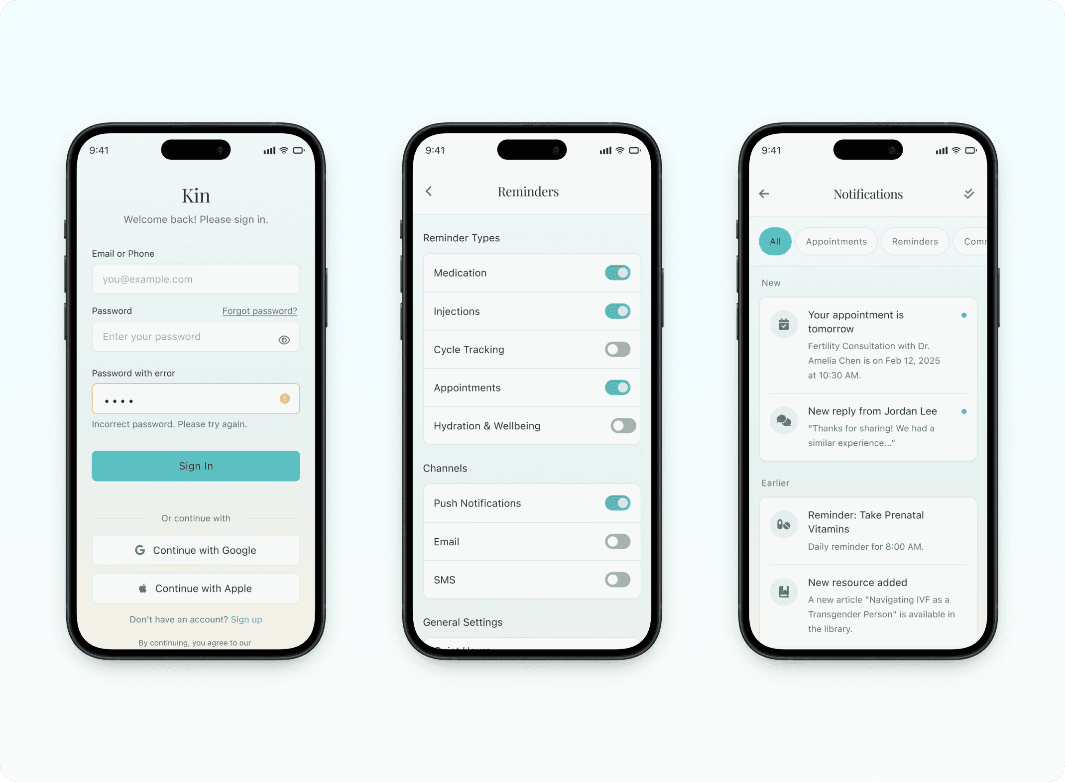
Granular notification controls
Users toggle specific reminder types (Medication, Injections, Cycle Tracking, Appointments, Hydration & Wellbeing) rather than all-or-nothing notification settings.
Channel preferences
Separate toggles for Push Notifications, Email, SMS let users choose how they want to be reached for different reminder types.
Quiet Hours with preview
10:00 PM - 8:00 AM default quiet hours prevent late-night disruptions. Preview shows what notifications look like so users can test before enabling.
Contextual notifications
Notifications tied to user goals—e.g., users on IVF journey get medication reminders, users exploring options don't. This prevents irrelevant alerts.
"Send Test Notification" button
Lets users verify notifications are working without waiting for a real reminder—reducing anxiety about missing critical doses.
This design respects that users are already managing significant cognitive and emotional load. Notifications support rather than burden.

Project Impact
How I'd measure success in production
Since Kin is a concept project, there are no live user metrics to report. However, if this were in production, I'd track resource engagement rates, appointment tracking frequency, community forum participation, and reduction in user-reported healthcare confusion—all indicators that the design is solving real problems.
What I validated through design and testing:
Key Learnings
What this project taught me
Product design is advocacy.
For underserved communities, thoughtful design isn't just about usability—it's about creating space, building trust, and addressing systemic failures through thoughtful features and interactions.
Privacy and safety aren't features—they're foundations.
Every design decision for LGBTQI+ healthcare needed to consider "could this expose someone?" and "could this cause harm?" before "is this delightful?"
Information architecture is strategic.
Organising content by user mental models (fertility pathways) rather than content types (articles, videos) made the library immediately more useful and reduced cognitive load.
Accessibility compounds across an experience.
High contrast, clear hierarchy, generous touch targets, and consistent patterns aren't individual features—they combine into an experience that works for everyone, especially under stress.
Community design requires proactive safety.
Anonymous posting, topic filtering, and visible guidelines aren't nice-to-haves—they're prerequisites for psychological safety in vulnerable spaces.
Concept projects need constraints.
Without user testing on scope, I initially tried to design for everyone. Narrowing to two core personas made the product stronger, not weaker. Real constraint is clarifying.