Health & Wellness App

2023

Simplifying complex fertility journeys with evidence-based, gender-inclusive design.

The LGBTQI+ community faces systemic barriers in fertility care—from discrimination and fragmented information to isolation and inadequate mental health support. I designed Kin, a mobile app concept that consolidates medically verified resources, tracks complex treatment journeys, and connects users with inclusive specialists and community support. Through research-driven design and iterative testing, I created a solution that addresses real pain points for an underserved community. This project demonstrates how thoughtful UX can turn systemic healthcare gaps into opportunities for meaningful impact.

Role

UX Researcher

Product Designer

Team

Solo Designer

Impact

Faster access to trusted LGBTQI+ fertility information.

Centralised tracking reduced healthcare data fragmentation.

Connected isolated prospective parents through peer support.

Role

UX Researcher

Product Designer

Team

Solo Designer

Impact

Faster access to trusted LGBTQI+ fertility information.

Centralised tracking reduced healthcare data fragmentation.

Connected isolated prospective parents through peer support.

Role

UX Researcher

Product Designer

Team

Solo Designer

Impact

Faster access to trusted LGBTQI+ fertility information.

Centralised tracking reduced healthcare data fragmentation.

Connected isolated prospective parents through peer support.

Problem area

When healthcare fails queer families

LGBTQI+ people navigating fertility care face systemic barriers that heteronormative healthcare doesn't address. Prospective parents encounter discrimination, struggle to find inclusive specialists, receive fragmented medical information across multiple providers, and have limited mental health support tailored to their experiences—particularly for trans and gender-diverse individuals.

The opportunity

Create a mobile app that consolidates resources, streamlines appointment tracking, and builds community support specifically for LGBTQI+ parents-to-be.

The opportunity

Create a mobile app that consolidates resources, streamlines appointment tracking, and builds community support specifically for LGBTQI+ parents-to-be.

Design goals

Listening first: three pain points that shaped every decision

Rather than designing to assumptions, I conducted competitive analysis and three in-depth user interviews to understand real pain points. While existing fertility apps offered strong tracking features, none centred LGBTQI+ experiences.

Faster access to trusted LGBTQI+ fertility information

Users wasted hours on conflicting, heteronormative research and couldn't identify trustworthy sources.

Faster access to trusted LGBTQI+ fertility information

Users wasted hours on conflicting, heteronormative research and couldn't identify trustworthy sources.

Design goal 01

Create a medically verified, LGBTQI+-specific resource library with clear categorisation and search functionality.

Design goal 01

Create a medically verified, LGBTQI+-specific resource library with clear categorisation and search functionality.

Design goal 01

Create a medically verified, LGBTQI+-specific resource library with clear categorisation and search functionality.

Centralised tracking reduced healthcare data fragmentation

Frequent misgendering, assumptions about family structures, and disorganised paper-based systems left users exhausted and disempowered.

Centralised tracking reduced healthcare data fragmentation

Frequent misgendering, assumptions about family structures, and disorganised paper-based systems left users exhausted and disempowered.

Design goal 02

Build a centralised symptom/appointment tracker that gives users control over their data and reduces reliance on fragmented healthcare communication.

Design goal 02

Build a centralised symptom/appointment tracker that gives users control over their data and reduces reliance on fragmented healthcare communication.

Connected isolated prospective parents through peer support

Users craved connection with people who understood their unique challenges and wanted reassurance that queer families thrive.

Connected isolated prospective parents through peer support

Users craved connection with people who understood their unique challenges and wanted reassurance that queer families thrive.

Design goal 03

Design a community forum feature to facilitate peer support and reduce feelings of isolation.

Design goal 03

Design a community forum feature to facilitate peer support and reduce feelings of isolation.

Design goal 03

Design a community forum feature to facilitate peer support and reduce feelings of isolation.

The pivot

Less is more: why I cut half the features

Initially, I aimed to design for the entire LGBTQI+ community with multiple complex features. After analysing feasibility and user needs, I realised this scope was too broad.

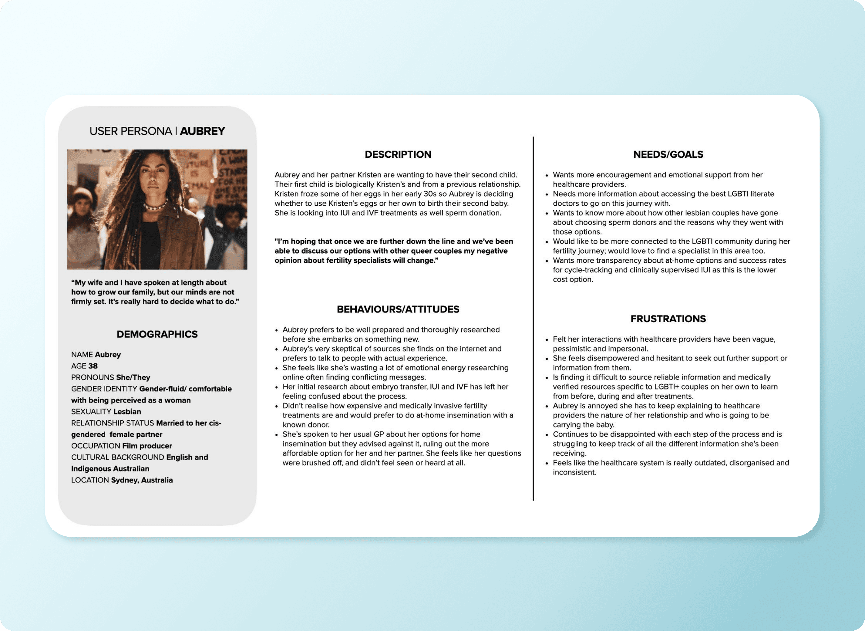
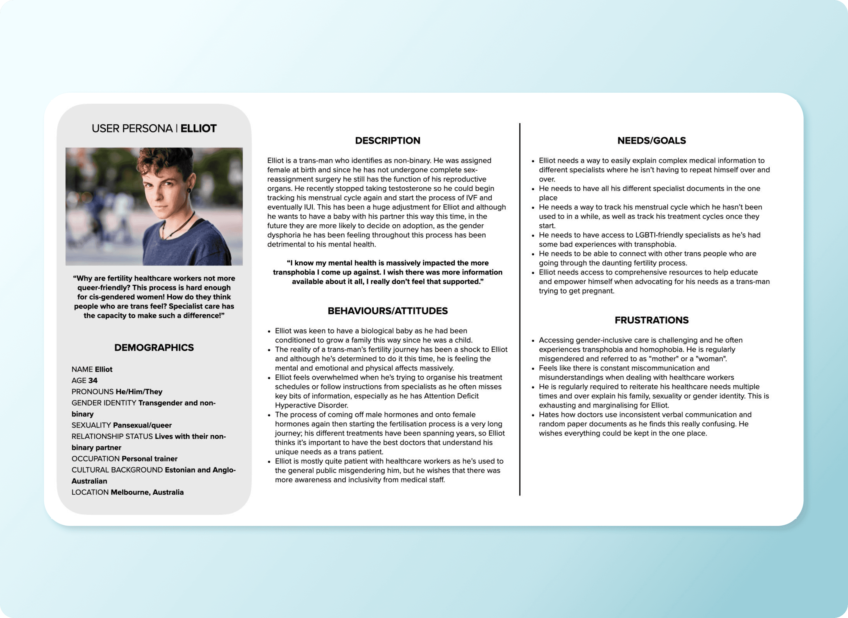
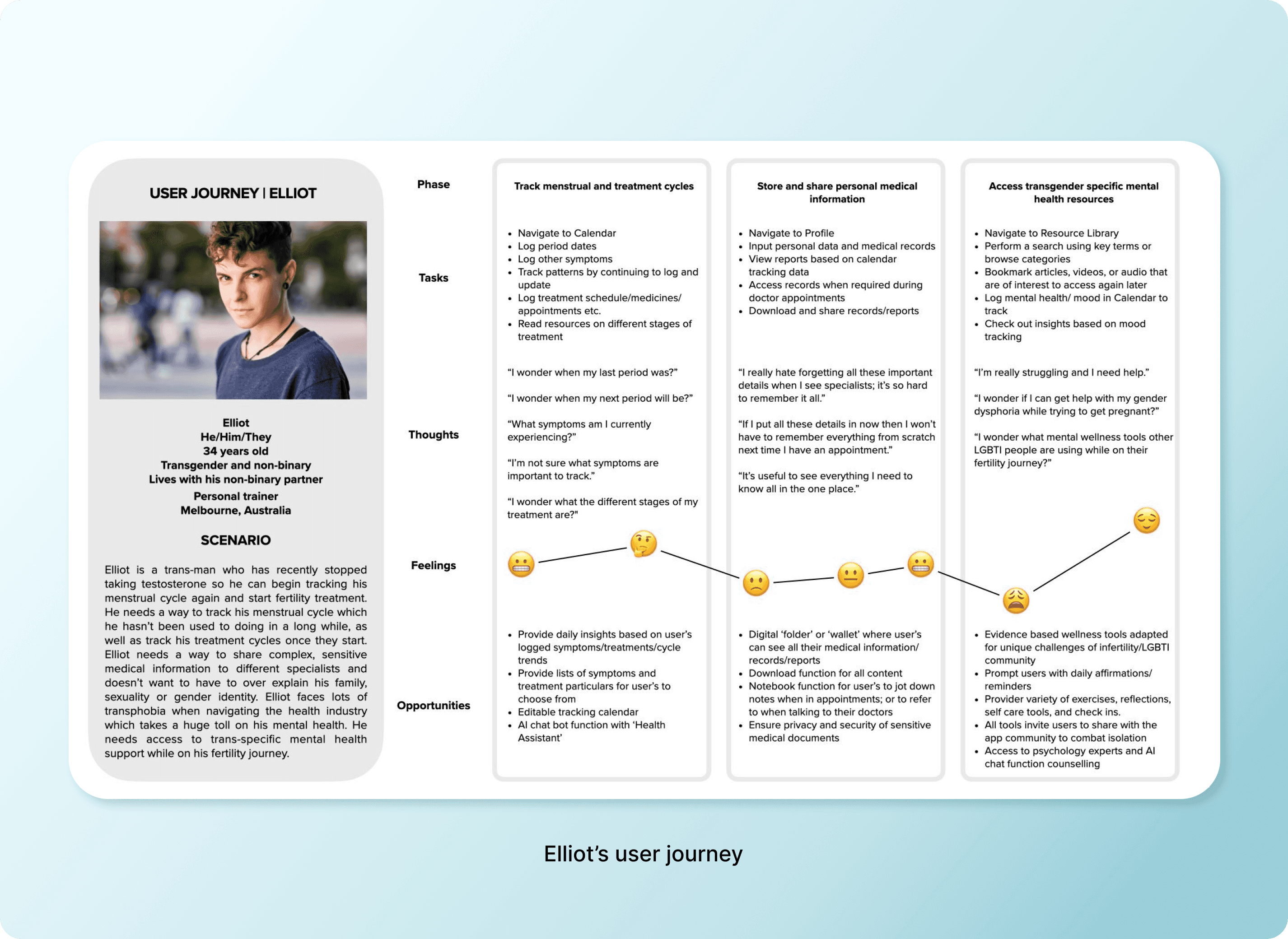
I narrowed focus to two core personas—Aubrey (a lesbian researching fertility options) and Elliot (a trans man navigating IVF while managing gender dysphoria)—and prioritised features that directly addressed their most critical needs.


This taught me that designing for everyone often means designing for no one. Constraints force clarity.

Design decision

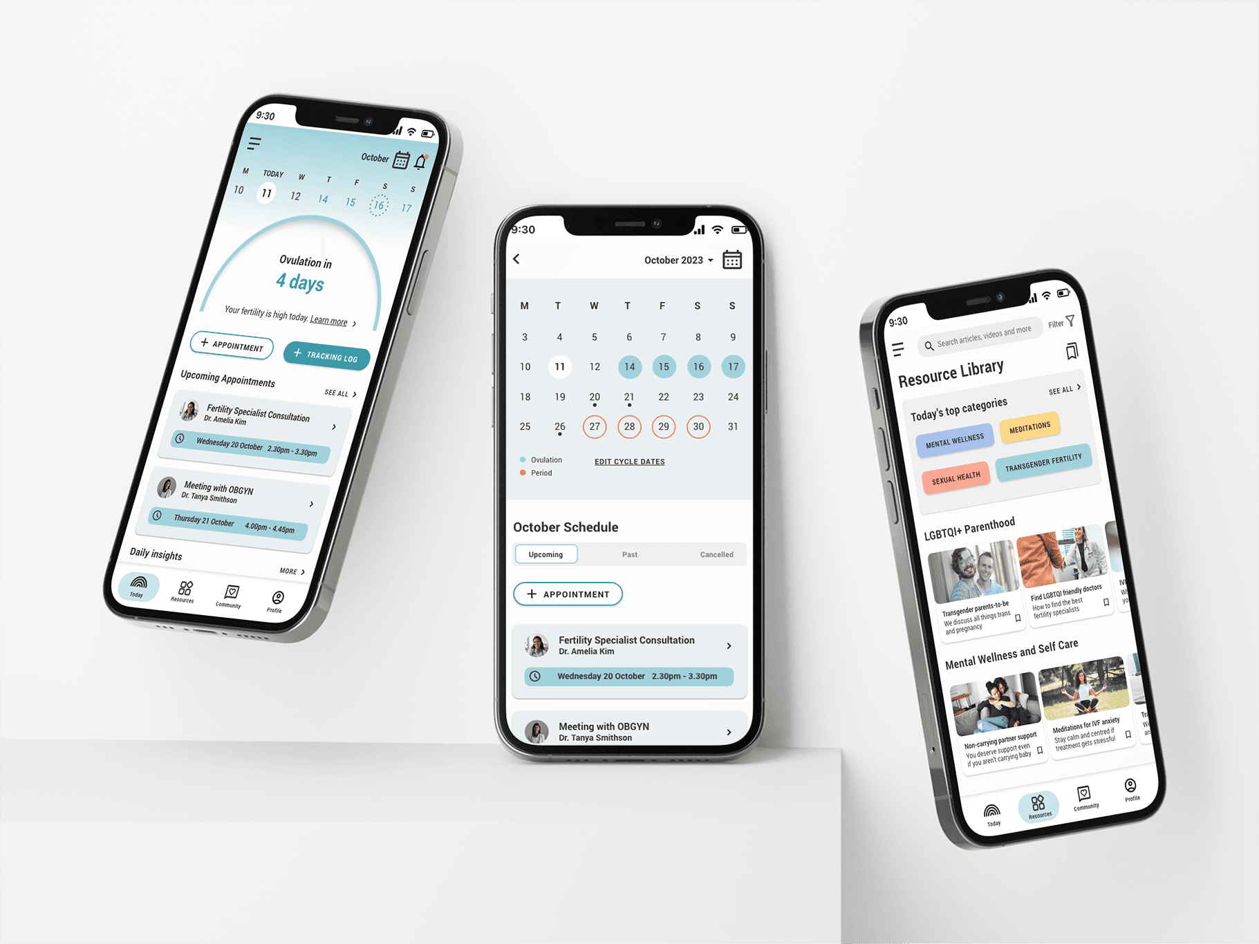
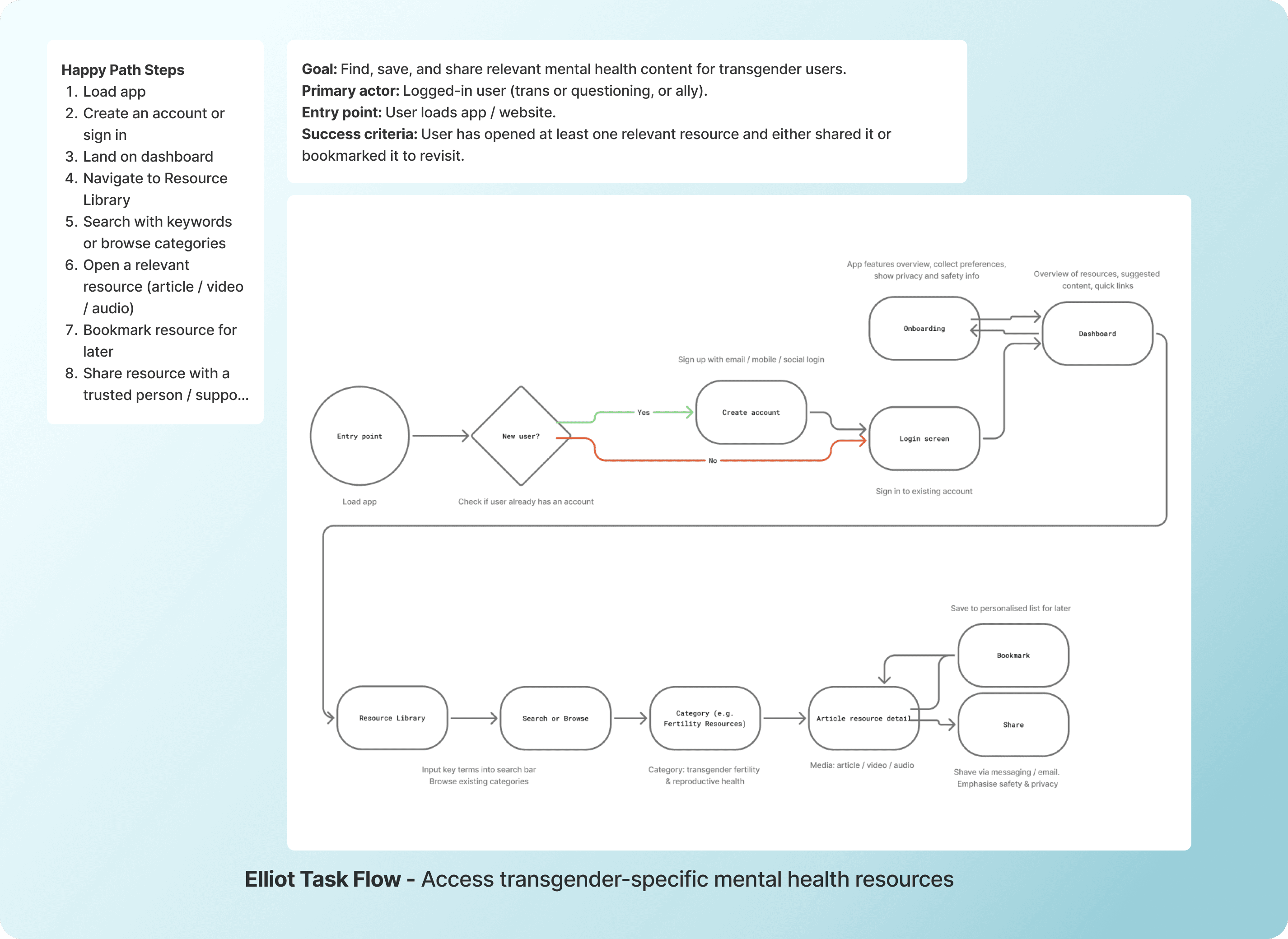
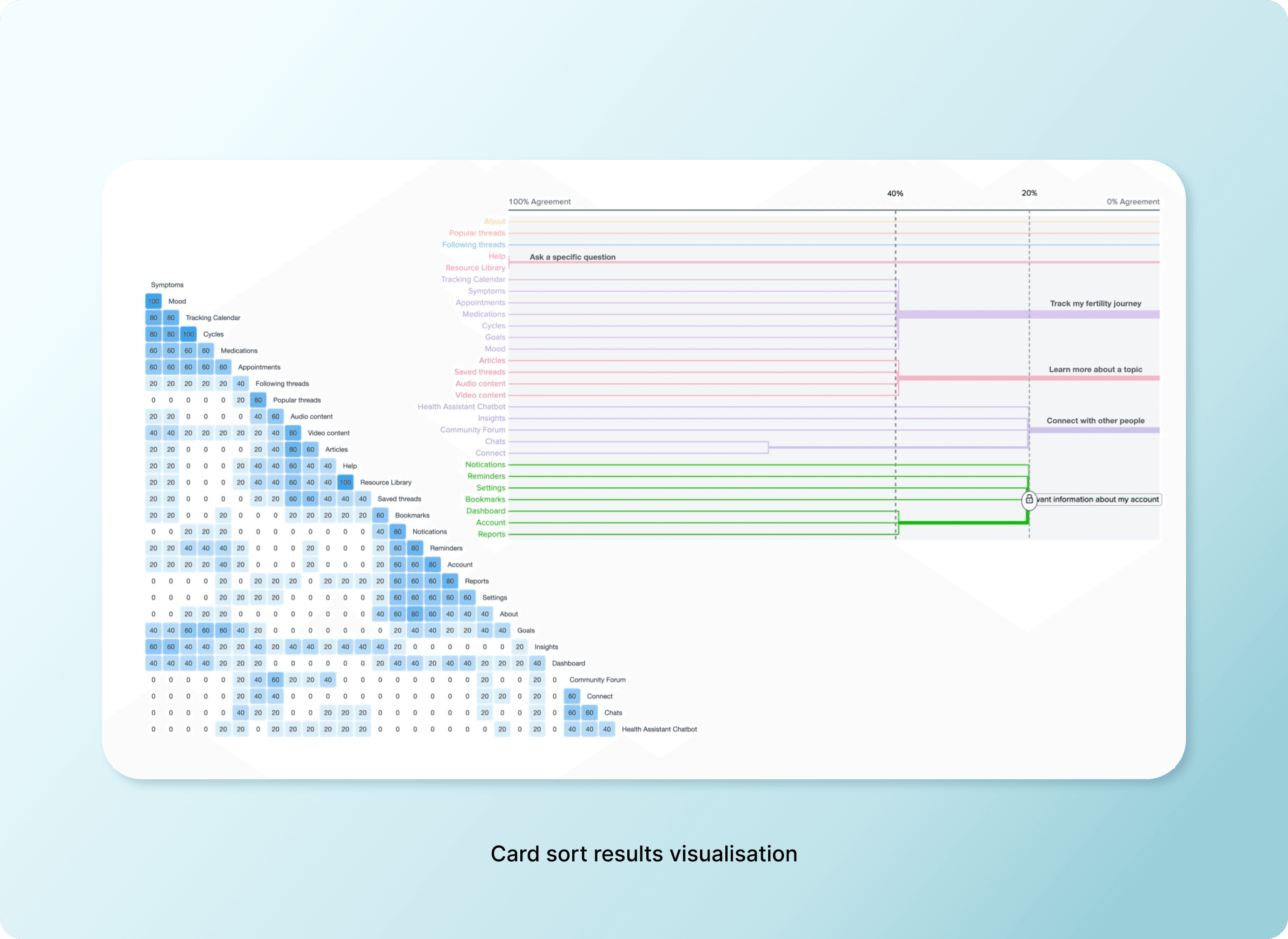
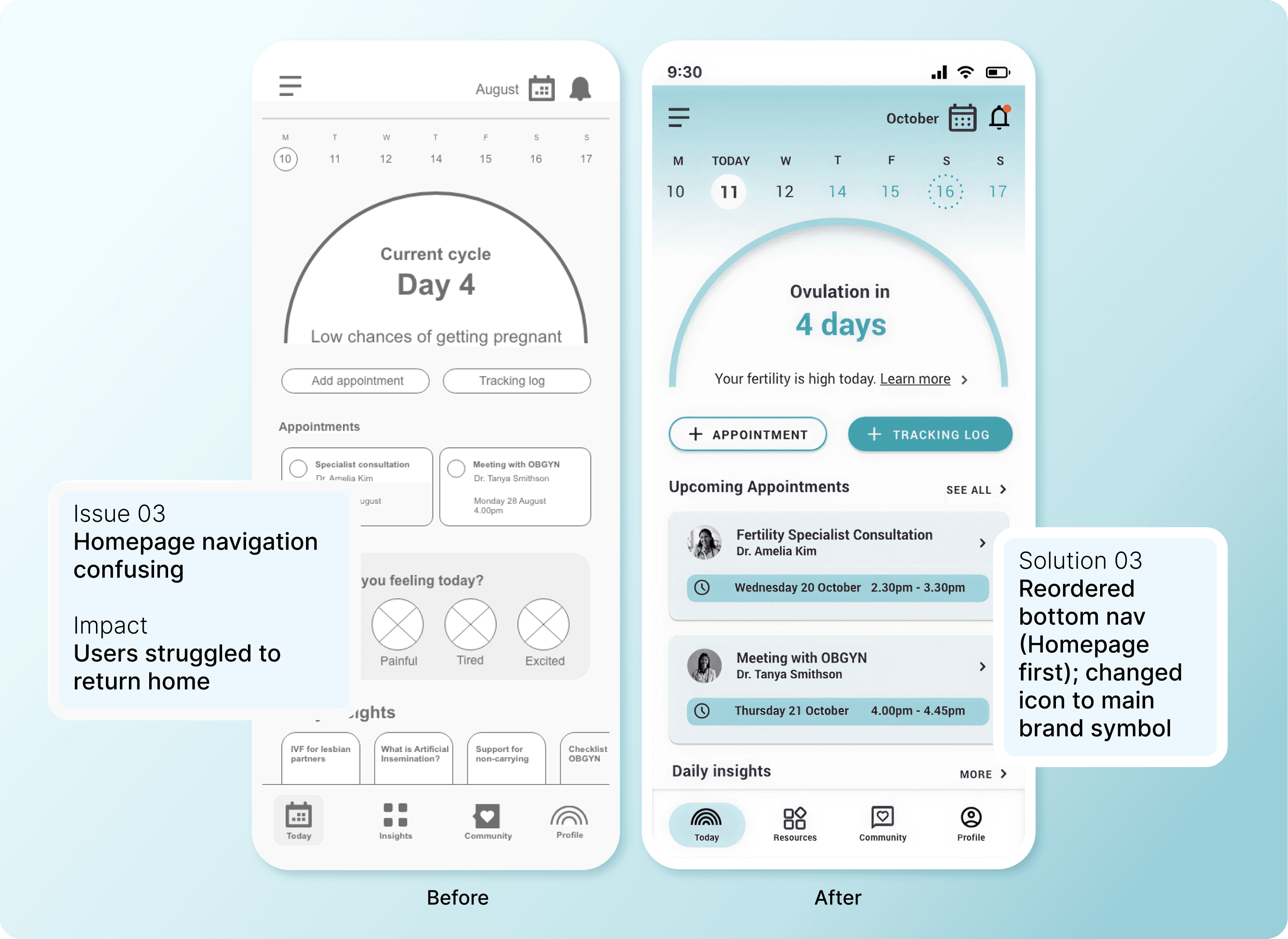
Building navigation users actually understand

I built task flows for each persona's primary goals, then validated the IA through a digital card sort with OptimalSort. This revealed:

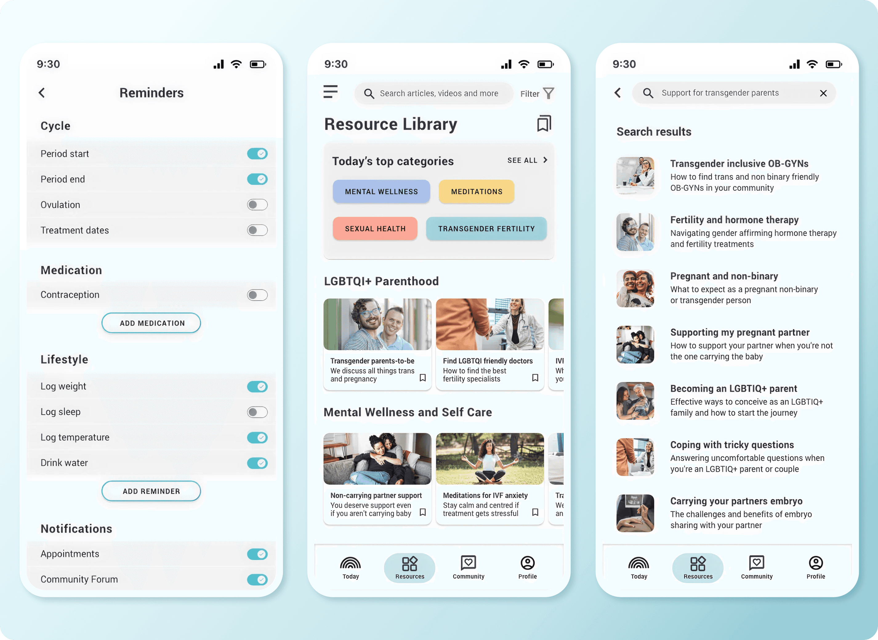
  • Users grouped "educational resources" separately from "tracking tools"

  • Terminology like "Insights" was ambiguous—"Resources" tested clearer

  • Users expected appointment management to be accessible from the homepage, not buried in navigation

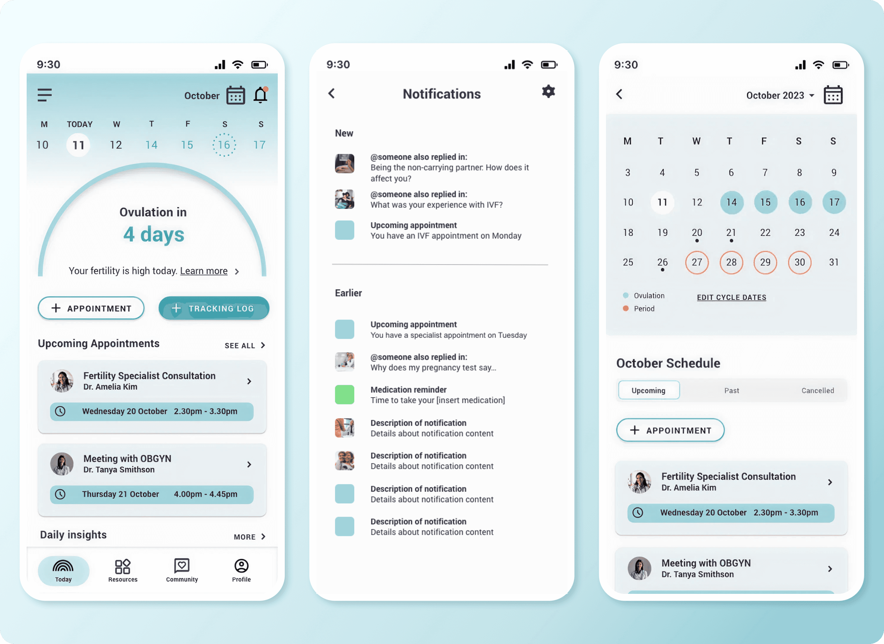
I restructured navigation to prioritise user mental models over my initial assumptions, placing frequently accessed features (Resources, Calendar, Profile) in the bottom nav and surfacing upcoming appointments prominently on the dashboard.

Usability testing

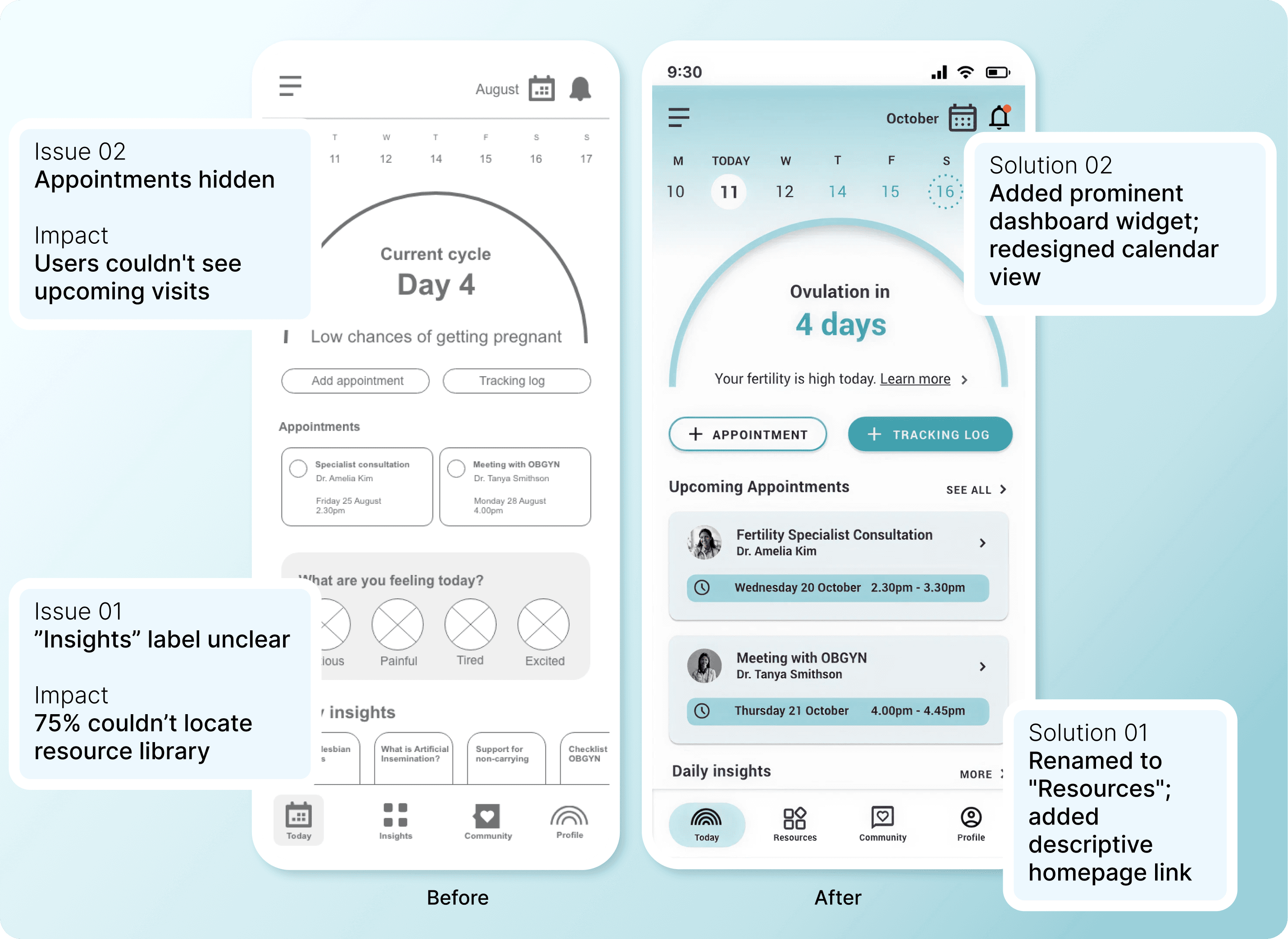
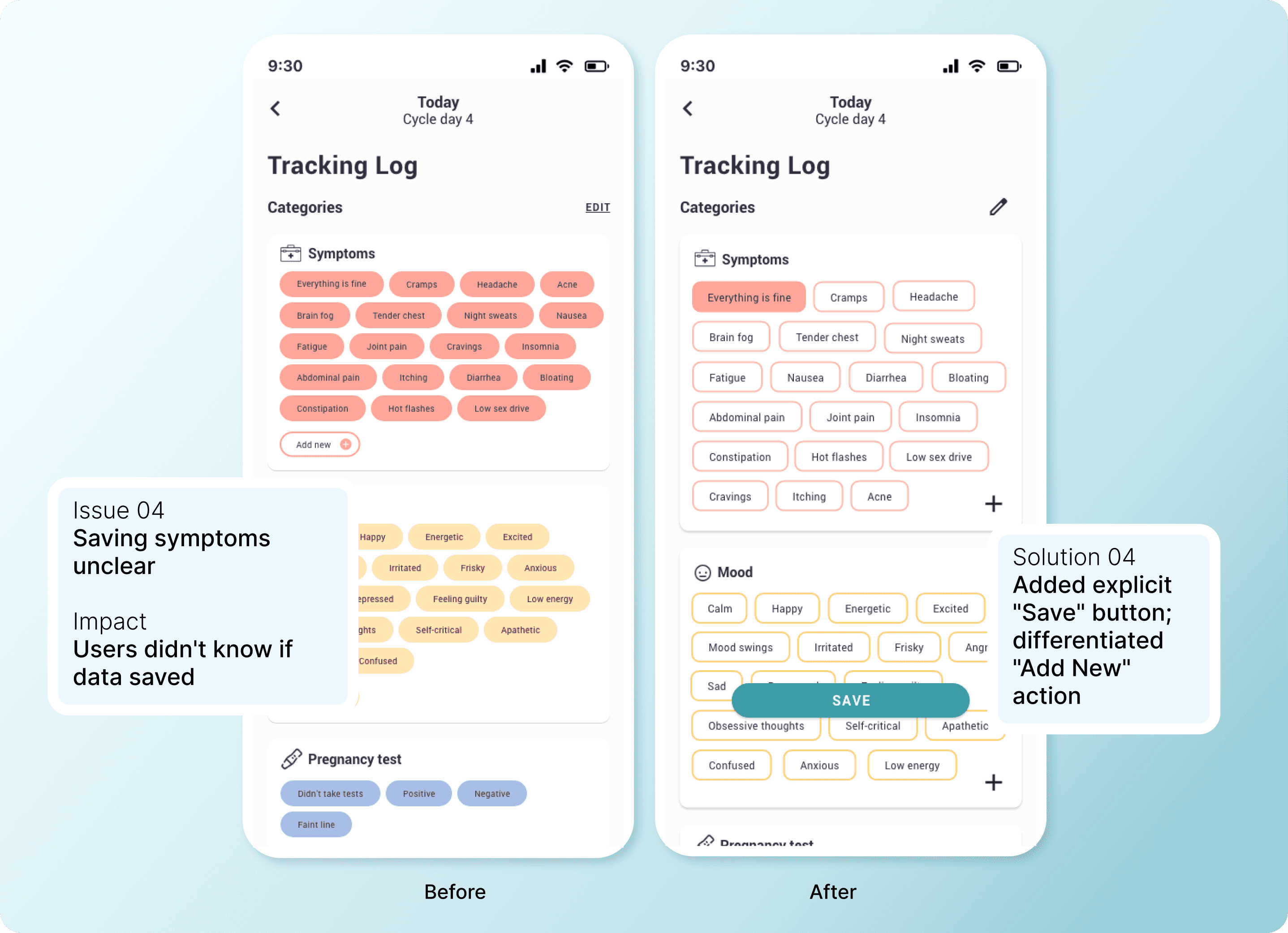
Testing revealed what I got wrong

I tested mid-fidelity prototypes with four participants matching my target users. Testing revealed five critical issues impacting task completion:

Learning 01

Unclear priorities: Competing data made it hard for business owners to see what mattered

Learning 01

Unclear priorities: Competing data made it hard for business owners to see what mattered

Learning 01

Unclear priorities: Competing data made it hard for business owners to see what mattered

Learning 02

Too much noise: charts were hard to read, slowing decisions when businesses needed speed.

Learning 02

Too much noise: charts were hard to read, slowing decisions when businesses needed speed.

The outcome

Second-round testing showed 100% task completion for core flows and positive feedback on clarity.

Design decision

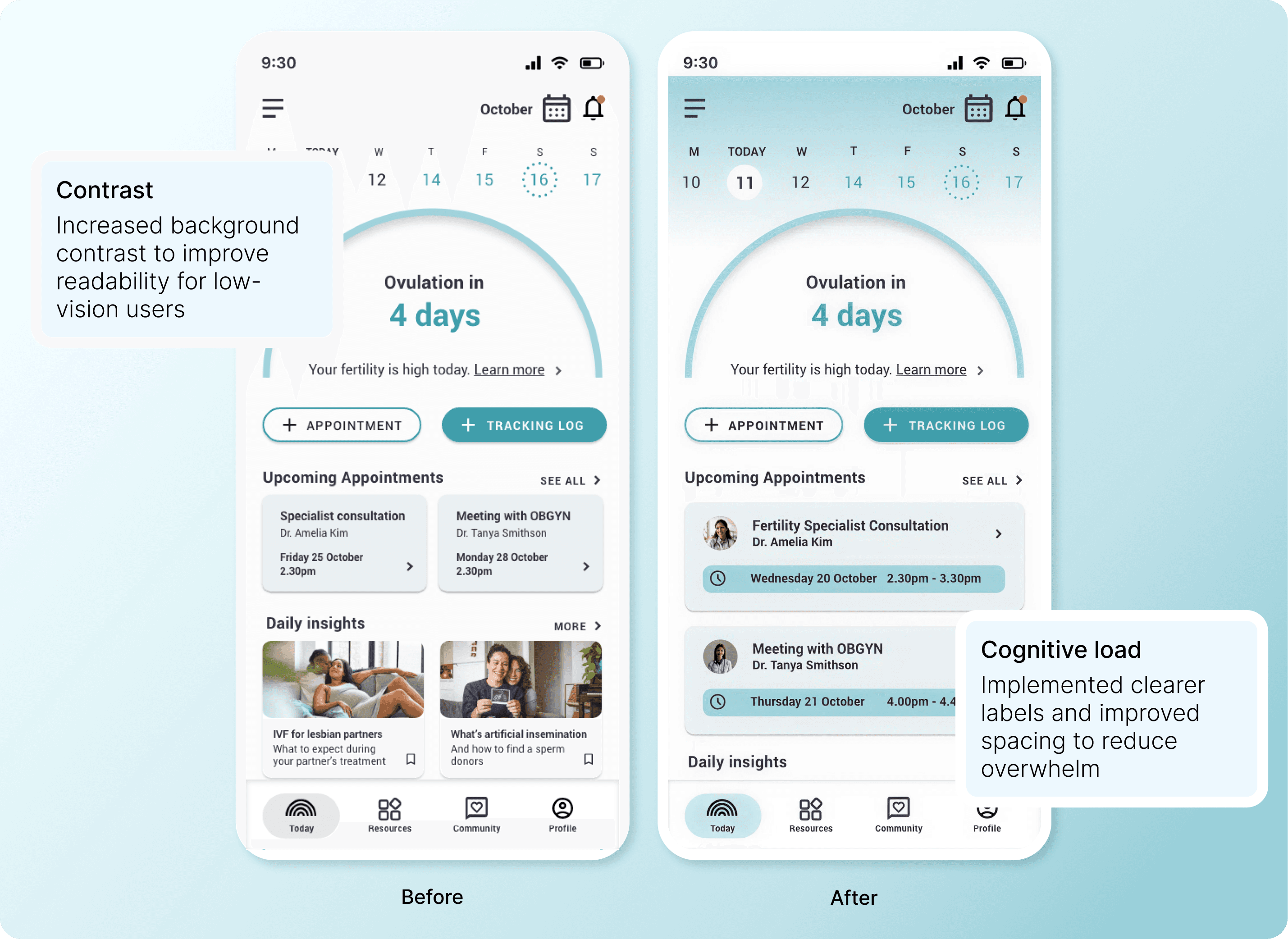
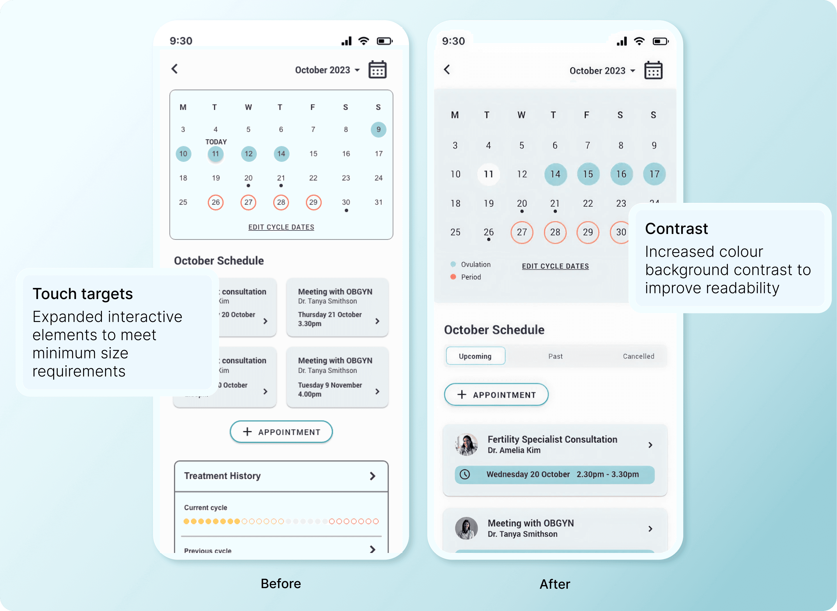
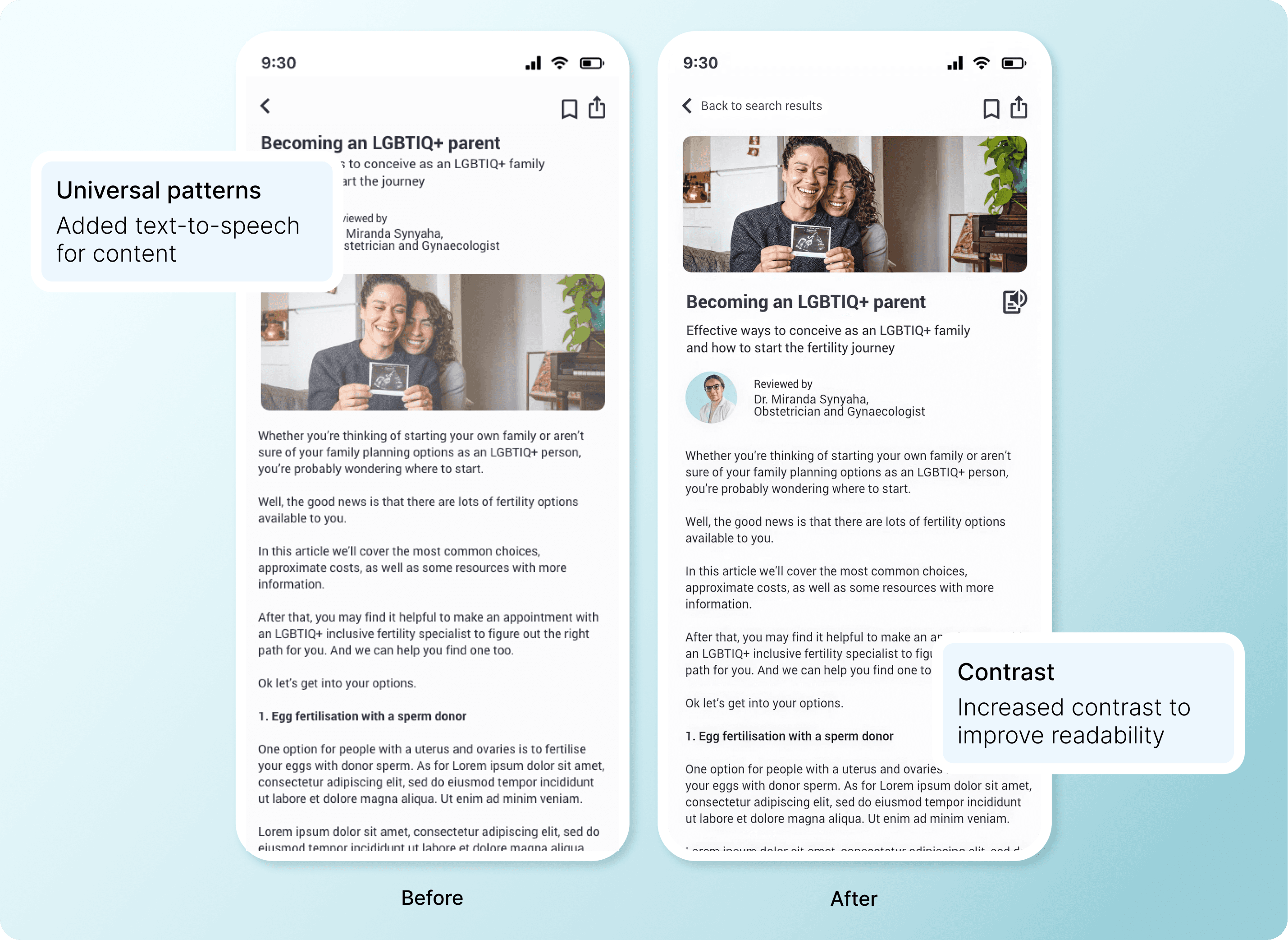
Designing for everyone means designing for disability

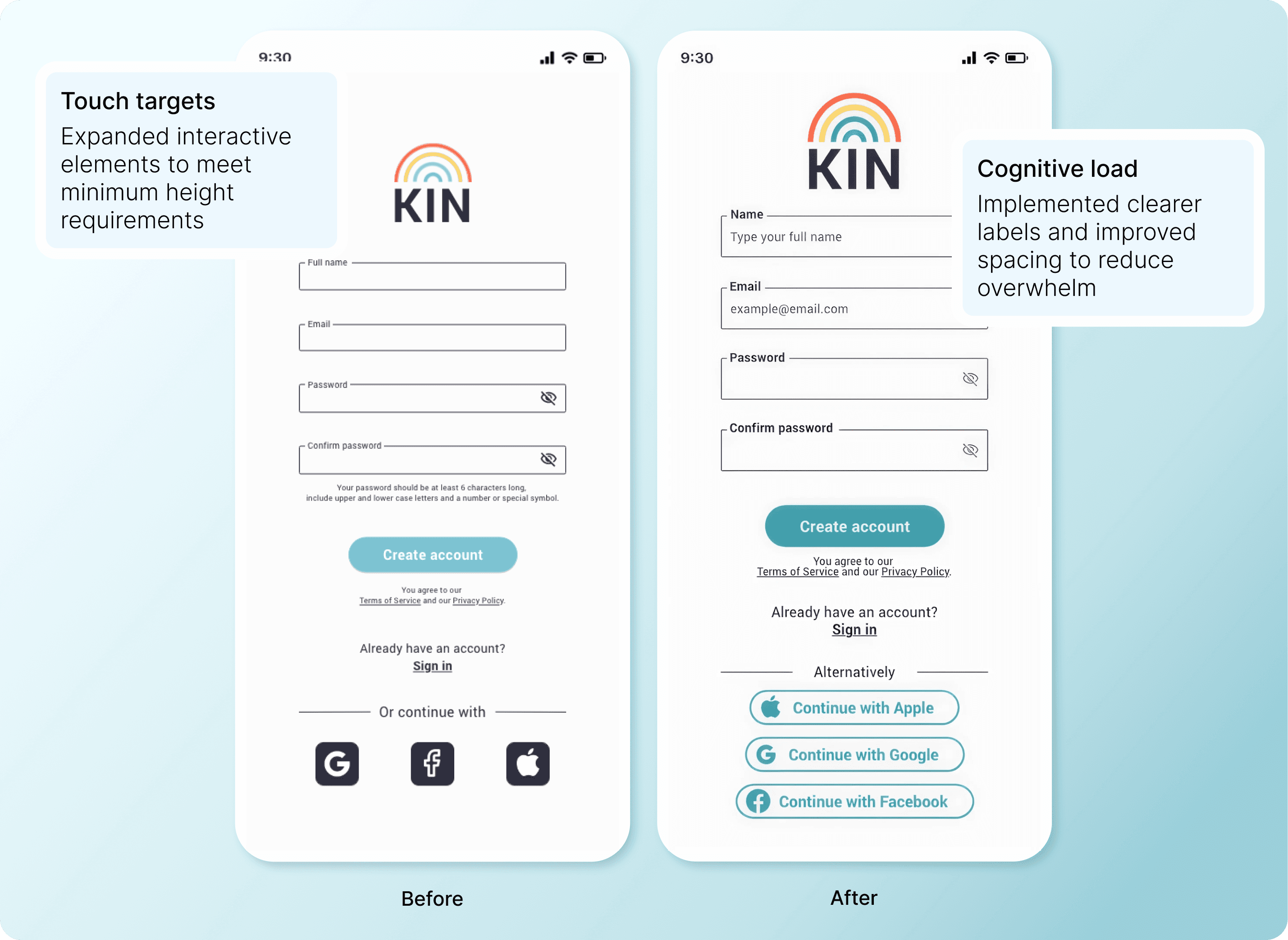
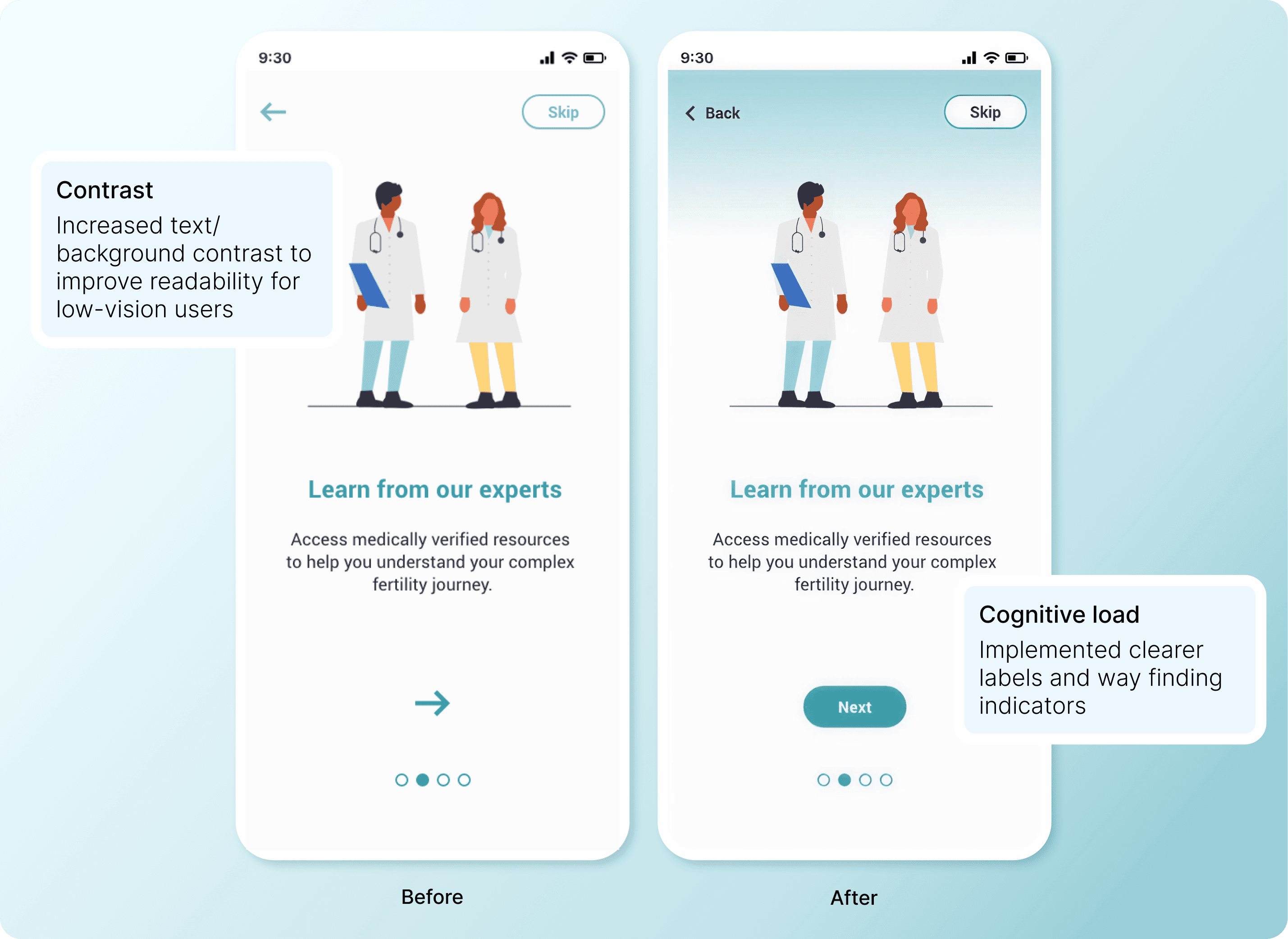
I audited designs against WCAG AA guidelines and made targeted improvements:

  • Contrast: Increased text/background contrast to improve readability for low-vision users

  • Touch targets: Expanded interactive elements to meet minimum 44x44px requirements

  • Universal patterns: Added text-to-speech for content; used symbols alongside colour for error states

  • Cognitive load: Implemented legends, clearer labels, and improved spacing to reduce overwhelm

Accessibility wasn't a checklist—it informed every design choice. Making the app usable for people with disabilities made it more usable for everyone.

Collaboration

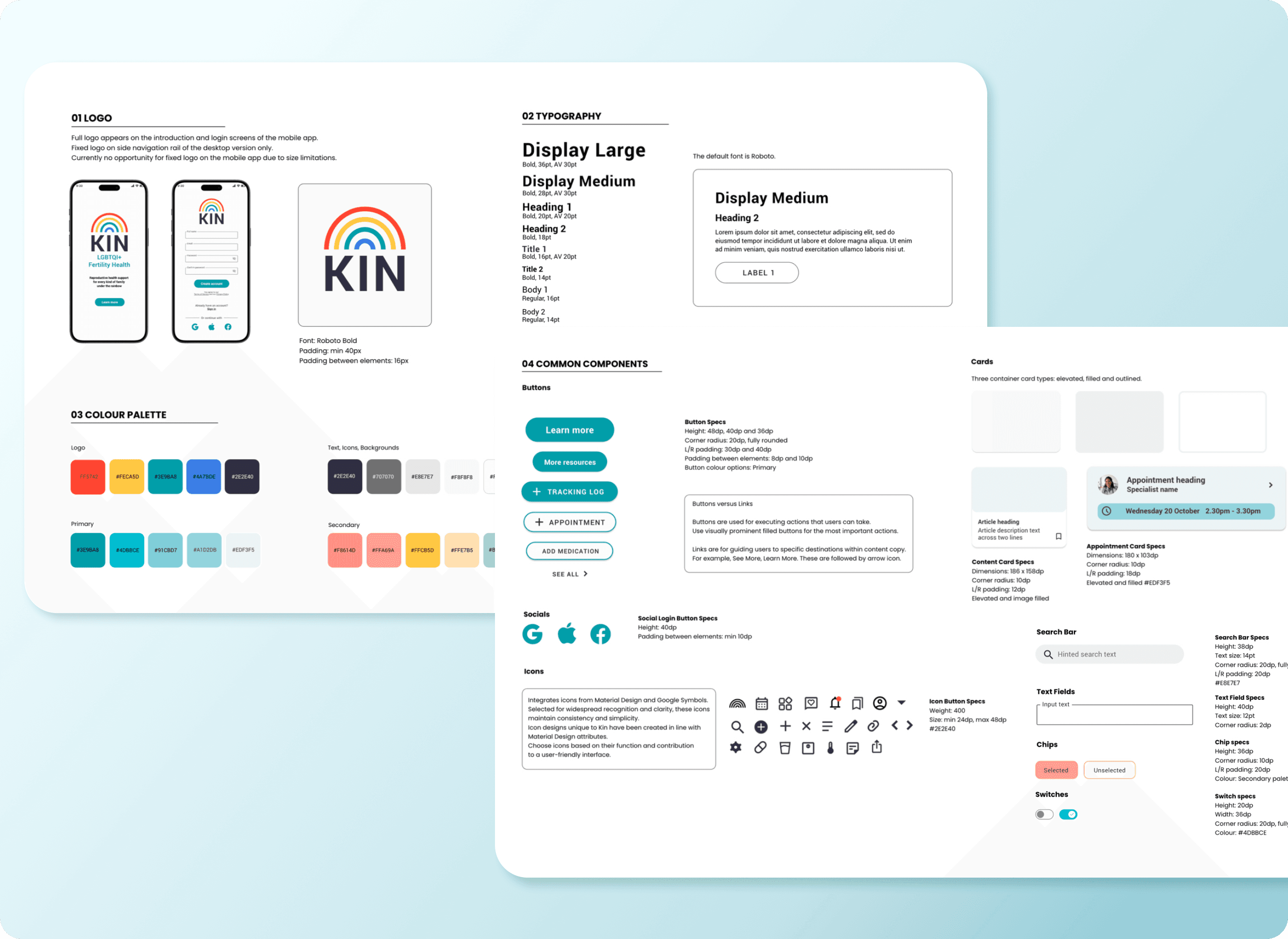
Preparing for handoff

I documented all visual elements, component behaviours, and design patterns to ensure development consistency. Files were organised intuitively, and documentation was concise—just enough detail to empower developers without overwhelming them.

Project Impact

How I'd measure success in production

Since Kin is a concept project, there are no live user metrics to report. However, if this were in production, I'd track resource engagement rates, appointment tracking frequency, community forum participation, and reduction in user-reported healthcare confusion—all indicators that the design is solving real problems.

What I validated through design and testing:

100% task completion rate

Achieved in second-round usability testing—up from 25% success rate on resource library navigation in initial tests.

100% task completion rate

Achieved in second-round usability testing—up from 25% success rate on resource library navigation in initial tests.

WCAG AA accessibility compliance

Across all core flows, making the app usable for people with visual, motor, and cognitive disabilities.

WCAG AA accessibility compliance

Across all core flows, making the app usable for people with visual, motor, and cognitive disabilities.

WCAG AA accessibility compliance

Across all core flows, making the app usable for people with visual, motor, and cognitive disabilities.

3 critical user pain points addressed

Information overwhelm, healthcare data fragmentation, and community isolation—validated through research and testing.

3 critical user pain points addressed

Information overwhelm, healthcare data fragmentation, and community isolation—validated through research and testing.

Developer-ready design system

Created to ensure consistency and efficient handoff, reducing implementation time and maintaining design integrity.

Developer-ready design system

Created to ensure consistency and efficient handoff, reducing implementation time and maintaining design integrity.

Key learnings

What this project taught me

Focus is strategic power.

Narrowing scope made the product stronger, not weaker. Trying to serve everyone dilutes impact.

Prototype fast, validate early.

Mid-fidelity testing revealed critical usability issues that would have been expensive to fix later.

Design decisions need rationale.

Every choice—from IA structure to button labels—should tie back to user needs, not designer preference.

Accessibility is foundational, not optional.

Designing for edge cases improves the experience for everyone.

Sarah Worrall

Copyright 2024 by Sarah Worrall

Sarah Worrall

Copyright 2024 by Sarah Worrall

Sarah Worrall

Copyright 2024 by Sarah Worrall