Rapid prototyping an educational vocabularly app based on user research
This case study is about how I designed the experience of memorising vocabularly by exploring how people learn and designing an app to address their educational goals.
Role
UX Researcher & UX Designer
Industry
Education
Duration
Stack
Tasks
Competitive Analysis, User Interviews, User Personas, User Stories, User Flows, Wireframing, Rapid Prototyping, Usability Testing
A quick project overview
I applied IDEO’s Design Thinking Process to create a researched and tested set of low fidelity mobile designs for an educational vocabulary application.
In this project I redesigned the experience of memorising and understanding new concepts, techniques, and terms by exploring how people learn vocabulary and designing a mobile app to address their goals and problems.
Getting to know the problem space
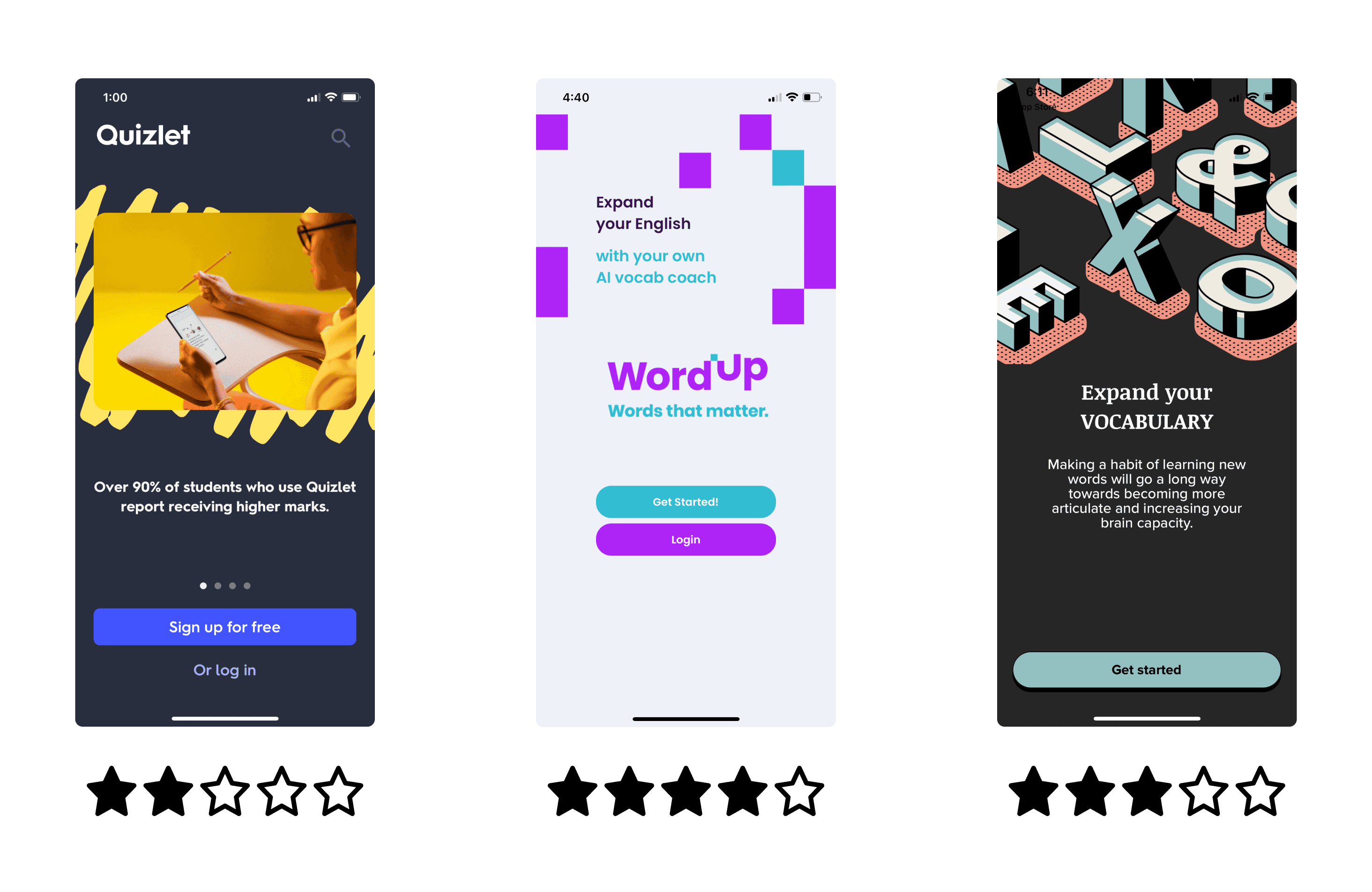
The first step in the design thinking process involves getting to know the problem space I’m operating within. To do this I conducted an in depth competitive analysis to assess the strengths and weaknesses of competitor apps to ascertain what kind of related issues existed, and what solutions to similar problems have already been proposed. I then identified areas for improvement that my application could address.
Some key takeaways from analysing competitors
Users need a straight forward user journey. Features of the app need to be obvious to first time users. Onboarding instructions are important.
Connection or comparison to other users could be motivating. Option to invite friends to study with.
Study plans need to be customisable based on education level and subjects.
Needs games, quick tests, words used in context to encourage users.
Needs a visual system to track progress and achievements.
Users need to be able to set multiple reminders.
User interface needs to be simple but engaging.
Understanding users better with in-person interviews
Next it was time to observe through user interviews, my preferred type of user research method as it’s a fast way to gather qualitative information directly from those engaged with the product or service. There was no testing involved—only conversation. I developed an effective script of questions and recorded the results, to get honest, direct feedback from current or potential users.
Equipped with knowledge about competitors and their strengths and weaknesses, I scheduled interviews with 3 respondents matching the following criteria:
Within age group specified by the project brief (25 to 45 years old).
Had previously used an app to learn new vocabulary.
The goal of the interviews was to understand the following questions
Why do users learn language or vocabulary? What is the bigger goal that they are pursuing?
Which contexts are they using their learning apps in? Home, school or on the go?
What are the most common pain points?
What helps users reach their goals?
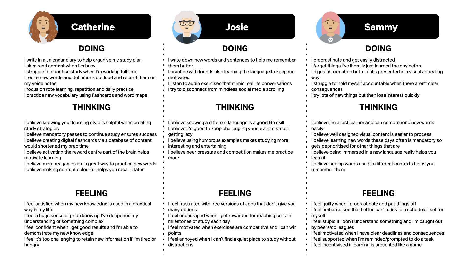
To present the findings I like to summarise interviews in the "Doing, Thinking, Feeling" format
What I learnt from interviewing potential users
Users wanted to select topics of interest, for work or advanced degree
Some users reference other study sources to learn and will benefit from personalising their flashcards
Grammar learning is difficult with an app
Users use words better if they are used in context
Variety of ways to study make it more fun and engaging
Some users want to speak the word back to the app to ensure they’re pronouncing it correctly
Creating a user persona to ensure user-centred design
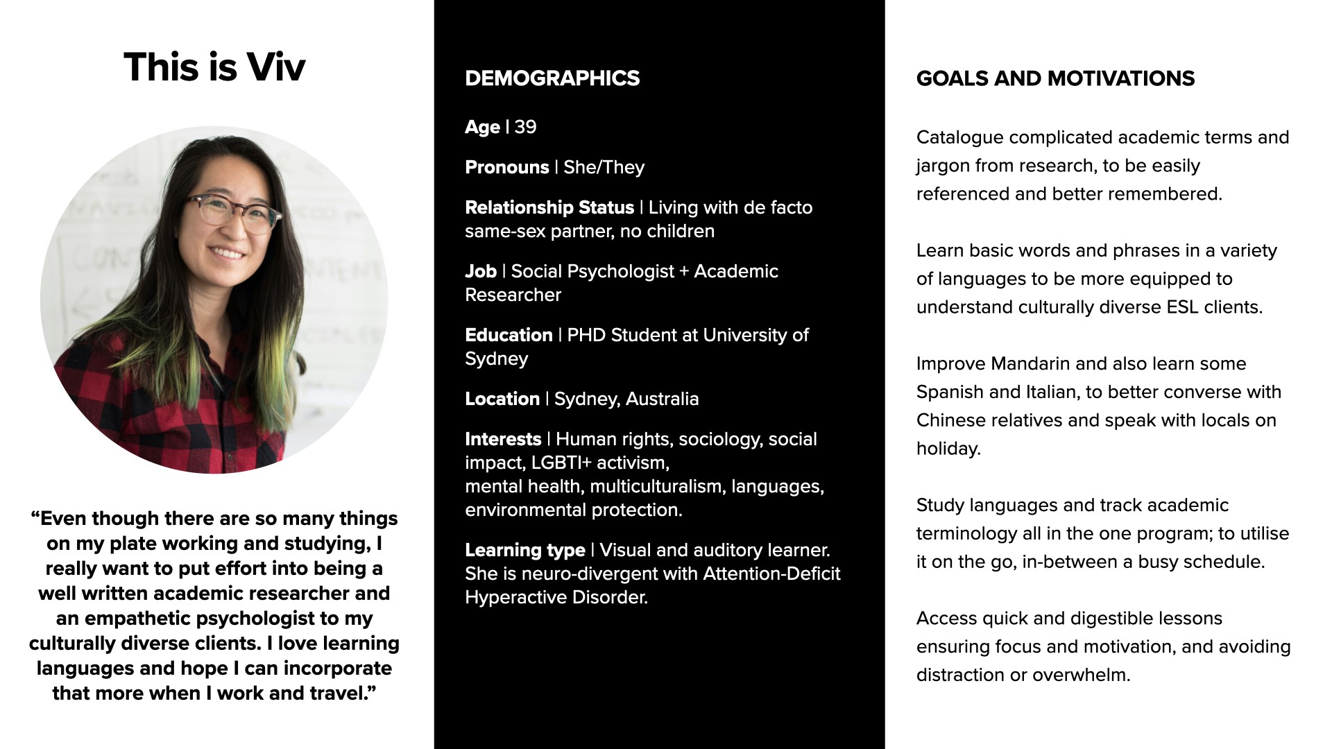
Using the feedback I acquired during the interviews I was able to identify similarities in their frustrations and goals and create a persona based on these. User personas are a great way to ensure you are designing in a user-centred way; making design decisions that incorporate the user, what they need, think and how they behave, into every aspect of the design process.
User stories to understand the 'why'
As a PHD student and an academic researcher, I want to catalogue complicated academic terms and jargon that I come across in my research, so that I can easily reference them and better remember them.
As a PHD student and an academic researcher, I want to catalogue complicated academic terms and jargon that I come across in my research, so that I can easily reference them and better remember them.
As Viv, I want to improve my Mandarin and also learn some Spanish and Italian, so that I can converse better with Chinese relatives and speak with locals in their native language when I travel with my partner.
As Viv, I want to study languages and keep track of academic terminology all in the one program, so that I can easily utilise it on the go, in-between my busy schedule.
As someone with ADHD and many competing priorities, I want to access a variety of quick and digestible lessons that keep me focused and motivated, so that I don’t get distracted or overwhelmed.
Job stories for additional context
When I’m conducting academic research, I want to keep track of difficult terminology and jargon I come across, so I can be sure to use it accurately when documenting and presenting my findings.
When I’m working with culturally diverse clients for who English is a second language, I want to be able to understand certain important words and phrases in their native language, so I can better connect with them, support them, and advocate for their needs.
When I go to visit my relatives, I want to be confident speaking to them in Mandarin, so I can impress them and also have a better relationship with them.
When I go travelling with my partner to different countries, I want to be comfortable speaking basic phrases with the locals, so I can travel more safely, navigate more confidently, and more thoroughly enjoy the experience.
When I study new languages for travel or for work, or when I document academic terminology, I want it to be a fun and simple process, so I can stay motivated and not feel overwhelmed.
By understanding my user I understand what problem I'm trying to solve
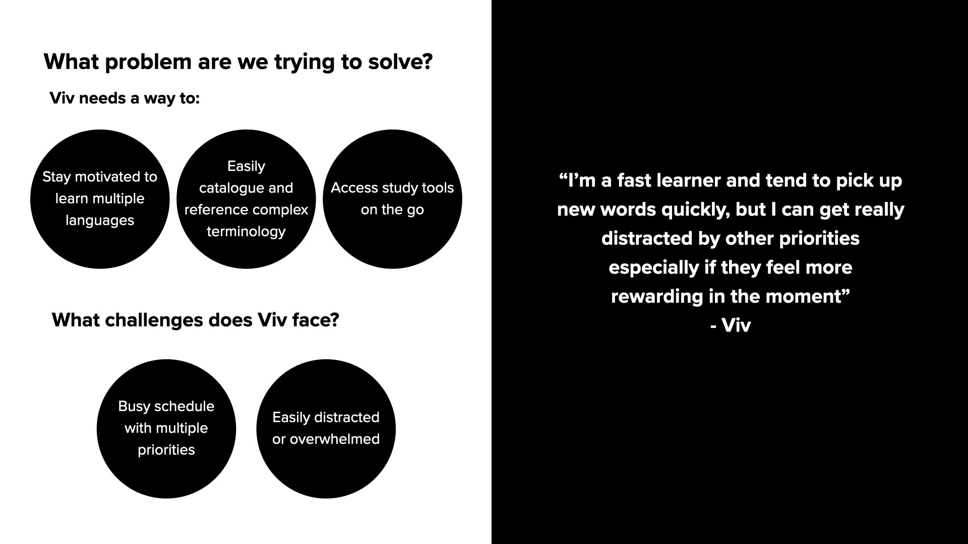
Now that I knew Viv, I could look at what problem I was trying to solve by designing this vocabulary app and what challenges Viv faces.
The problem
Viv needs a way to stay organised and motivated to learn new languages as well as keep track of academic terminology whilst on the go because she has a busy schedule with multiple competing priorities and although she’s highly intelligent and a fast visual and auditory learner she can get easily overwhelmed or distracted by something more instantly rewarding.
So how to create a vocabulary app that addresses these problems and challenges for Viv?
The proposed solution
It’s believed that by:
Creating a simple and intuitive way to create lists of terms with their definitions and easily review them;
Offering visually and auditory appealing study tools like flashcards, memory games, voice recordings and entertaining media to see language used in context;
Offering the capacity to set reminders, encouraging bite-sized study time and tracking progress in a fun and interactive way, for Viv…
…we will achieve the engagement of a consistent user who feels supported, motivated, entertained and not overwhelmed when referencing complex academic terms and finding time to enjoy learning new languages.
Designing the information architecture with task analysis and user flows
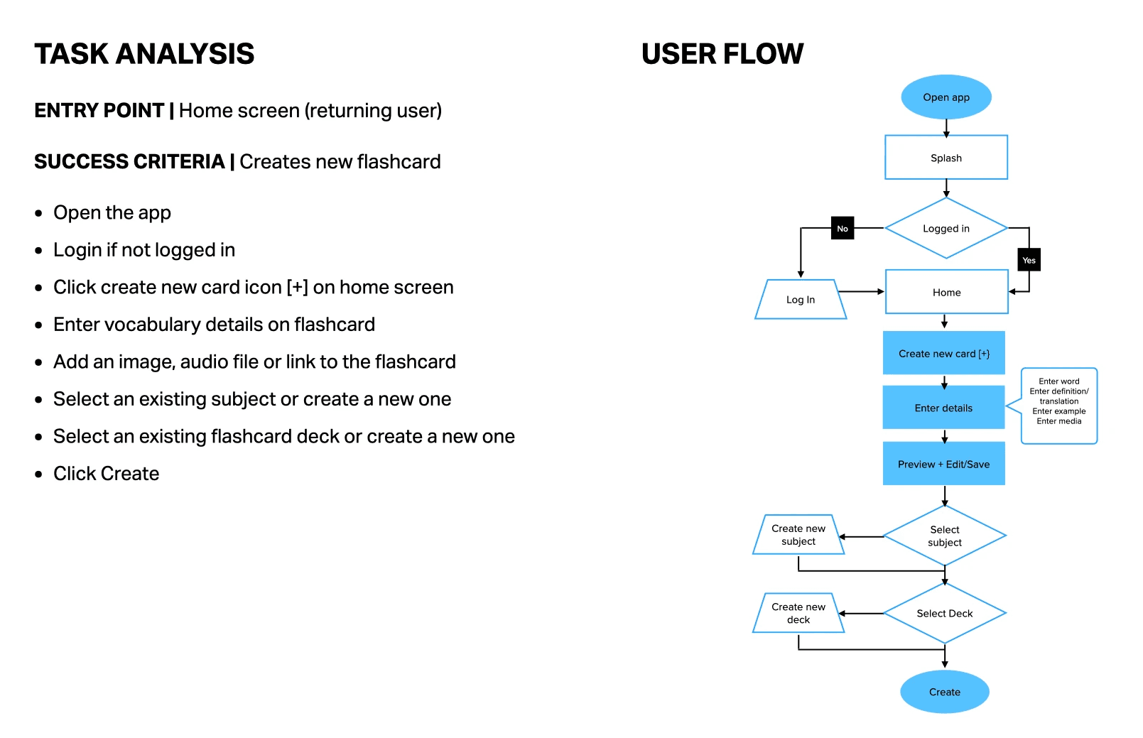
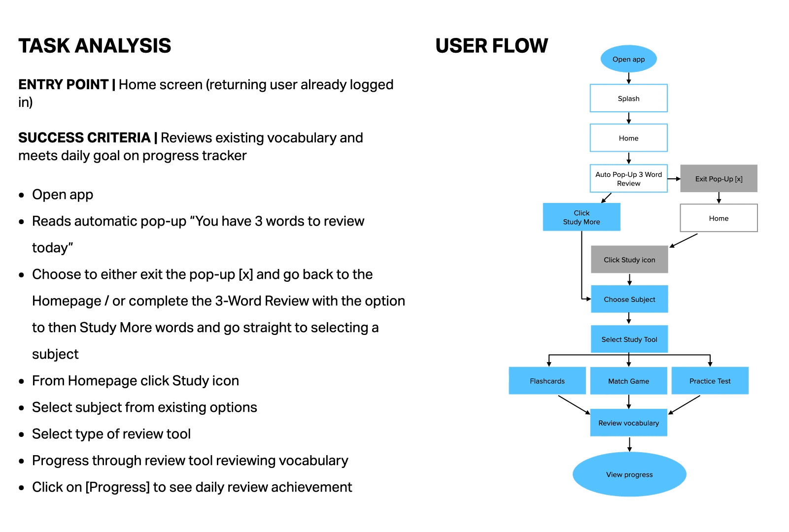
With the persona’s needs and goals in mind, I set out to develop a few common task flows for the user and job stories. This step brought me closer to defining the app’s structure and major interaction points. An open card sort helped me understand potential users’ mental models and how to best group topics together.
Based on our persona’s needs, the main navigation would include a home dashboard, learning modes, adding words or sets, a search function, and a progress profile.
Creating a new flashcard
Reviewing existing flashcards
Time to get sketching some wireframes
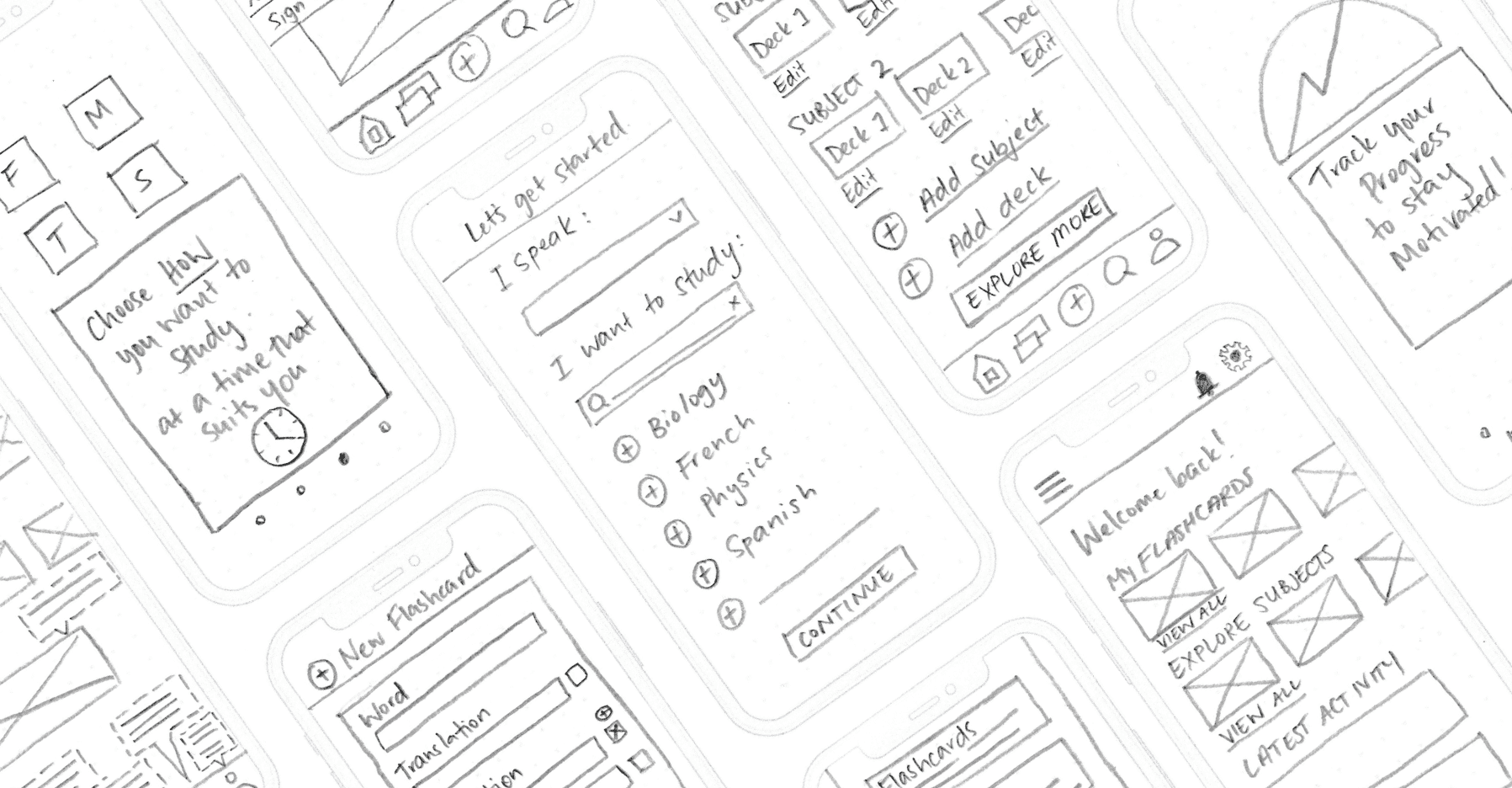
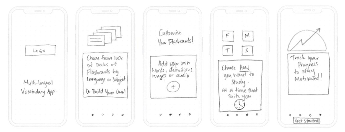
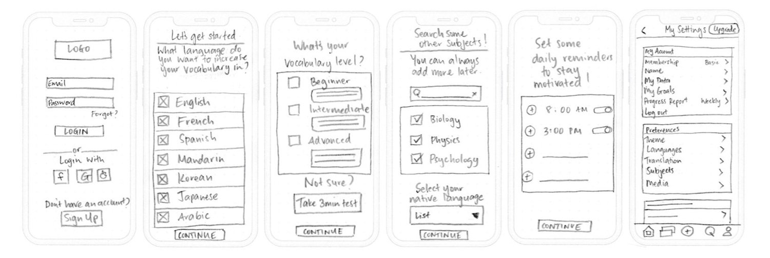
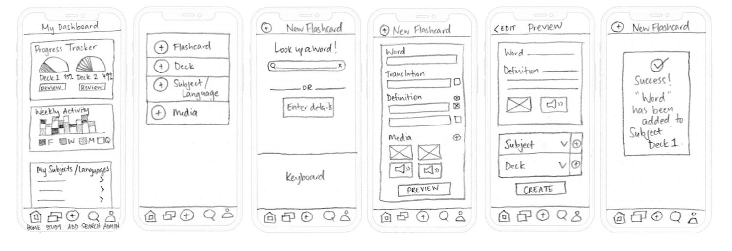
I referred to the task analyses to rapidly sketch the wireframes, ensuring my designs were meeting the persona’s objectives. I did this on paper to keep this stage agile, as I found myself sketching many wireframes in order to find the most useful design choices. A key learning for the future is to outline a sitemap before delving into sketching the individual screens.
Onboarding
Sign up and customisation
Create and save new flashcards
Review flashcards and track progress
Early user testing with a prototype is crucial to evaluate a design's usefulness
Based on Lean UX methodology, early testing with a prototype is crucial to quickly evaluate it’s usefulness, validate what worked in the initial designs and reveal unexpected pain points.
As Jakob Nielsen so rightly describes:
“Usability and utility are equally important and together determine whether something is useful: it matters little that something is easy if it’s not what you want. It’s also no good if the system can hypothetically do what you want, but… is too difficult.”
I conducted monitored remote usability testing on Zoom with 3 participants. I gave them 4 scenario based tasks to complete using an interactive Marvel prototype. The app was received with genuine curiosity and after the sessions, participants asked when they could see the final product. Observing the participants mental models and uncovering errors early on, resulted in saving time and designing a product better focused on the user’s needs.
Scenario tasks to be tested
You’ve just downloaded this vocabulary app on the recommendation from a friend.
Find a way to learn what the app is about.
You’ve decided you’re keen to try it out.
Find a way to create an account and customise the app to your individual needs.
You’re ready to start making flashcards.
Find a way to create a new one.
You’ve created a bunch of flashcards and are ready to start studying.
Find a way to review your flashcards and then check your progress.
Closing interview questions:
How did you feel when you were using the app?
What did you like/dislike about it?
Do you have anything else to add?
Reporting on findings and prioritising prototype revisions
As the usability testing results were extensive, for this project I focused only on severity 4 issues. Severity 4 comes from Jakob Nielsen’s error severity rating scale and is the metric that was used to evaluate and rate the findings. Severity 4 issues are considered a usability catastrophe and are imperative to fix before the release of the product.
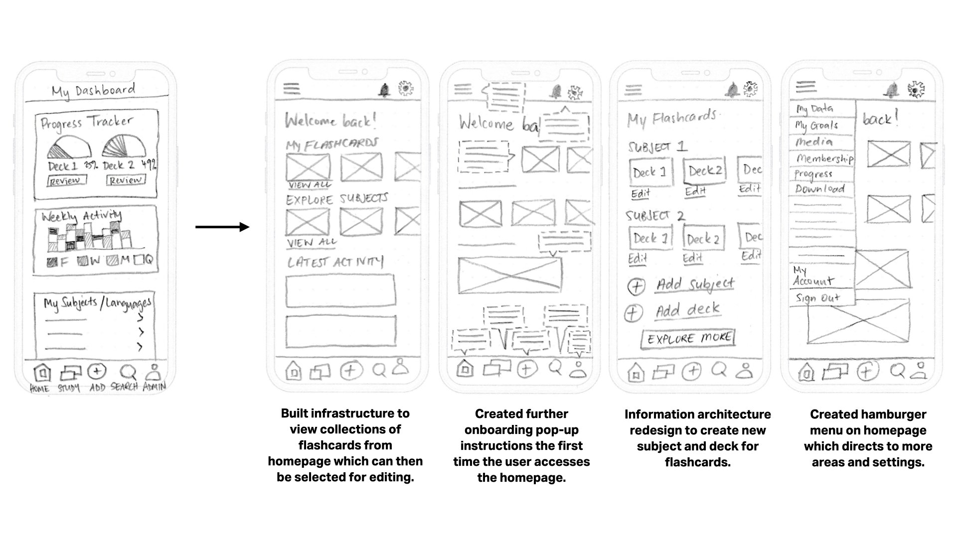
The first severity 4 observation was that the user didn’t know how to find existing flashcards for different subjects. We could fix this by creating an easily accessible section that holds all the users collections of decks sorted by subject.
Next it was observed that a user needed prompts to understand what does what on the homepage. This could be easily fixed by creating further onboarding pop-up instructions the first time the user accesses the homepage.
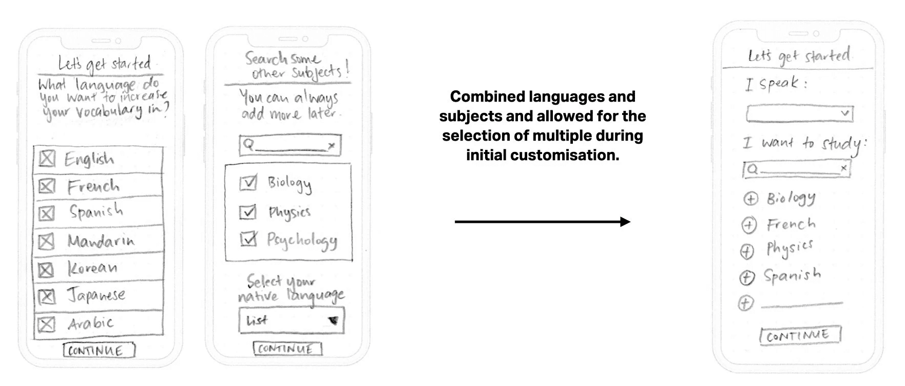
Another user wanted to add more than one language during the initial customisation. This is also something that our user persona would have wanted too. It’s imperative there is no confusion around whether this is a language app or a subject terms review app. A solution to this would be to recategorise languages as subjects also, and allow for the selection of multiple at the customisation stage.
Another severity 4 issue was that it wasn’t clear how to edit or move existing flashcards to other decks at a later date. This could be solved by building infrastructure to view the user’s collections of flashcards which can then be selected for editing.
Iterative changes based on usability feedback
What was changed as a result of the usability testing?
The first wireframe revision was for the initial customisation stage. It was redesigned to combine languages and subjects and allow for the selection of multiple. The user experience surrounding nominating what their native language was also simplified.
It was also decided that the language proficiency level test be removed from the customisation stage, as this app is less about undertaking language courses like say DuoLingo, and more focused on reviewing collections of flashcards based on subjects, those subjects of course include different languages. The users proficiency level would be later reviewed based on their tracked progress and perhaps something they could customise later in settings.
The next revisions show a completely redesigned homepage which now made it easier to view collections of flashcards. These could then be viewed and edited, as you can see in the wireframe of the My Flashcards page.
The second wireframe along shows how further onboarding pop-up instructions could be included to assist the user the first time they access the homepage. And the last you can see the inclusion of a hamburger menu which would allow for easy access to other features of the app. A notifications button and a settings button were added to the homepage in the top right corner, which were considered necessary revisions also.
What could be done next to improve the prototype?
First I’d want to conduct more user interviews and tests with a wider variety of different types of users - think different ages, backgrounds, motivations, goals etc.
Next I’d want to be creating more user personas based on those findings to better inform the future direction of the app.
It would be great to have a creative brainstorming session to come up with a suitable name for the app which would appeal most to our target audiences. As well as starting to consider some of the interface design features: colour schemes, shapes of buttons, typefaces etc. Also putting more consideration into the UX writing that would be used across the app.
Next I’d want to be designing low-mid fidelity wireframes for any new or revised features.
And then creating a mid-high fidelity prototype with animated navigation that adopts the considered user interface design elements. I’d of course be wanting to test, test, test all of this as I went forward.
What did I learn from this project?
Thorough onboarding can make so much of a difference to a users continued experience with an app. Just because we as designers understand how it’s to be used, it doesn’t necessarily mean our point of view is a universal one. So perhaps providing more detailed instructions at first which can always be scaled back based on testing observations would be a better way to go.
The way buttons/tabs are labelled or worded can make or break a users capacity to navigate the app successfully. There were many iterations that had to happen when creating the user-flows specifically with the type of wording used. Testing language is just as important as testing the positioning and inclusion of functions. As well as things like sizing, orientation and hierarchy of objects, text etc.
You can’t include every single feature in the one app. Sometimes less is more. It’s important to focus on solving one problem at a time to not get overwhelmed by the scope of it all. If you’re trying to do too many things, scale it back to the items that are most important and then build from there.
